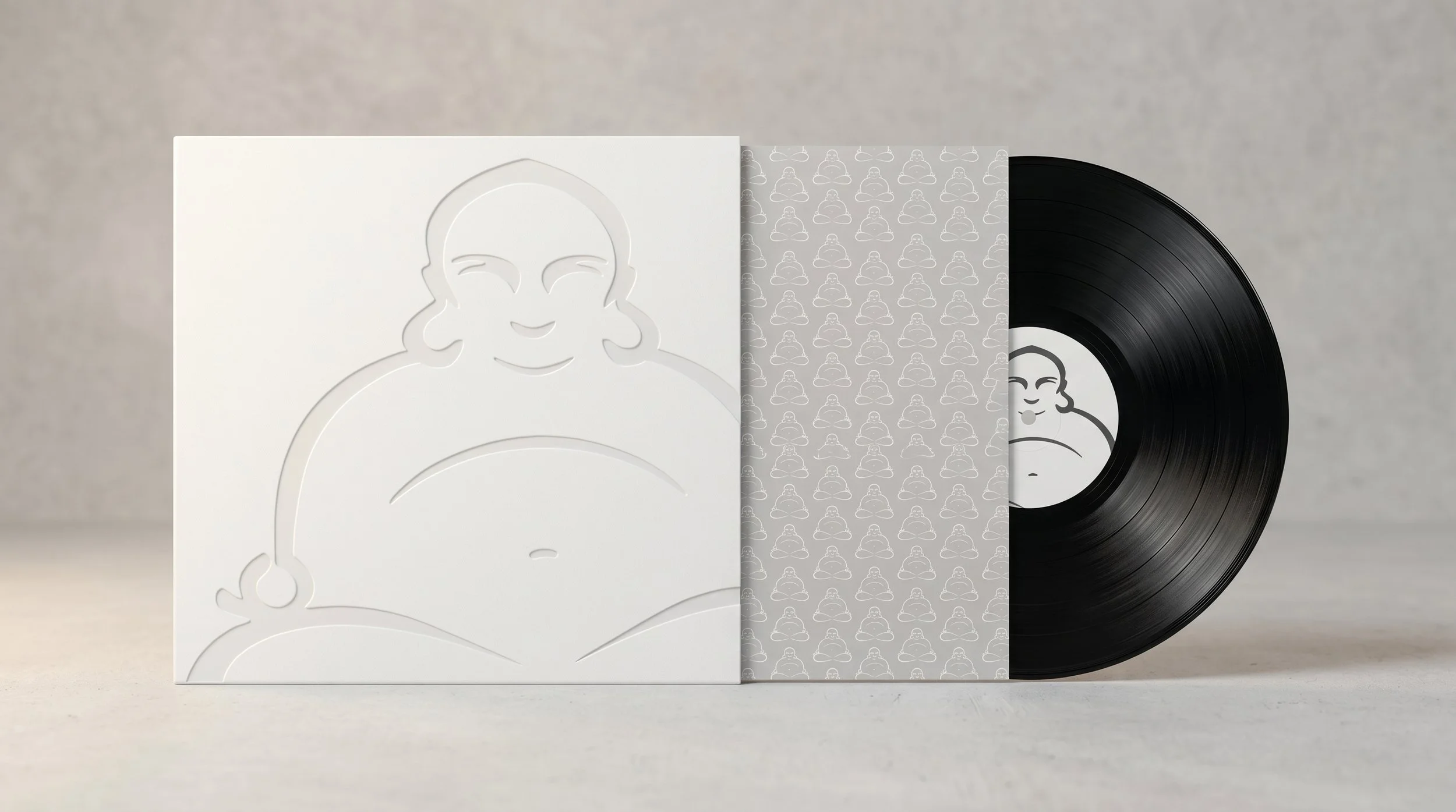
Buddah Records Brand Refresh
A contemporary editorial reframing of a cultural icon.
Client: BMG Music Group NYC
Scope: Logo and Brand Identity
Role: Lead Design Agency
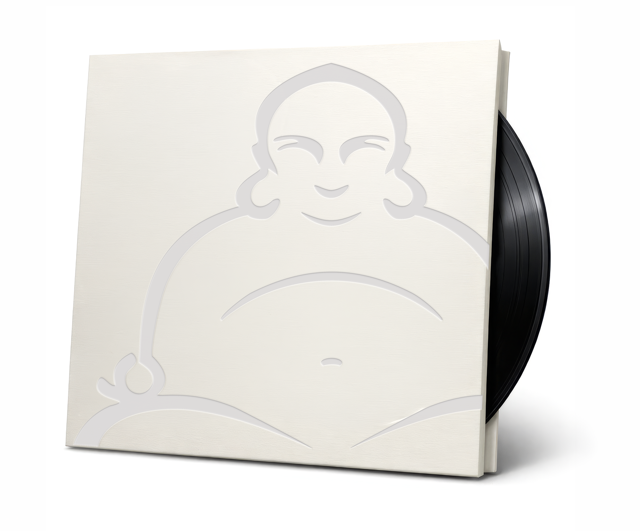
Buddah Records has long stood as a symbol of musical experimentation and cultural expression. This brand refresh reimagines the label’s iconic identity through a modern editorial lens, preserving its analog warmth and heritage while introducing a refined, scalable system for BMG’s next era of catalog releases and artist storytelling.
-
Buddah Records is one of the most distinctive labels of the 1960s and 70s, known for its eclectic roster, experimental sound, and instantly recognizable mascot. When BMG Music Group initiated a brand refresh, the goal was to modernize the identity without losing the cultural warmth and analog character that defined the original imprint. The challenge was to create a contemporary, scalable system that honored the label’s heritage while giving BMG a clean, flexible toolkit for future catalog releases and brand extensions.
Our approach began with a close study of Buddah’s visual history — the playful geometry, the rhythmic repetition of the mascot, the warm vinyl‑era palette, and the expressive typography that shaped its early presence. From this foundation, we rebuilt the mark with precise vector architecture, refined proportions, and a simplified silhouette that preserves the spirit of the original while performing flawlessly across digital and print environments.
The refreshed identity introduces a structured color system drawn from archival materials, paired with a bold typographic voice using the Antonio and Agenda One Condensed families. Together, these elements form a cohesive, modern brand system that supports everything from catalog packaging to artist promotions and internal BMG communications.
The result is a contemporary editorial reframing of a cultural icon — a brand identity that respects Buddah Records’ legacy while positioning it confidently for the next era of music distribution and storytelling.
-
Honor the cultural legacy of Buddah Records while modernizing the identity for contemporary use
Rebuild the iconic mascot mark with precise vector architecture and balanced proportions
Establish a cohesive visual system — color, typography, and layout — that supports both digital and print applications
Provide BMG with a flexible, scalable identity toolkit for catalog releases, artist promotions, and internal brand communications
-
Our creative direction began with a deep dive into Buddah Records’ visual lineage — the warm analog palette, the rhythmic repetition of the mascot, and the expressive typography that defined its early era. Rather than reinventing the brand, we focused on refinement: simplifying the Buddha silhouette, strengthening its geometry, and rebuilding the mark for clarity at every scale.
Typography was selected to echo the bold, poster‑driven energy of the label’s heyday while introducing a modern editorial discipline. The color system draws from archival vinyl sleeves and production ephemera, creating a palette that feels both nostalgic and contemporary. Together, these elements form a unified identity system that respects the past while positioning the brand for future storytelling.
-
Refined primary and secondary logo marks in full vector architecture
Comprehensive color system and typographic standards
Identity system guidelines for digital, print, and large‑format applications
Branded assets for BMG internal use, including promotional and catalog‑ready artwork
-
The refreshed identity was embraced by BMG for its balance of heritage and modernity — a system that preserves the character of the original imprint while giving the brand new clarity and reach. The updated mark, color story, and typographic voice now serve as the foundation for future catalog packaging, artist promotions, and brand extensions, allowing Buddah Records to move confidently into its next era with a renewed sense of presence and purpose.

The Modernized Mark
A refined vector reconstruction of the iconic Buddah silhouette, rebuilt for clarity, balance, and scalability.




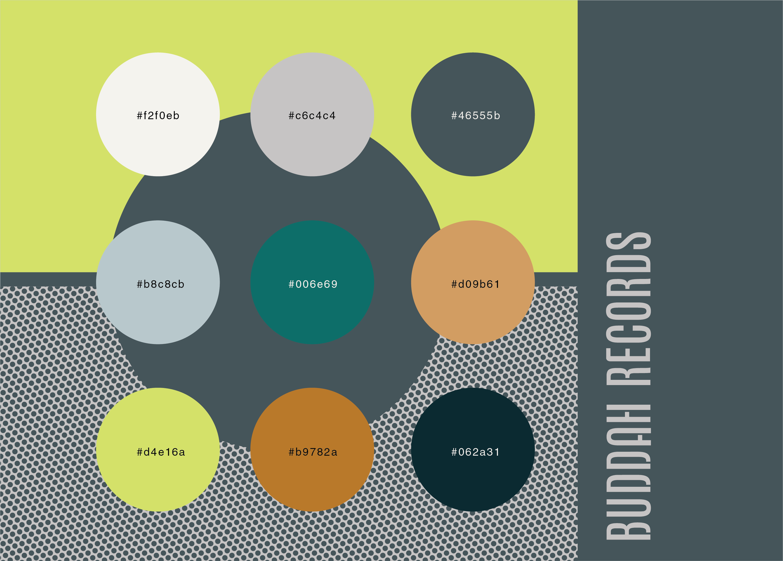
The Heritage Color Story
A palette drawn from archival vinyl, production ephemera, and analog print tones in warm, expressive, and era‑true.
Secondary tones that expand the system for packaging, digital environments, and promotional materials.


Clearspace Lockup
The Buddah Records lockup maintains a consistent clearspace to preserve legibility and visual balance across all applications.
The minimum clearspace is defined by the height of the Buddha’s head, applied uniformly around the full perimeter of the lockup. This ensures the mark and wordmark remain unobstructed, readable, and visually dominant in every context.

The Repetition System
A rhythmic multi‑mark pattern inspired by vintage sleeve art and the label’s experimental visual history.
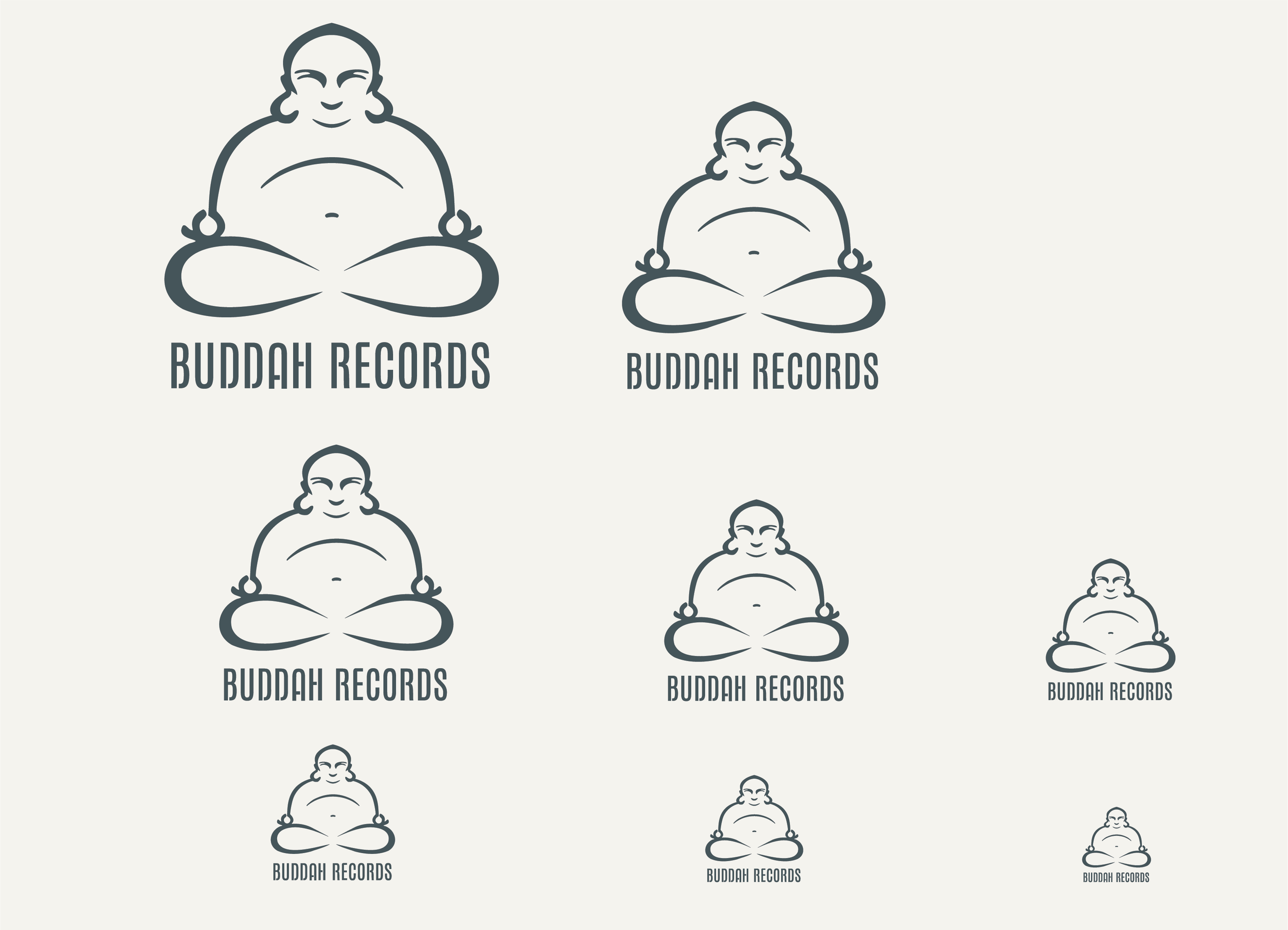
Size Variations — Lockup
The Buddah Records lockup is engineered to maintain clarity and balance across a wide range of sizes. At smaller scales, the simplified geometry of the Buddha silhouette ensures the mark remains legible without visual collapse. At larger scales, the proportional relationship between the symbol and the wordmark preserves hierarchy and presence. Minimum size recommendations ensure the lockup performs consistently across digital, print, and large‑format applications.

Clearspace Letterform
The primary letterform requires a protective zone equal to the vertical stroke width. This clearspace prevents crowding, maintains the integrity of the geometry, and ensures the letterform performs consistently at all scales from small digital placements to large‑format print

Size Variations — Letterform Logo
The standalone letterform is optimized for extreme scalability, from micro‑applications to oversized display. Its refined stroke structure and open counters allow it to hold shape at reduced sizes, while its geometric precision supports crisp reproduction in large‑format environments. Minimum size guidelines protect legibility, ensuring the letterform remains recognizable and authoritative in every context.

The Letterform Logo
The Buddah Records letterform is a hand‑tooled construction that blends Bauhaus reduction with contemporary urban stencil logic. Its geometry is intentionally spare; every stroke, break, and curve is shaped with purpose, creating a mark that feels both engineered and human. The open stencil cuts introduce rhythm and breath, allowing the form to hold clarity at small sizes while giving it a modern, street‑influenced edge.
Though rooted in Bauhaus principles of functional minimalism, the letterform retains the warmth of its hand‑drawn origins, resulting in a symbol that is precise, iconic, and unmistakably Buddah.
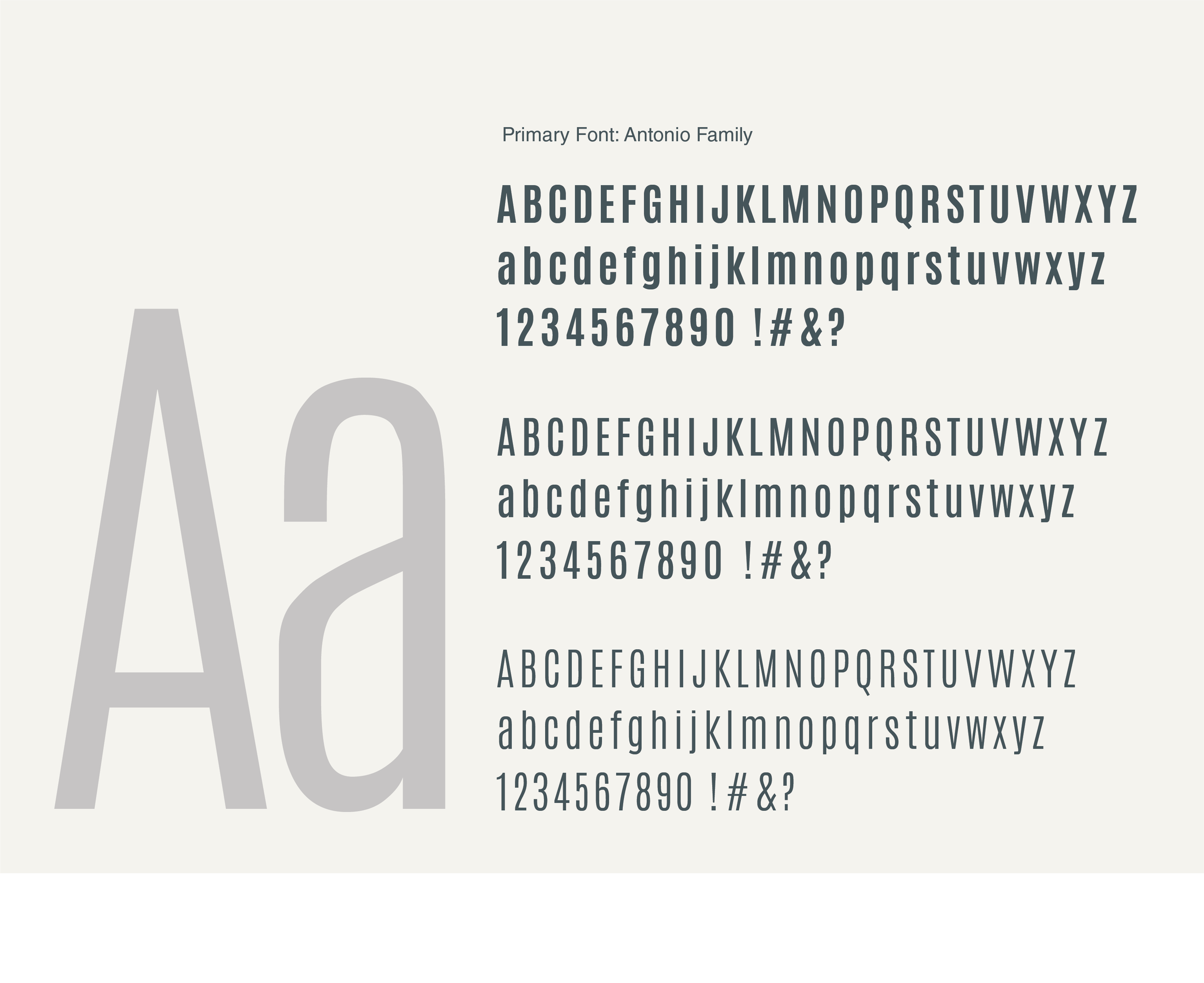
Typography System — Antonio Family
A bold, geometric sans serif that echoes poster‑driven 70s energy while delivering modern editorial precision.
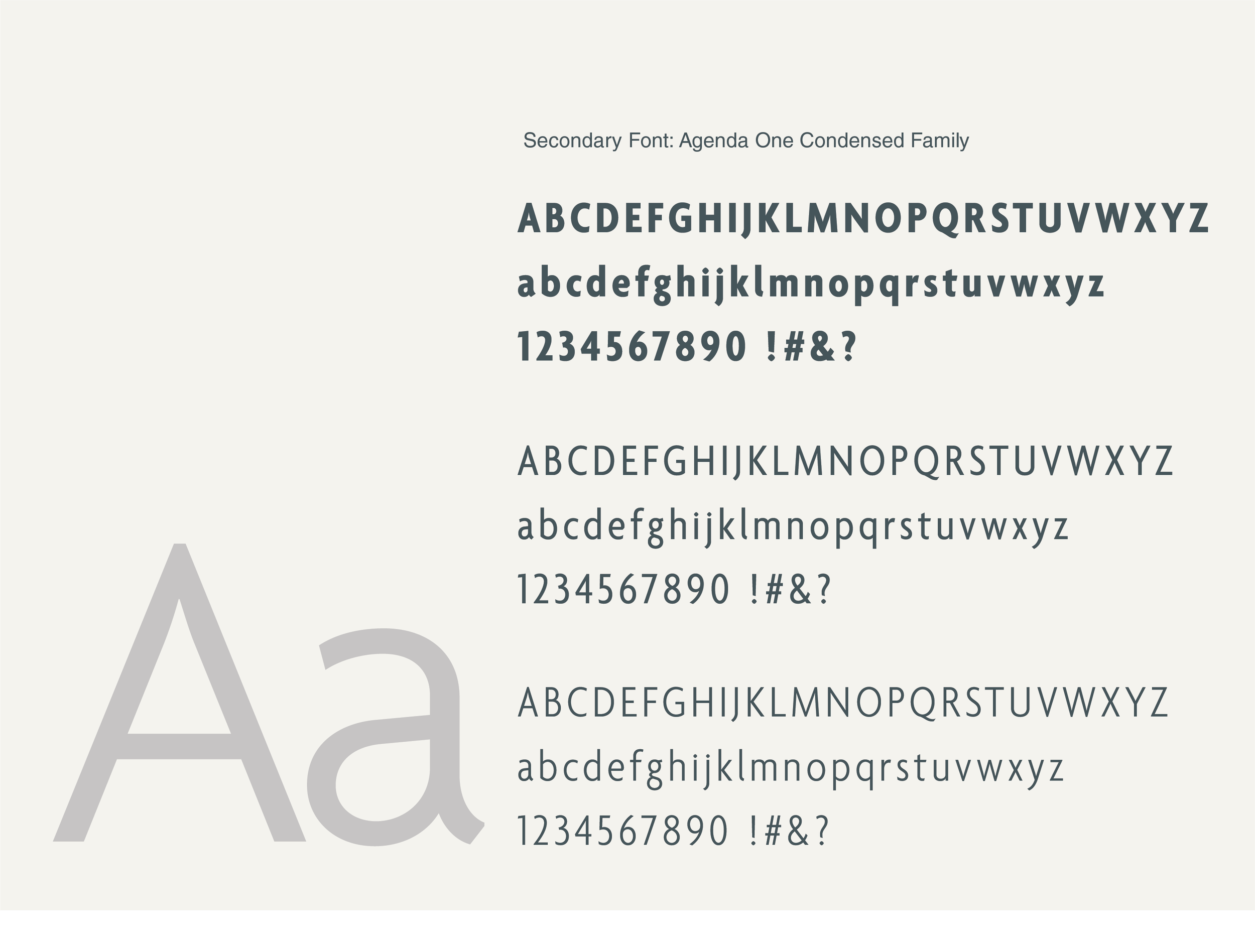
Typography System — Agenda One Condensed
A condensed companion family that brings rhythm, hierarchy, and a clean vertical structure to the identity.
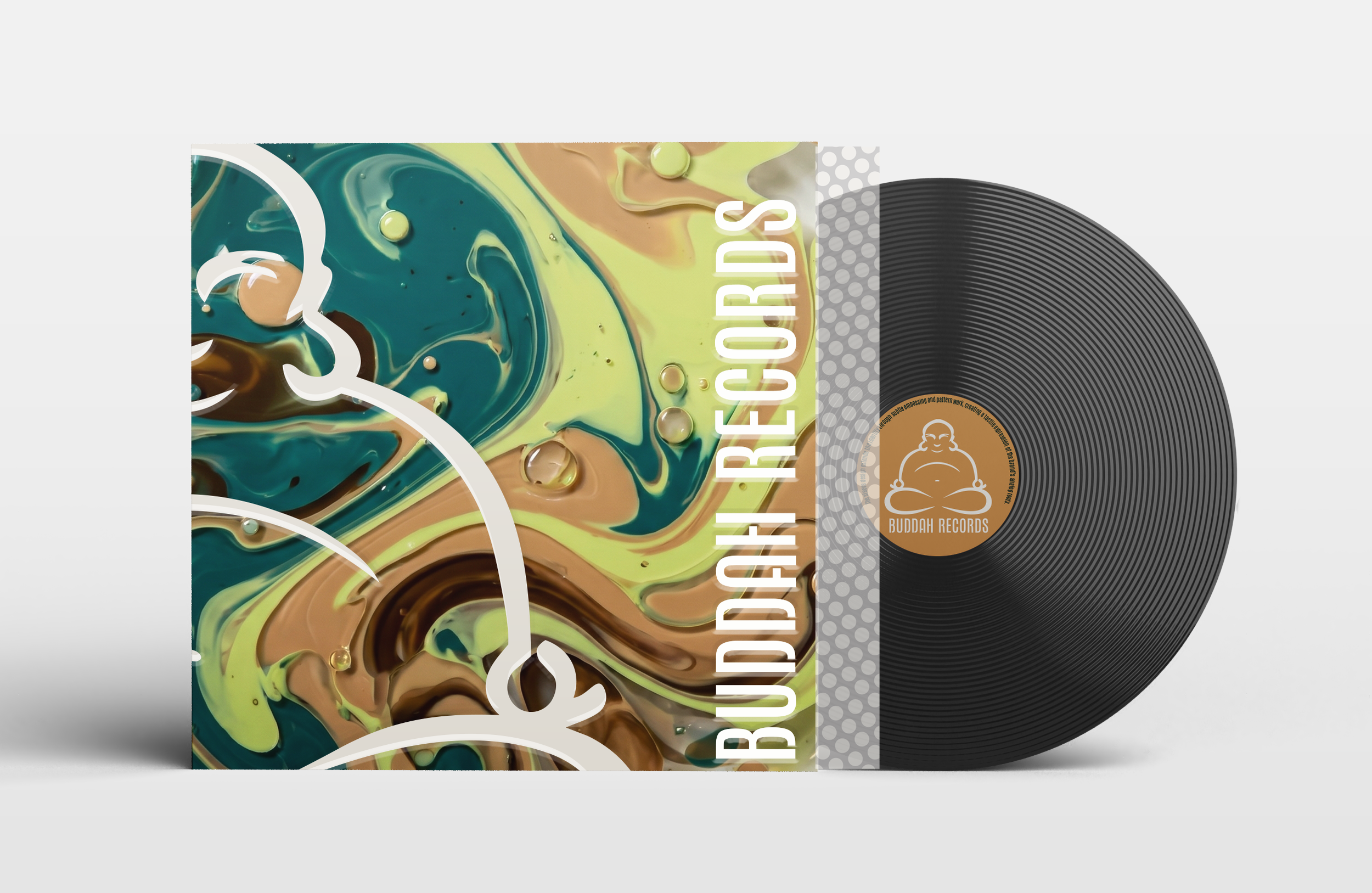
Application Packaging System
The application system demonstrates how the refreshed identity performs across real‑world touchpoints. From packaging to promotional materials, each layout uses the brand’s grid, color story, and typographic hierarchy to create a unified visual experience. The mark, letterform, and supporting patterns work together to deliver a contemporary editorial presence that honors the label’s heritage while elevating its modern expression.

Pattern System
The Buddah pattern system is derived directly from the geometry of the mark, creating a rhythmic visual texture that reinforces brand recognition without overpowering content. The pattern can be deployed as a subtle background wash, a bold full‑bleed field, or a structural divider within layouts. Its modular construction allows for scaling, cropping, and repetition while maintaining consistent spacing and proportion across all applications.

Icon System
The Buddah Records icon set is a collection of hand‑drawn symbols inspired by the label’s golden era cultural motifs. Each icon uses the same line weight, curve logic, and geometric discipline as the primary mark, creating a cohesive visual language across the system. The icons function as expressive extensions of the brand, playful, rhythmic, and rooted in R&B music, soul, fashion, and analog culture while maintaining the clarity required for modern digital use.


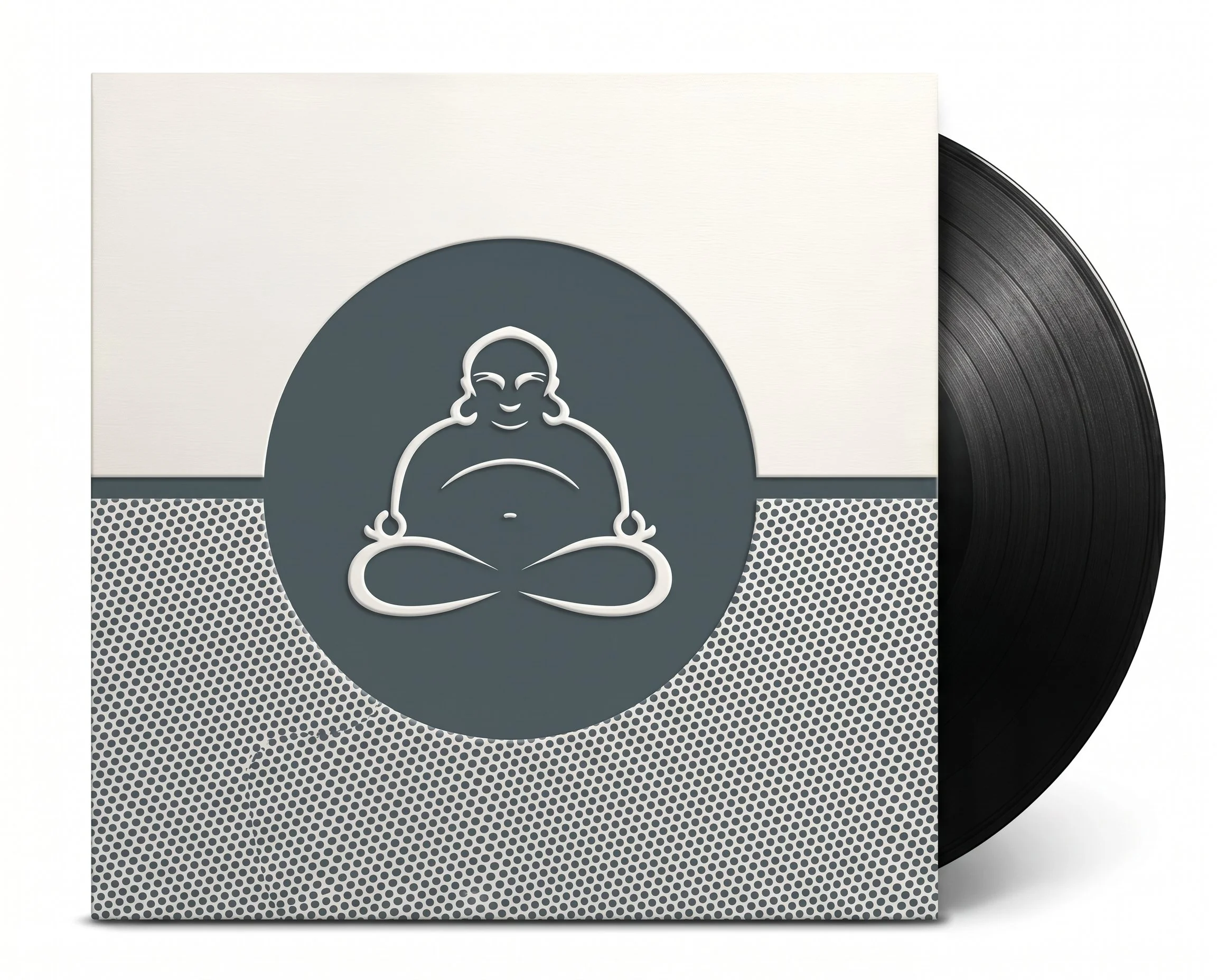
The Buddah Records refresh bridges past and present — a modern identity system rooted in heritage, rebuilt with clarity, precision, and editorial strength. Designed for BMG’s evolving needs, the new mark, palette, and typographic voice provide a flexible foundation for catalog releases, artist promotions, and future brand extensions. It is both a preservation and a progression: a renewed visual language for a label with deep cultural resonance.