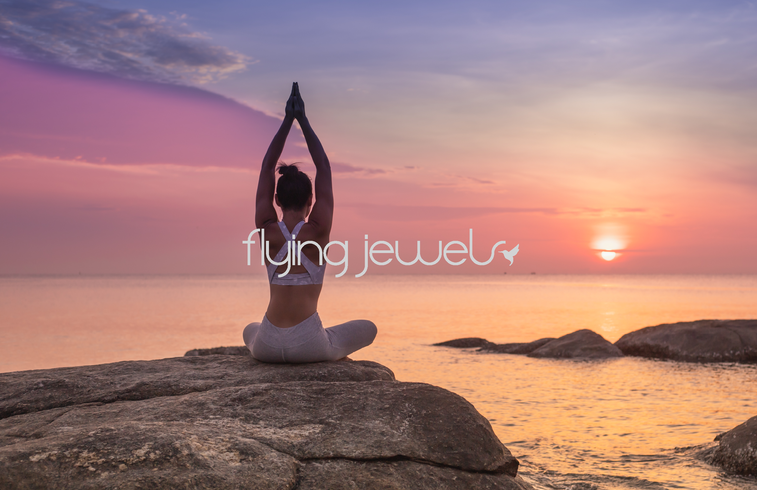
Flying Jewels — A Brand of Breath and Movement
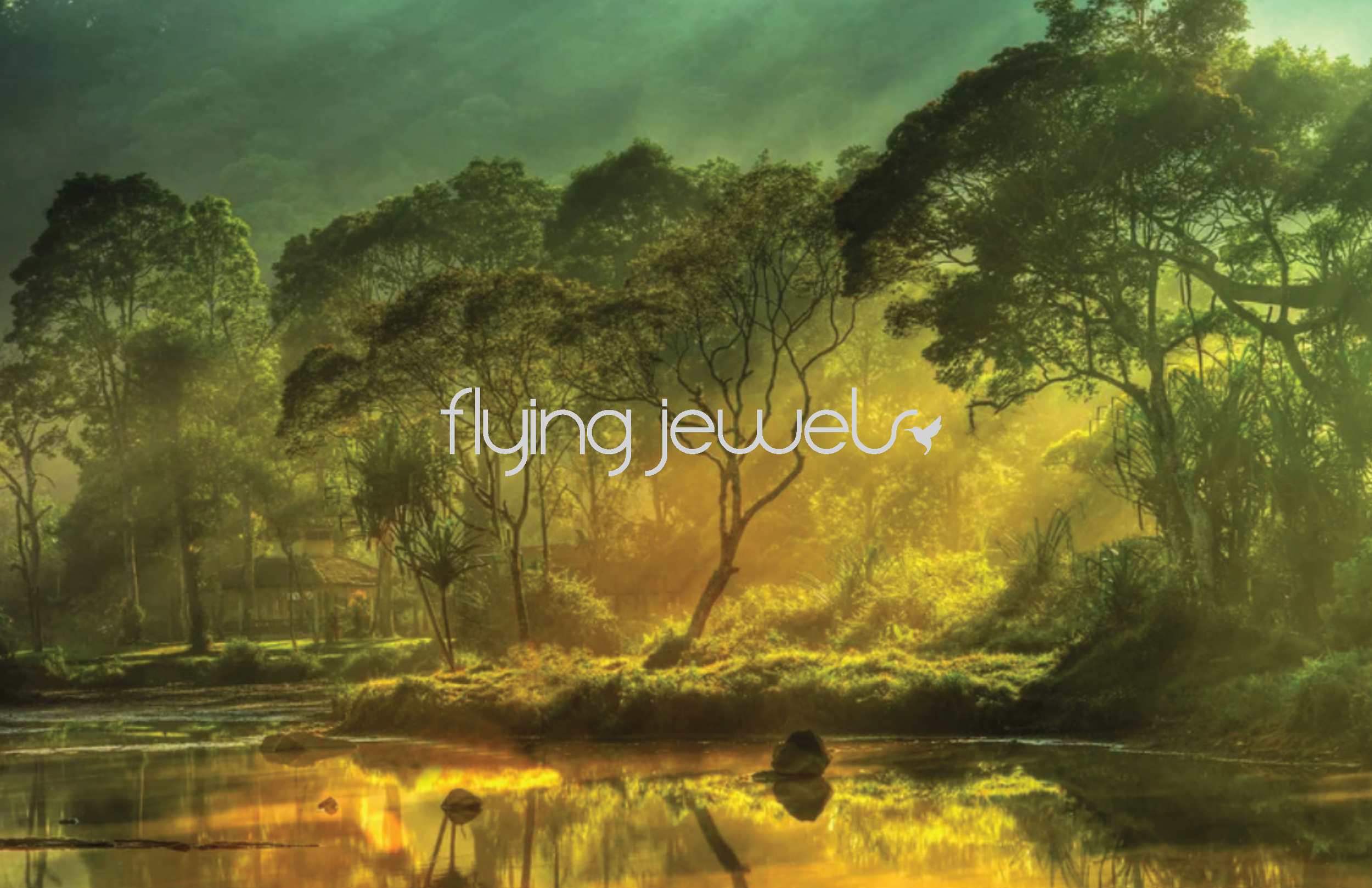
Flying Jewels is a restorative identity built around breath, weightlessness, and the quiet discipline of movement. The system needed to feel soft without becoming sentimental — a visual language that holds space rather than fills it.
Brand Context
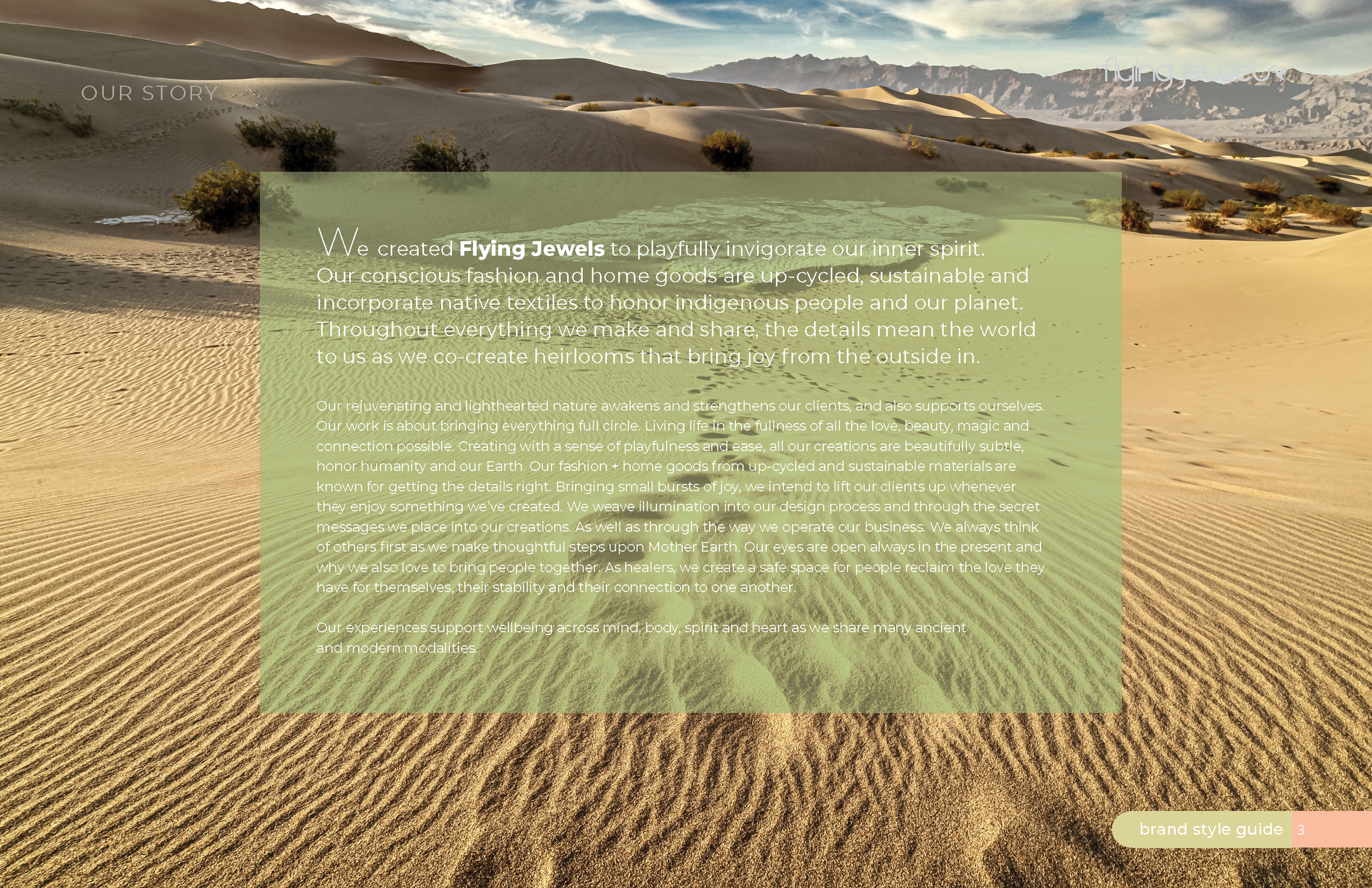
A collective of yoga instructors known for their gentle, meditative practice approached us for a brand that reflected their philosophy: presence, lightness, and the subtle joy of embodied movement. They needed an identity that felt calm, grounded, and quietly luminous — a brand that could support their teaching without overpowering it.
Design Rationale
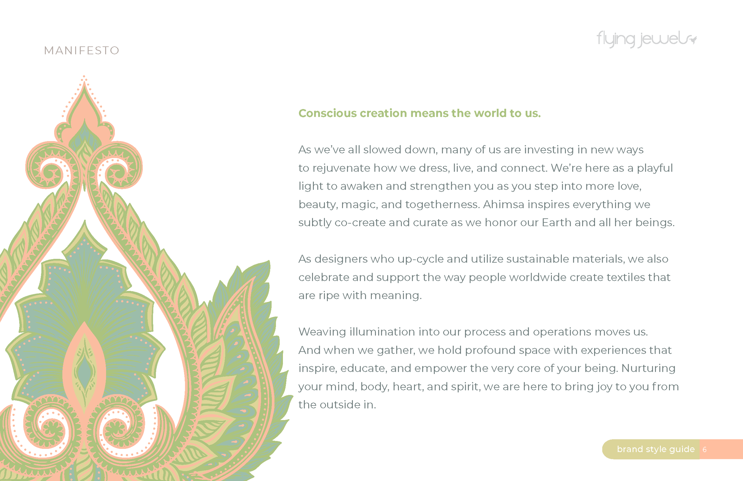
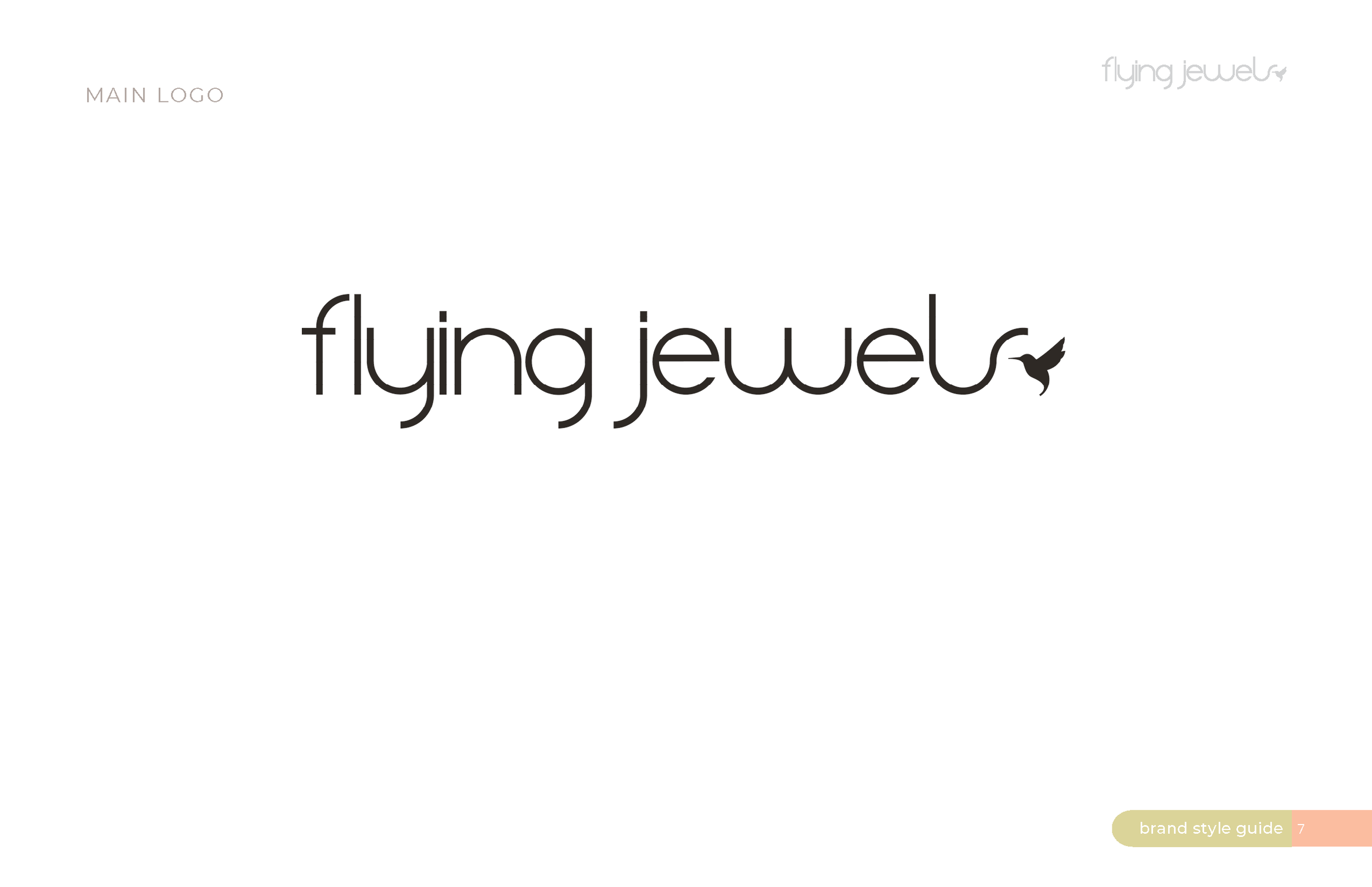
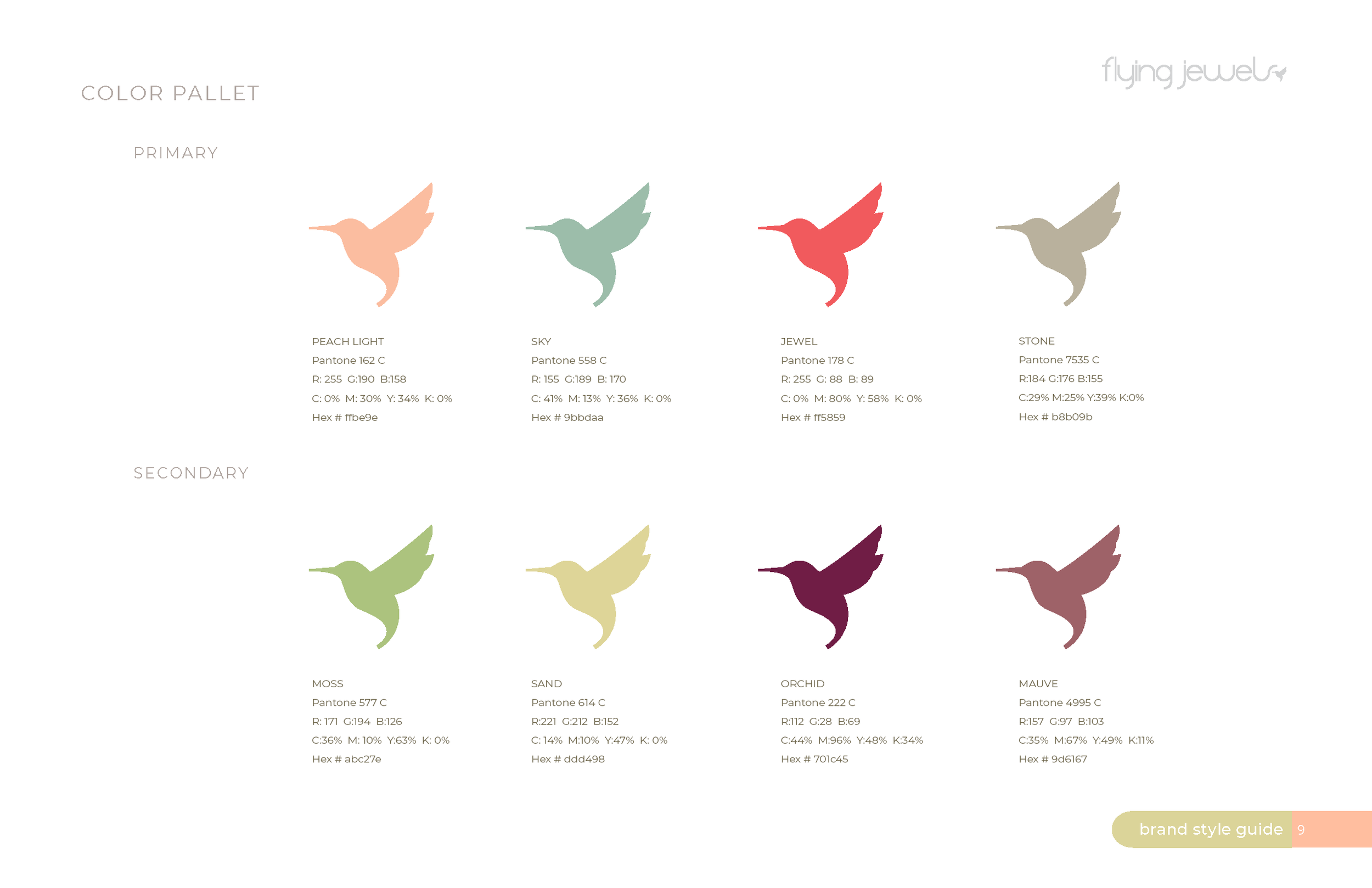
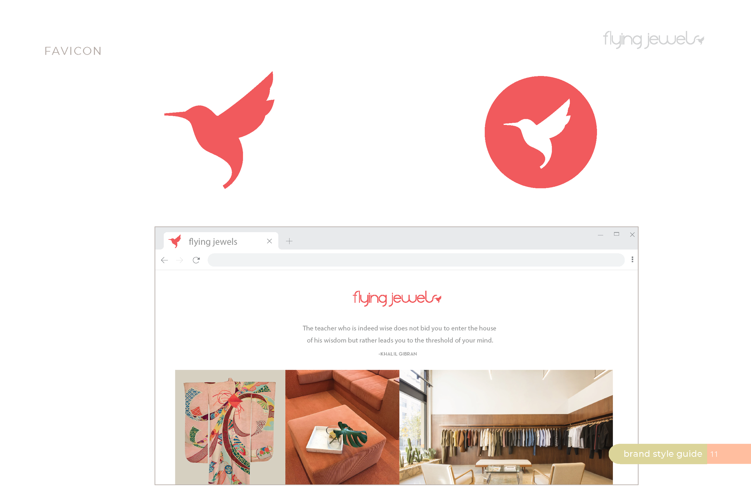
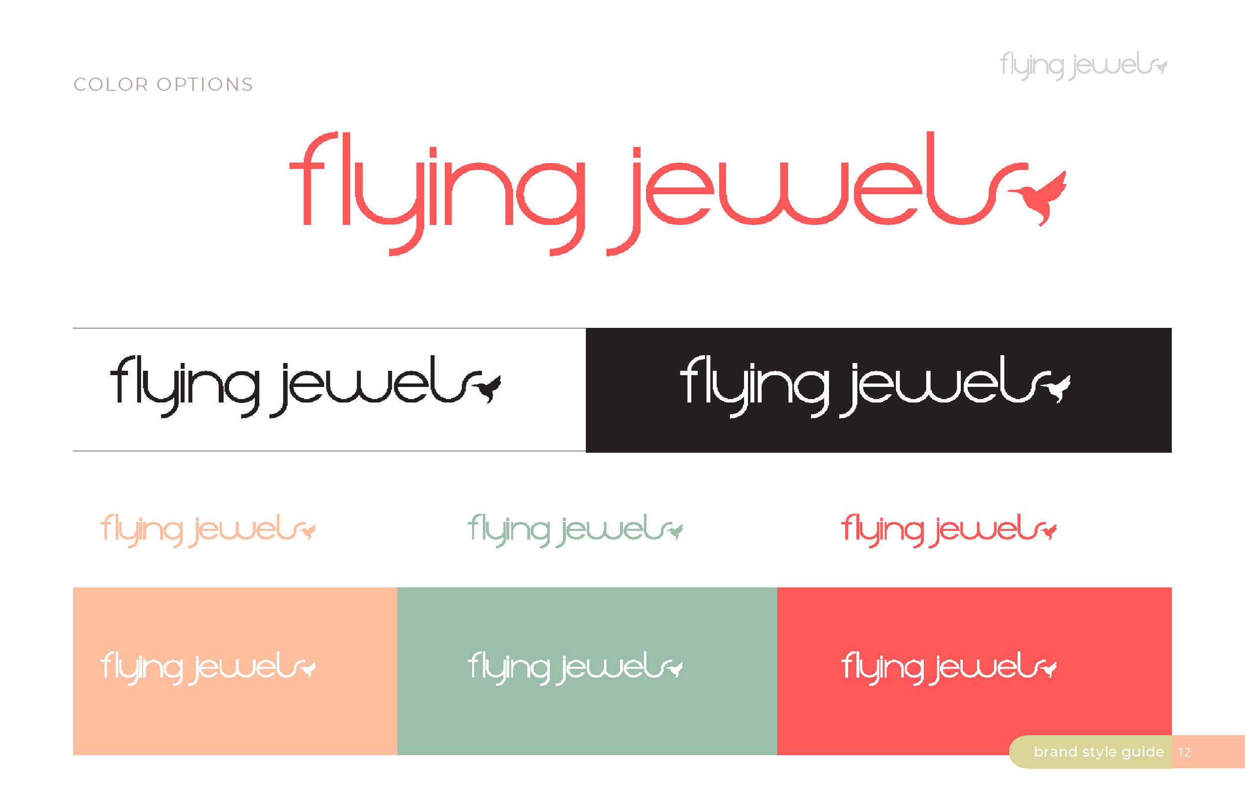
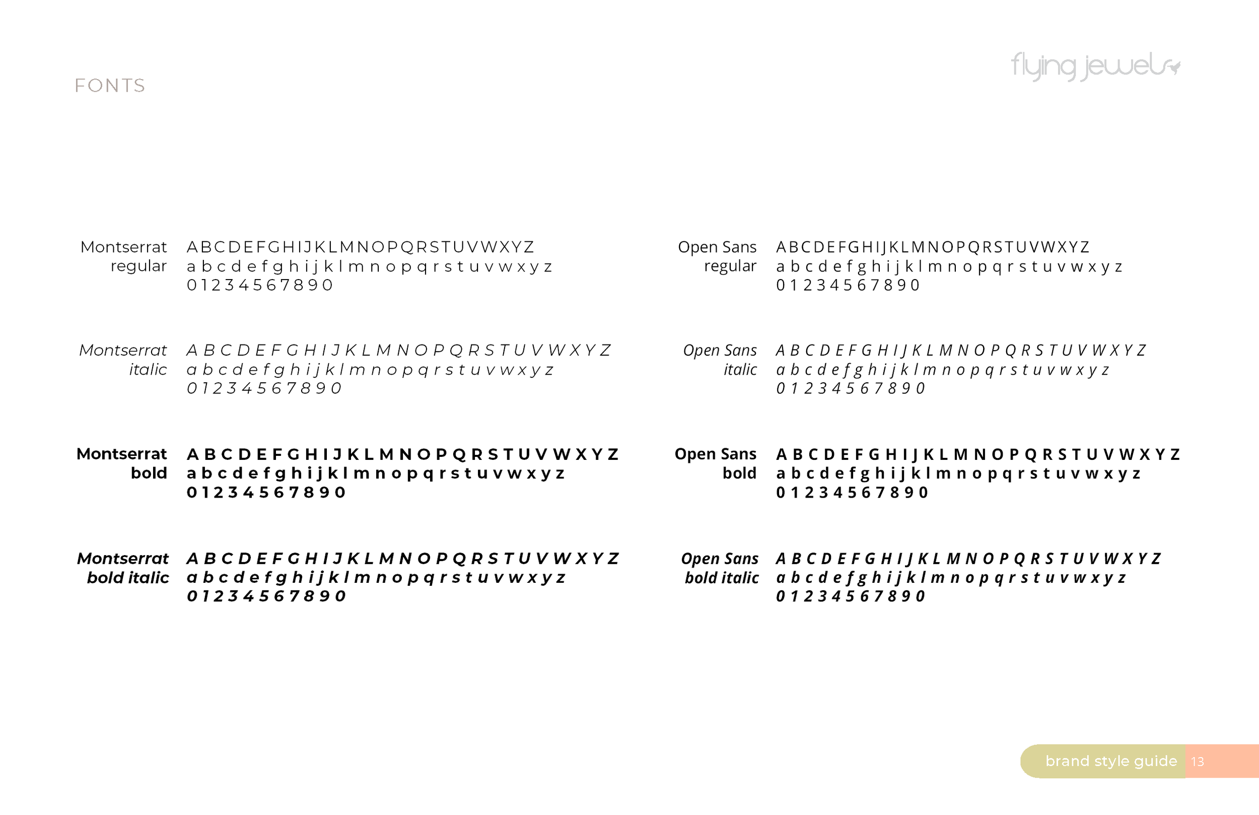
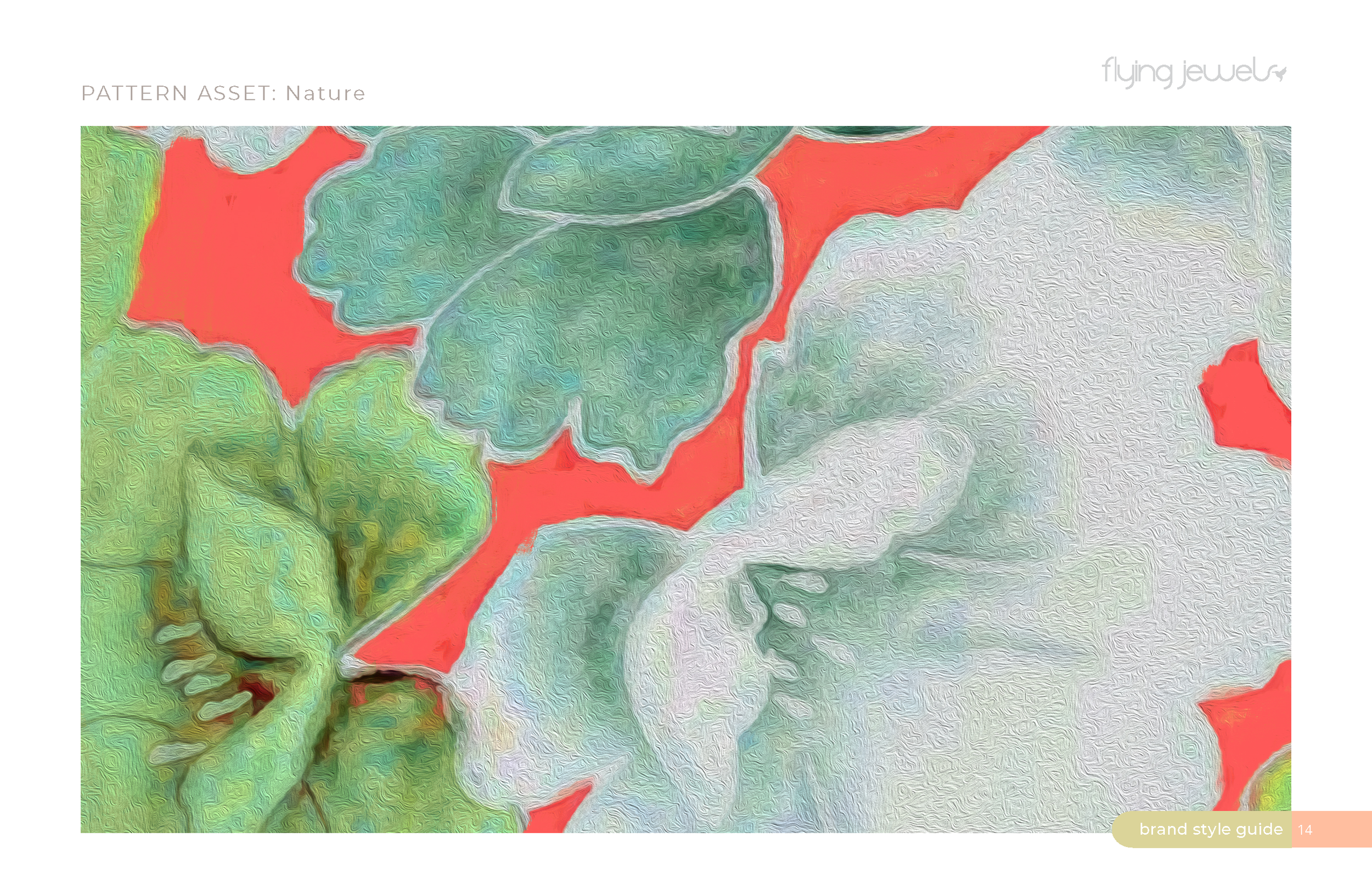
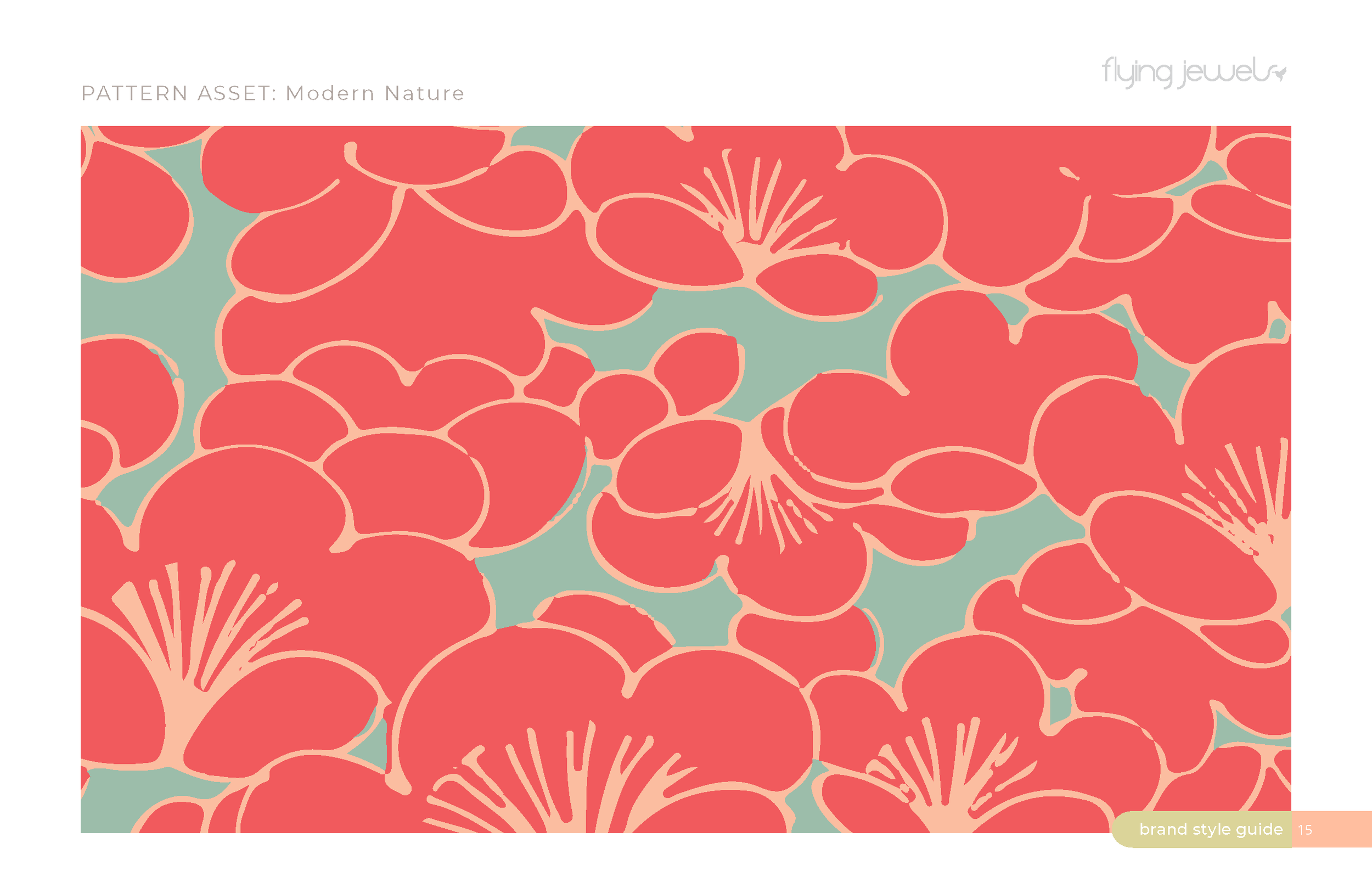
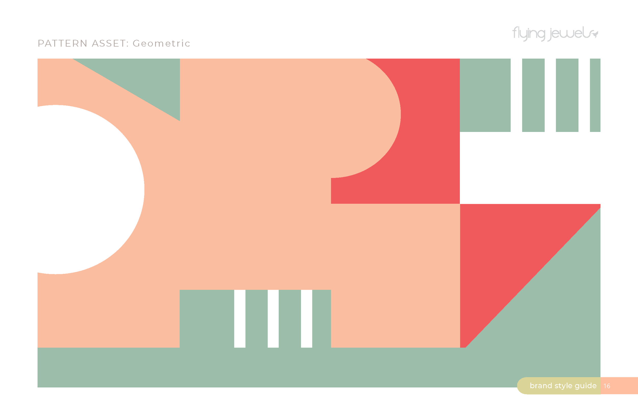
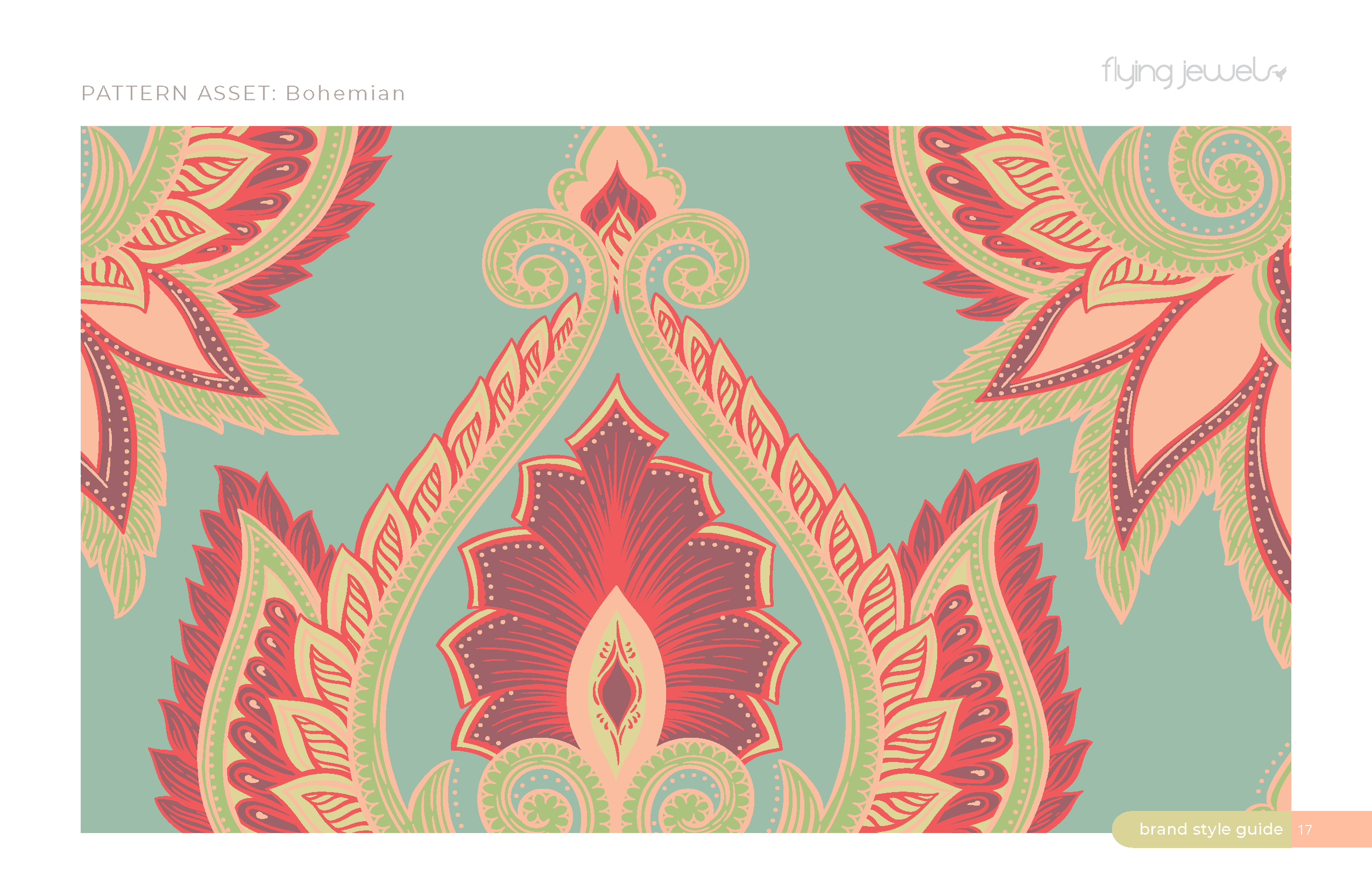
The symbol was designed as a gesture — a soft, upward motion that suggests breath rising through the body. Its form is intentionally weightless, almost floating, to echo the instructors’ restorative approach. The palette draws from muted natural tones, chosen for their ability to calm rather than stimulate. Typography remains structured but gentle, creating a balance between discipline and ease.
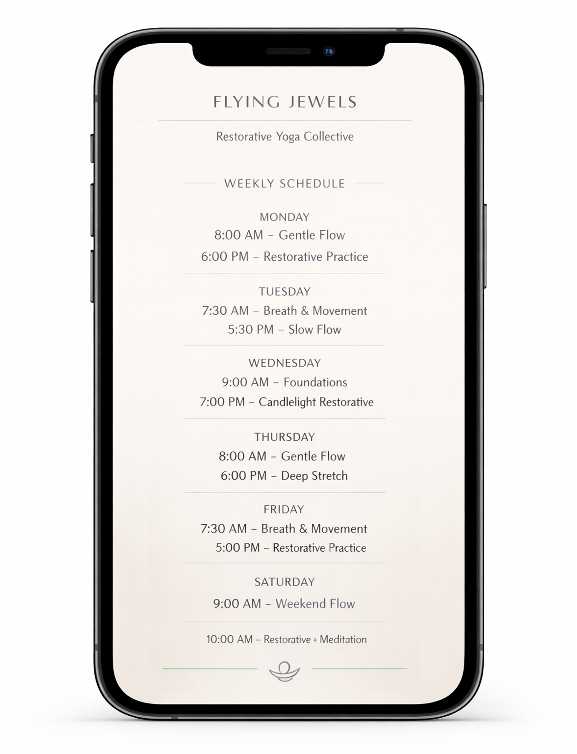
System Expression
The identity extends into class materials, digital touchpoints, and environmental applications with the same quiet clarity. Every element is designed to feel like an exhale — open, spacious, and intentional.