
JoJo Learning — A Warm, Structured Identity for Bilingual Growth
Designing clarity and confidence for early multilingual learners.
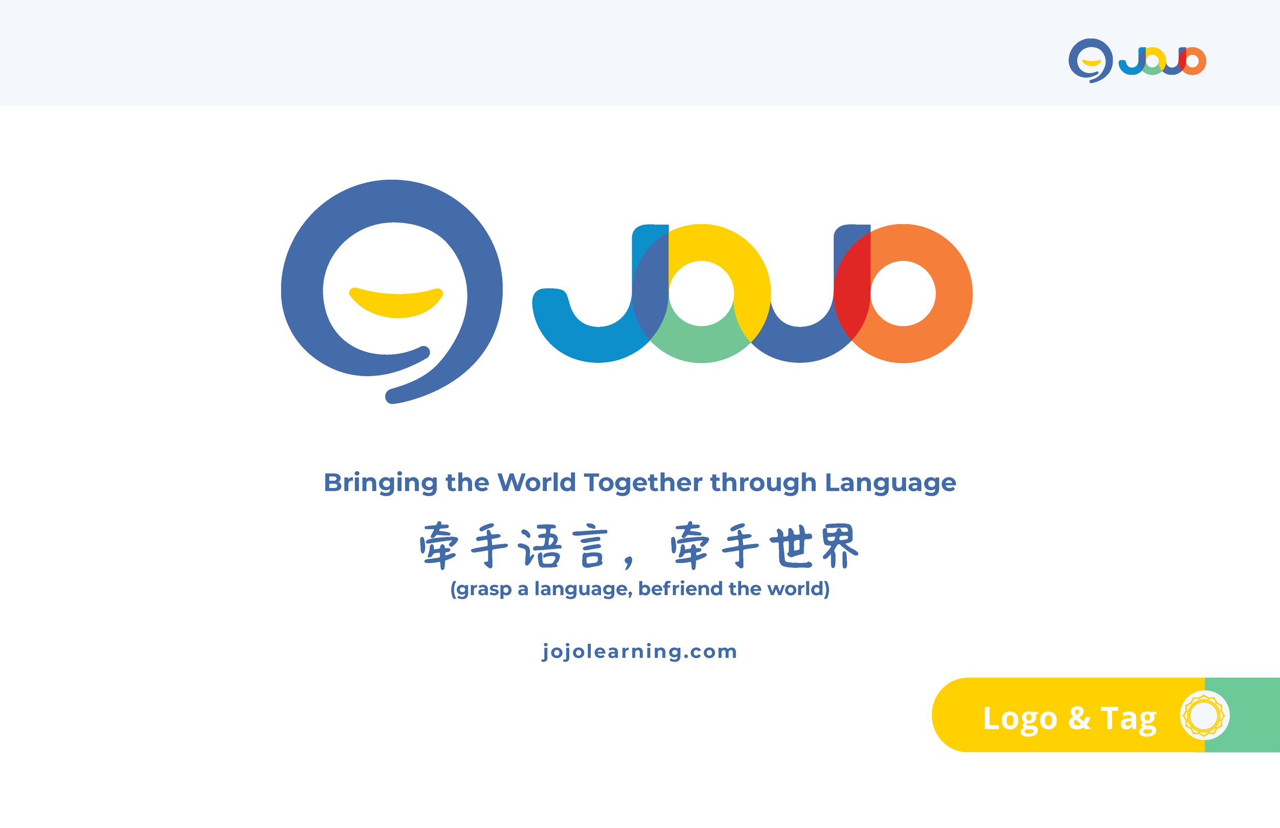
A global identity for early multilingual learning.
JoJo Learning engaged Big Concepts to shape the foundational identity for their early bilingual‑learning mission. Guided by the vision of “Bringing the World Together Through Language,” we developed the brand’s first visual system — including the logo, brand guide, presentation templates, and social media assets — creating a warm, globally minded presence for their launch.
Explore the core elements of the JoJo Learning identity system.
-
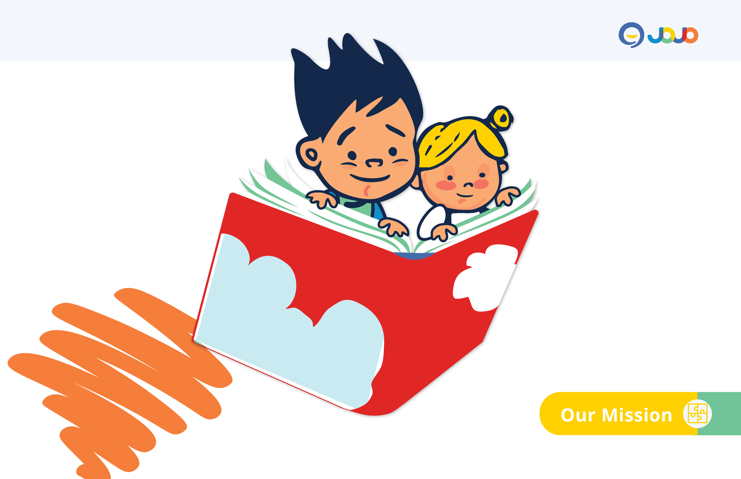
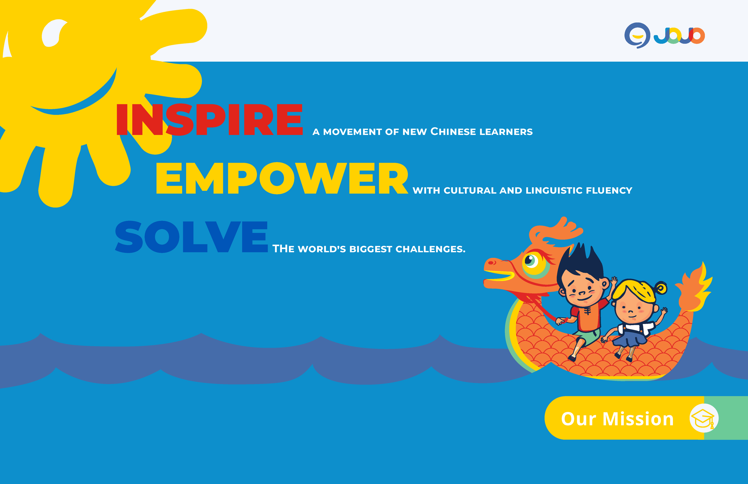
JoJo Learning was founded on a simple but ambitious idea: that early bilingual literacy can open the world for a child. Their mission — to help families raise multilingual children from birth through early childhood — required a brand identity that could communicate across cultures, ages, and levels of linguistic familiarity.
As a company working at the intersection of education, technology, and global family life, JoJo needed a visual language that felt universally approachable. The identity had to speak to English‑speaking parents who may not know the target language, while still honoring the cultural origins of the materials they were bringing into their homes.
-
JoJo Learning entered the market with a powerful mission: to make early bilingual literacy accessible to families around the world. What they lacked was a visual identity capable of carrying that ambition. As a young company operating at the intersection of education, culture, and early childhood development, JoJo needed a foundational system that felt modern, warm, and globally minded — a brand that could speak to both parents and children with equal clarity.
Their team came to Big Concepts at a pivotal moment: preparing to launch their first products, expand their partnerships, and introduce a new category of early‑learning tools to English‑speaking families. They needed an identity that could establish credibility, communicate trust, and express the joy and possibility of raising multilingual children.
-
Designing for early bilingual learners requires a different kind of rigor — one that blends educational clarity with emotional warmth. Our approach began with understanding how young children absorb language, how parents engage with unfamiliar scripts, and how a brand can support both experiences simultaneously.
We built the JoJo identity as a system first: a framework that could scale across languages, age groups, and product formats. The visual language needed to feel intuitive for parents, joyful for children, and flexible enough to support future curriculum, technology, and partnerships.
To achieve this, we focused on three pillars:
Clarity — A typographic and layout structure that supports early literacy, reduces cognitive load, and makes multilingual content approachable for non‑native speakers.
Warmth — A palette and illustration logic inspired by natural materials and early‑childhood environments, designed to feel friendly, modern, and culturally neutral.
Adaptability — A modular system that could extend from books and subscription boxes to digital content, presentations, and social media without losing coherence.
The result was a foundational identity built not just for a launch, but for a long-term vision: a brand capable of growing with its learners, its families, and its global ambitions.
-
With the strategic foundation in place, we translated JoJo’s mission into a visual system designed to feel clear, warm, and globally adaptable. The identity needed to support early literacy, communicate trust to parents, and remain flexible enough to grow with the brand as it expanded into new languages and product categories.
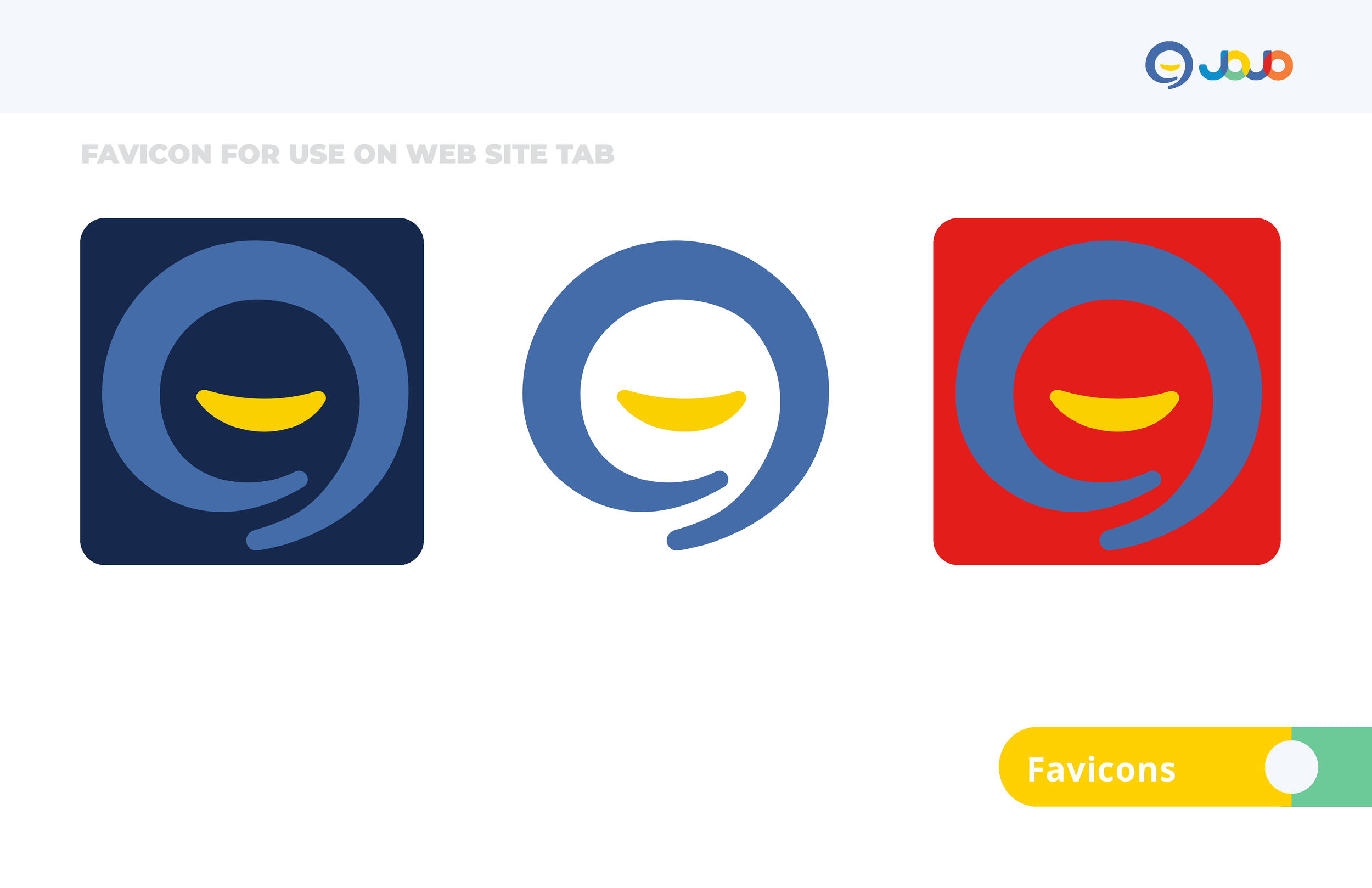
We began with the logo — a simple, sun‑inspired mark that conveys optimism, learning, and the promise of a brighter future. Its geometry was intentionally minimal, allowing it to scale across print, digital, and product applications without losing its friendliness or clarity.
From there, we developed a natural, contemporary color palette rooted in early‑childhood environments: soft primaries, warm neutrals, and accents that feel playful without becoming juvenile. The palette was designed to work across multilingual content and to remain culturally neutral, ensuring global accessibility.
Typography and layout followed the same principles. We built a hierarchy that supports early readers, accommodates multiple scripts, and gives non‑native‑speaking parents the clarity they need to guide their children. The system balances structure with approachability, creating a visual rhythm that feels both educational and inviting.
Together, these elements formed a cohesive identity system — one capable of supporting JoJo’s first chapter while laying the groundwork for future curriculum, partnerships, and product development.
-
With the core identity established, we translated the system into practical tools that could support JoJo’s early growth across communication, education, and marketing. As a young company preparing to introduce new products and partnerships, JoJo needed a suite of applications that felt cohesive, modern, and easy for their team to use.
We developed a set of presentation templates that brought clarity and warmth to their investor decks, curriculum overviews, and partnership materials. The layouts were intentionally simple, giving the team a flexible structure for communicating complex ideas to parents, educators, and collaborators.
For social media, we created a series of modular templates designed to maintain visual consistency while accommodating a wide range of content — from product announcements to early‑learning tips. The system balanced playfulness with professionalism, helping JoJo build trust with families while expressing the joy of early bilingual learning.
-
The completed identity gave JoJo the clarity and confidence needed to enter the market with purpose. The system brought together warmth, structure, and global accessibility, helping the brand communicate its mission to families navigating early bilingual learning for the first time.
With a cohesive visual language, JoJo was able to present itself as both trustworthy and joyful — a brand grounded in educational rigor but expressed through approachable, child‑centered design. The logo, palette, and typographic system worked together to support early literacy, while the presentation and social templates ensured consistency across every touchpoint.
The identity carried JoJo through its first chapter, supporting product launches, partnerships, and community‑building efforts. It provided a foundation the team could grow from, adapt, and evolve as their offerings expanded into new languages and formats.
-
Big Concepts Studio partnered with JoJo Learning at a formative moment in the company’s development, providing the foundational identity system that supported their early growth. Our work included logo design, a comprehensive brand guide, presentation templates, and social media templates — tools that helped the team communicate clearly, consistently, and with warmth across their first public touchpoints.
Origins & Inspiration
A modern identity rooted in ancient forms.
The JoJo symbol carries a subtle echo of Oracle Bone Script, one of the earliest known systems of Chinese writing. These pictographic marks—simple, expressive, and childlike—represent the beginnings of human communication. Their presence here creates a quiet bridge between ancient meaning‑making and JoJo’s mission to nurture early learning across cultures.
From these ancient forms emerges the modern JoJo symbol.
Identity System Overview
Core principles guiding JoJo Learning’s visual and verbal expression.
The JoJo Learning identity is built as a flexible, global system designed to support early multilingual growth. Each component—logo, architecture, color palettes, typography, layout, and applications—works together to create a warm, structured visual language that adapts across cultures, platforms, and learning environments. What follows is the full system: the marks, colors, type, and behaviors that define JoJo’s presence in the world.
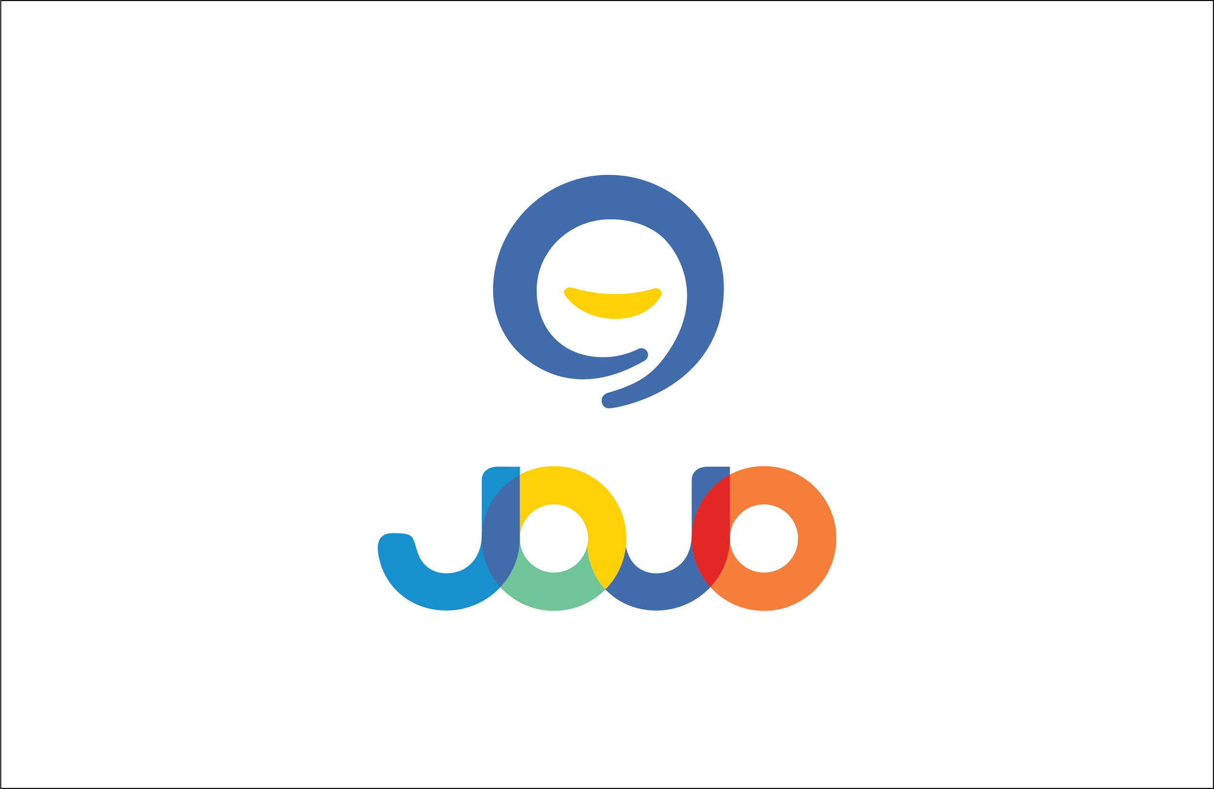
The JoJo Symbol
A minimal, warm mark shaped by early learning.
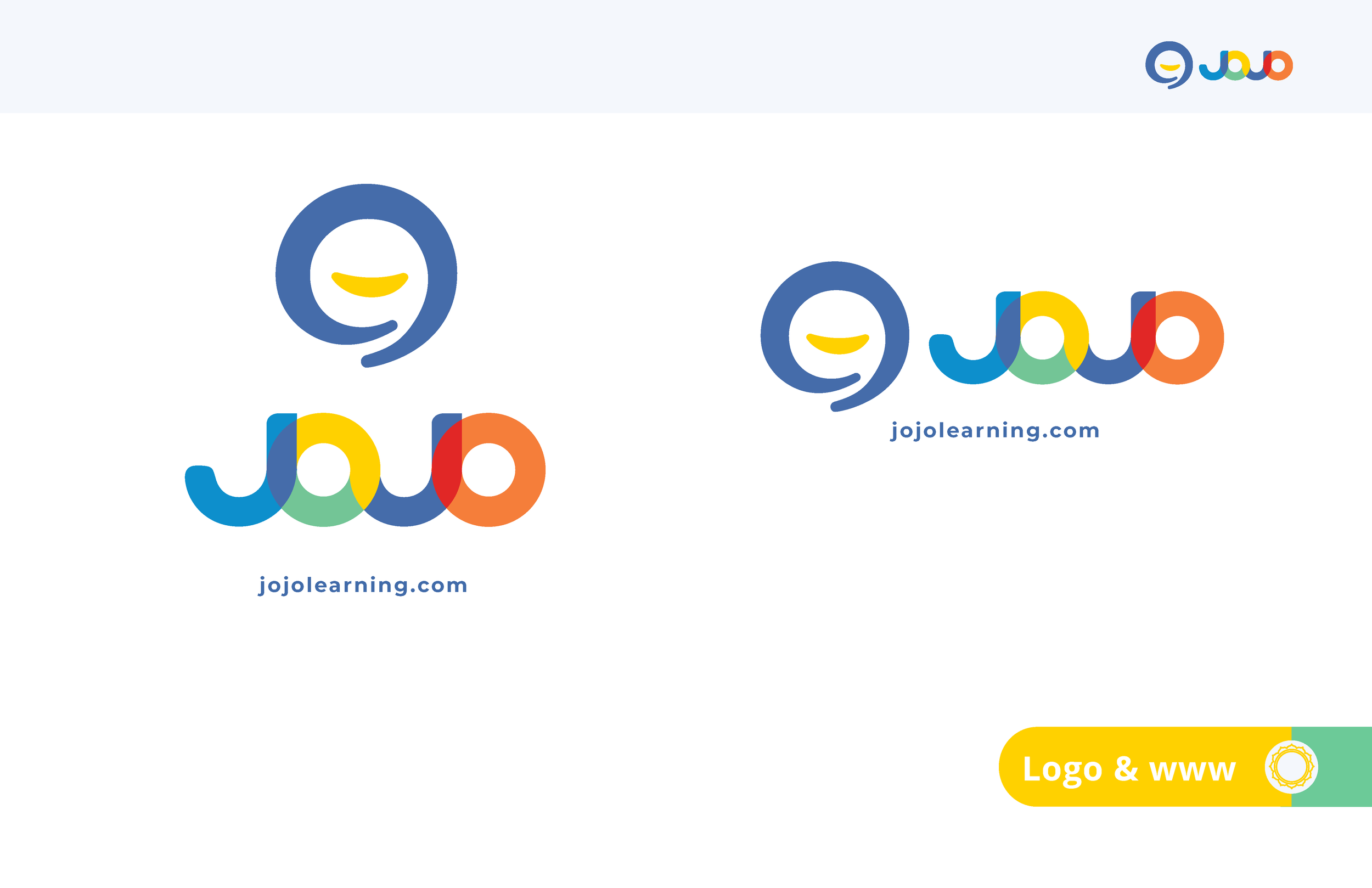
The JoJo Learning mark is built as a clear, adaptable symbol for early multilingual growth. Its structure supports a range of bilingual lockups, maintains clarity at small sizes, and preserves consistent spacing and behavior across all applications. The following pages outline the primary mark, its lockups, clearspace standards, and the usage principles that guide its expression across global learning environments.
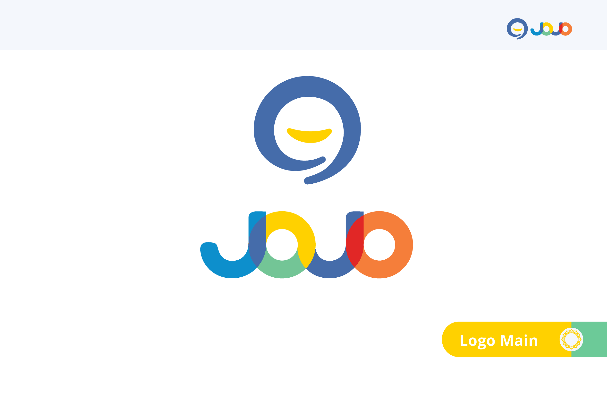
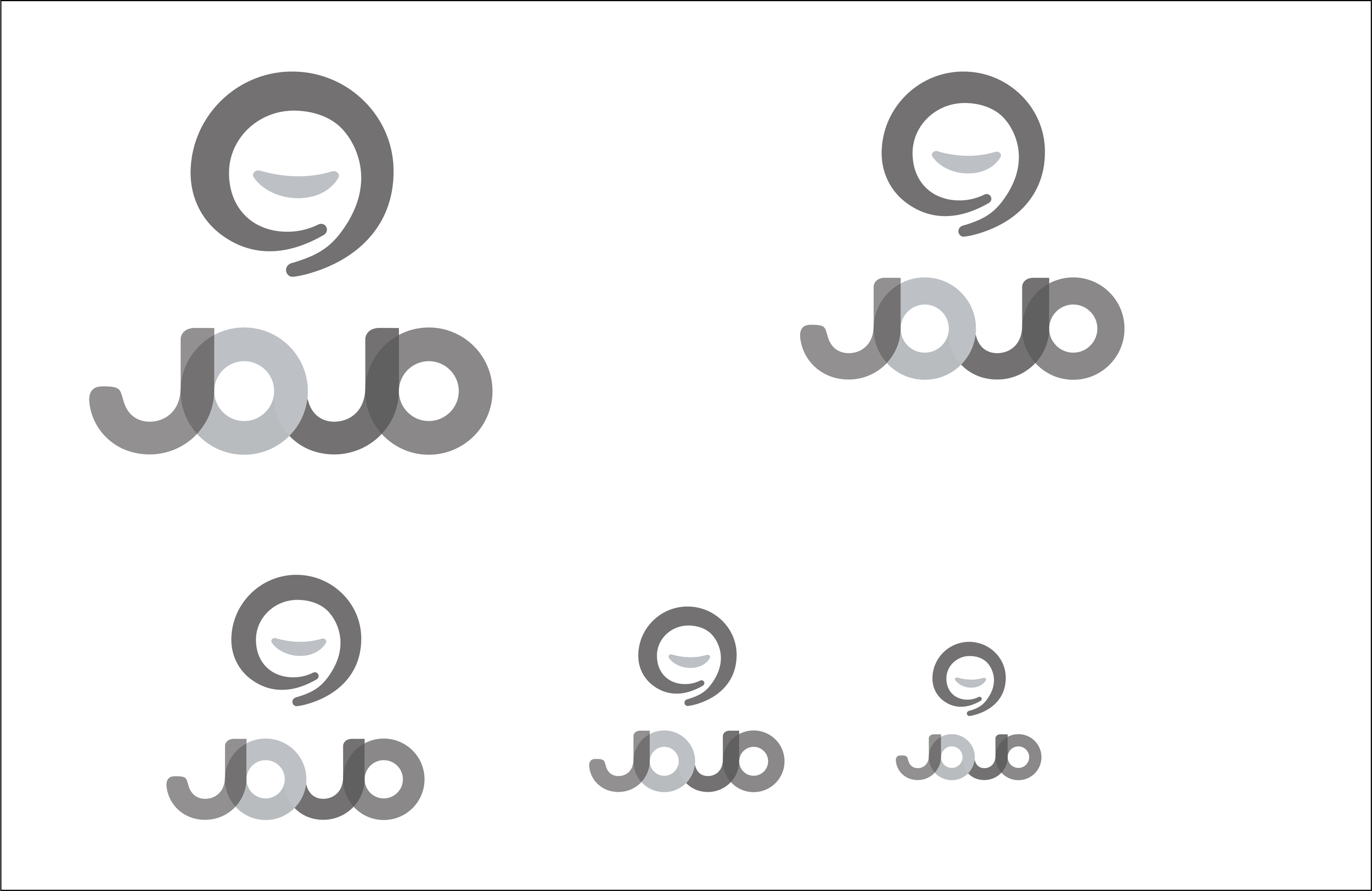
Primary Mark
The core symbol representing JoJo Learning’s identity.
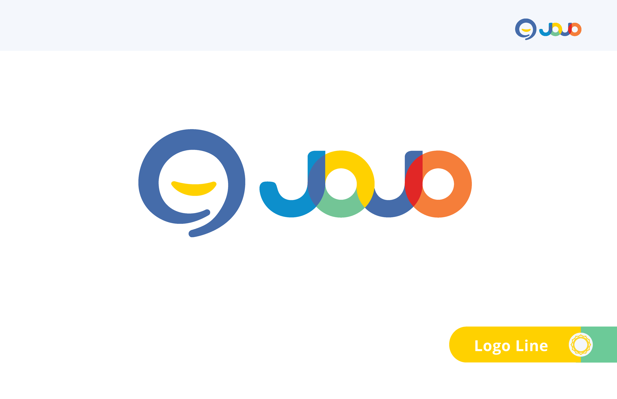
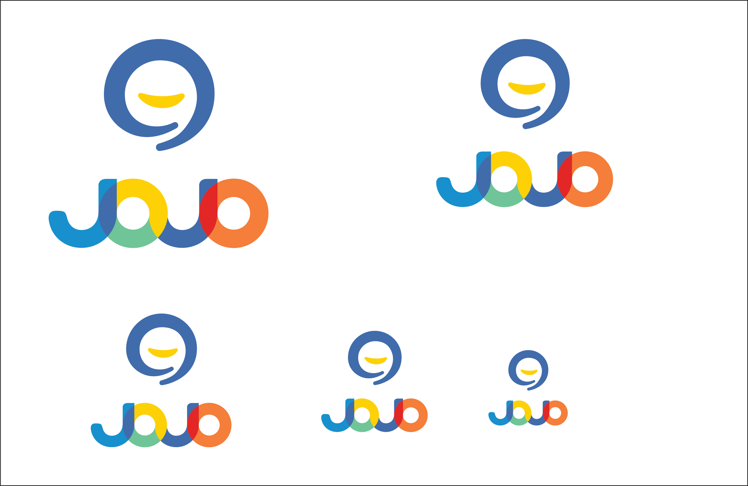
Bilingual Lockups
Adaptable configurations for multilingual communication.
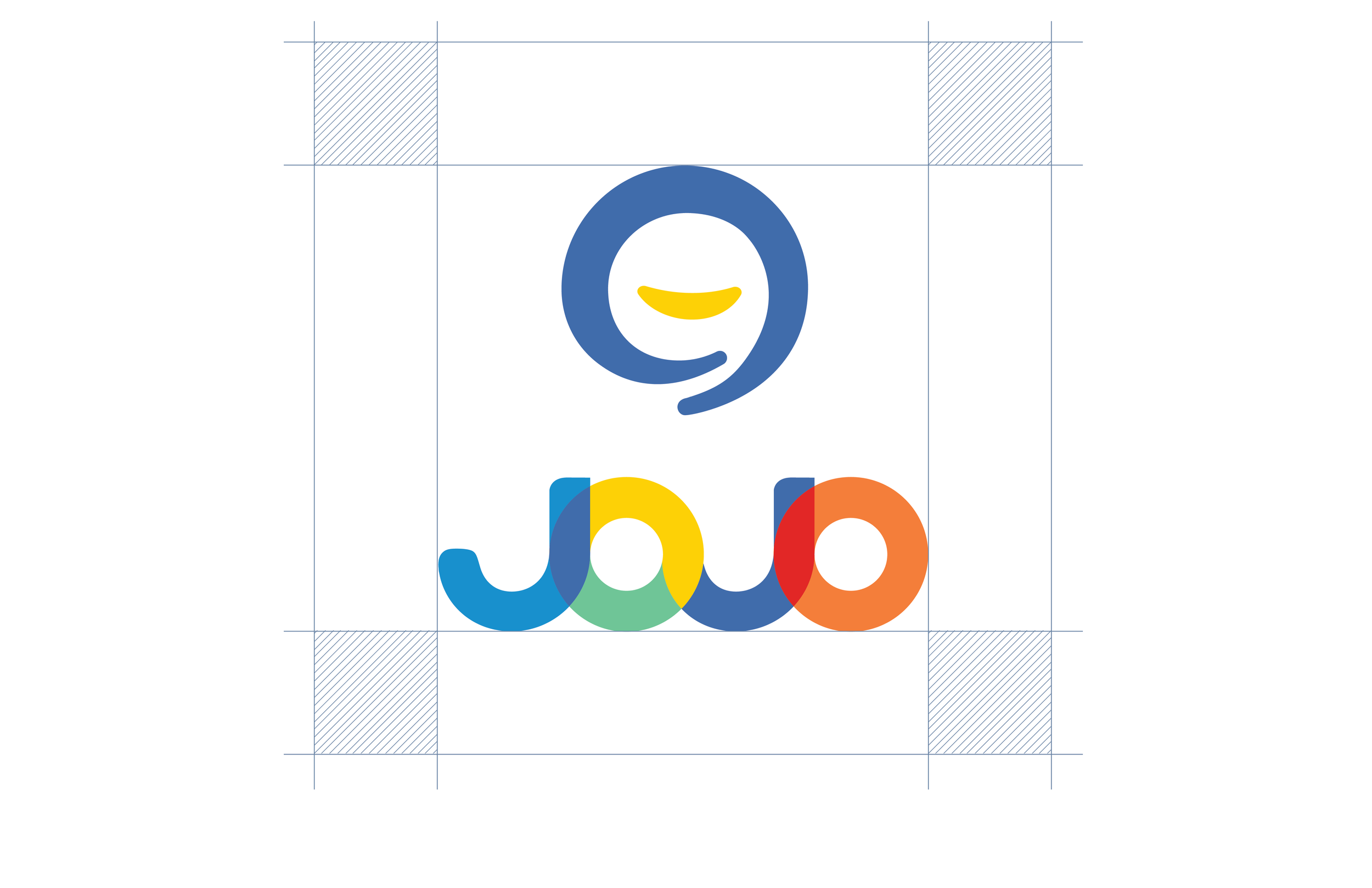
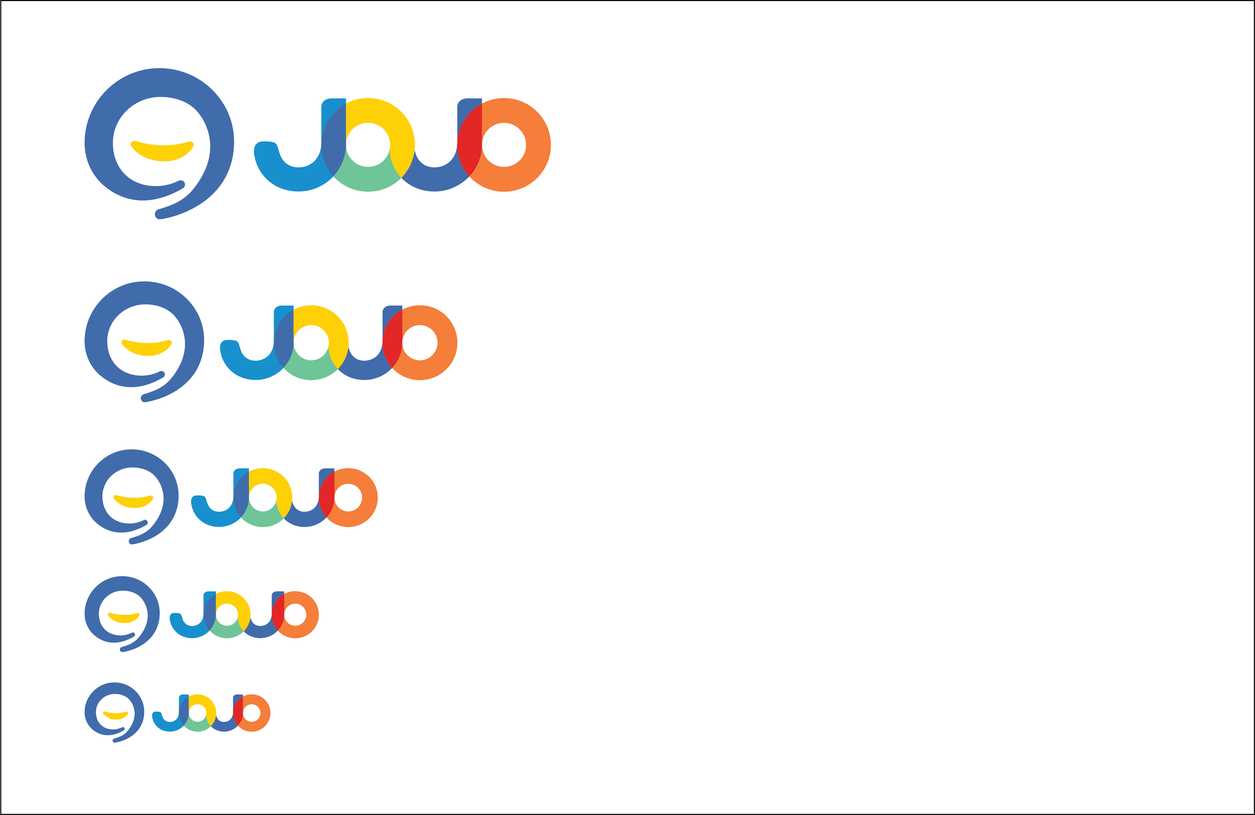
Clearspace
Minimum spacing to ensure clarity and recognition.
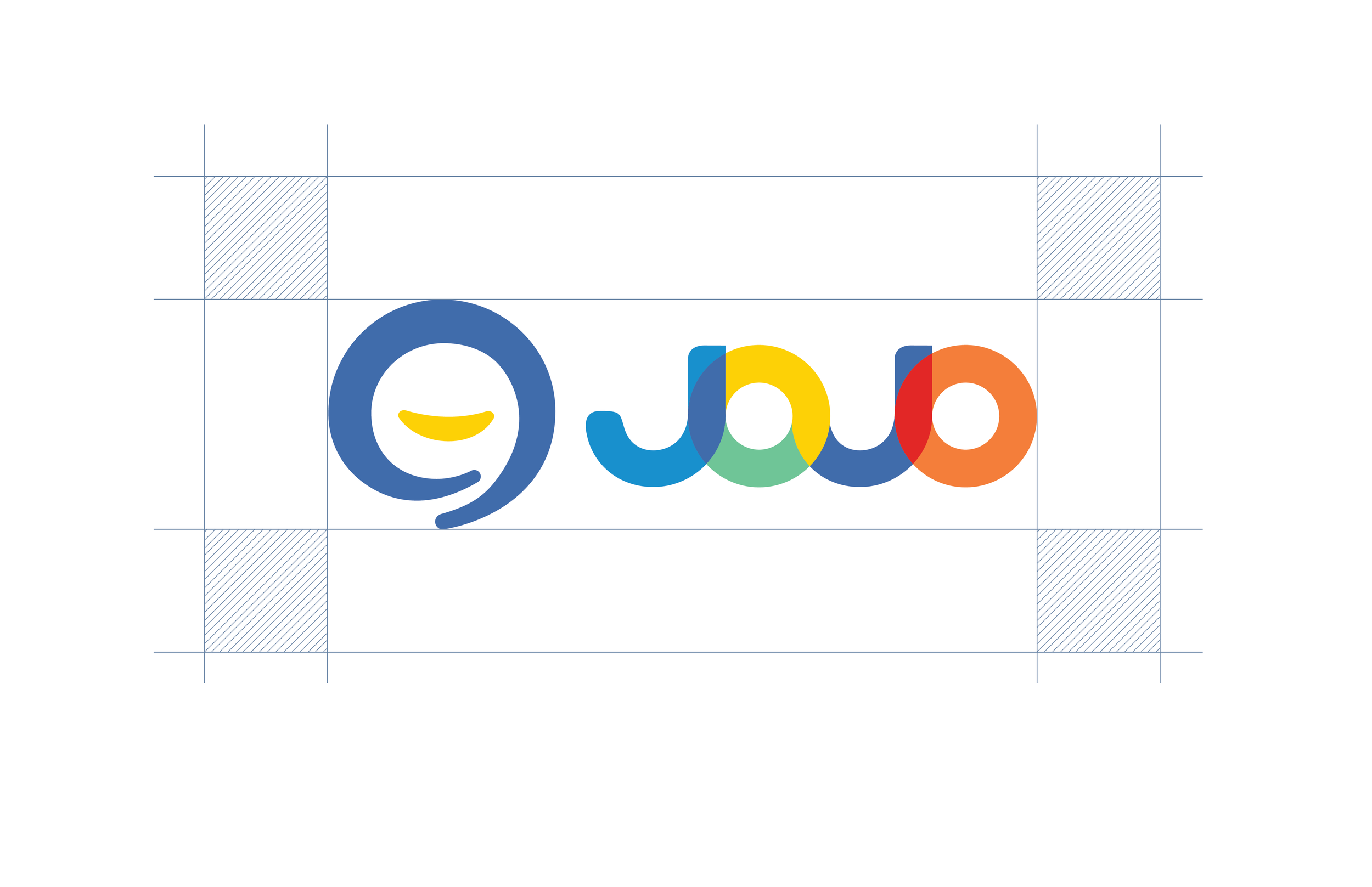
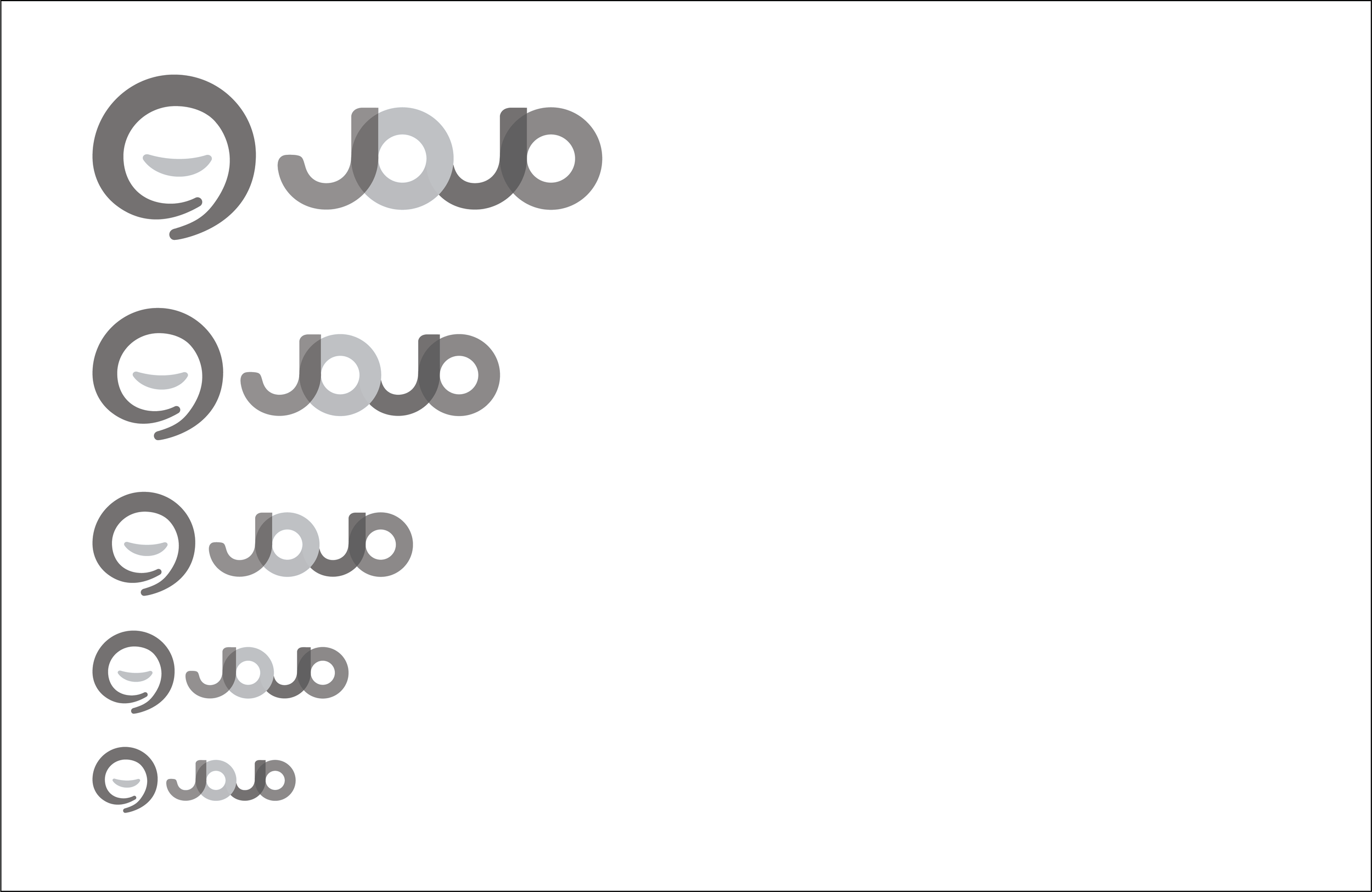
Scaling Behavior
Guidelines for maintaining legibility at all sizes.

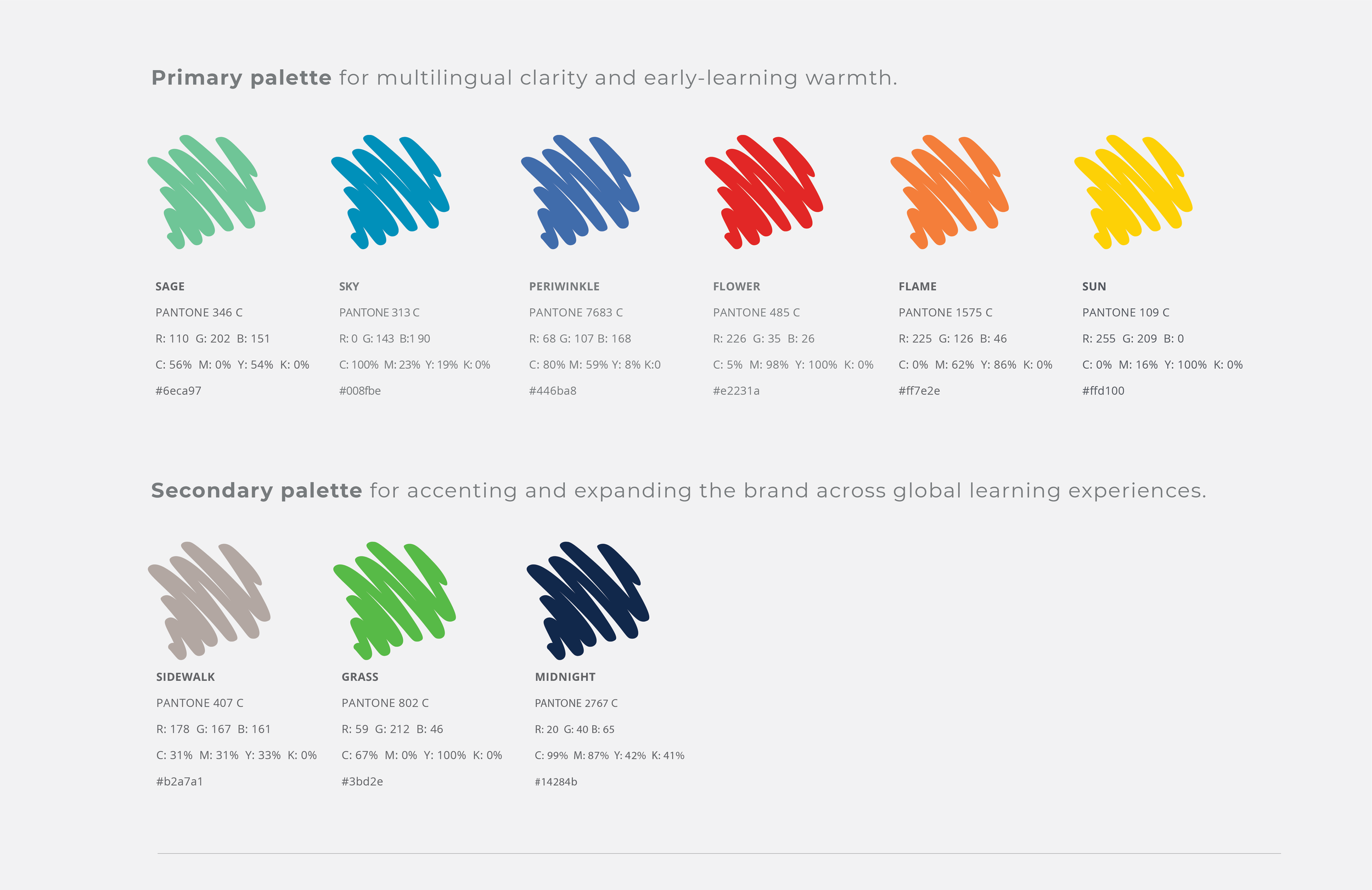
Color Palette
Primary Palette
Core colors supporting clarity and early multilingual learning.
Secondary Palette
Expanded tones for flexible, expressive applications.
JoJo Learning’s color system is built to balance clarity, warmth, and global adaptability. The primary palette establishes the core tones that support early multilingual learning, while the secondary palette provides accents that expand the brand across diverse contexts and applications. Together, these palettes create a flexible, expressive foundation for JoJo’s visual identity.
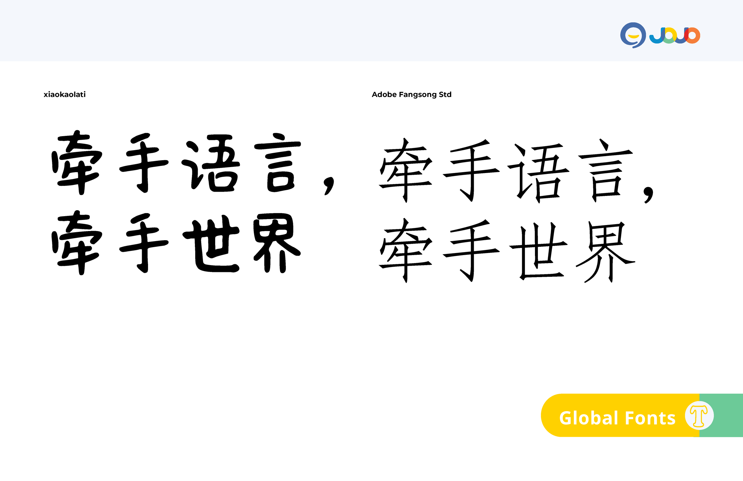
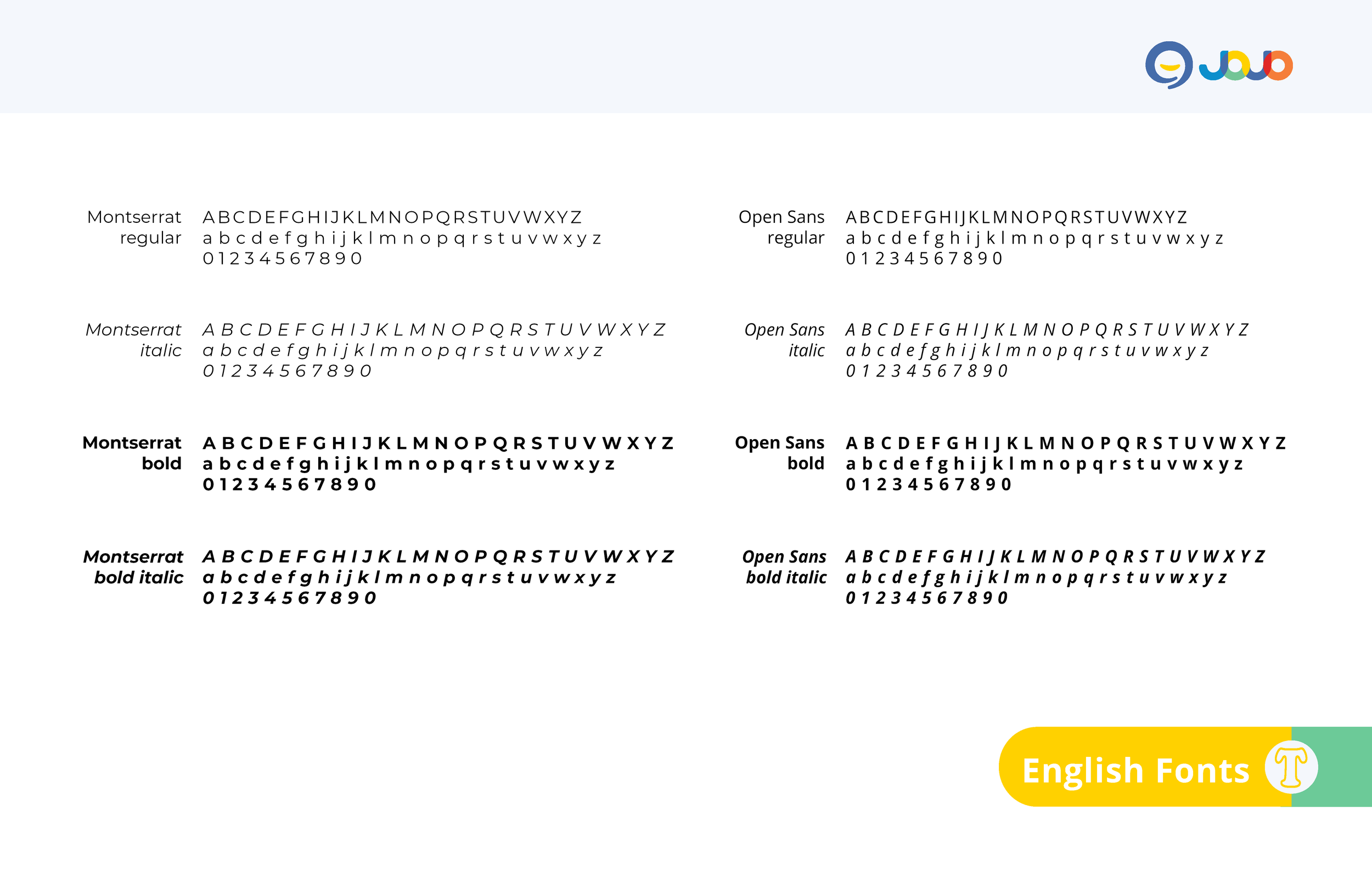
Typography
Primary Typeface
A clear, approachable typeface supporting bilingual communication.
Typographic Hierarchy
Consistent structure across print and digital environments.
Bilingual Behavior
Typographic rules supporting multilingual layouts.
JoJo Learning’s typographic system is designed to support clear, bilingual communication across a wide range of early‑learning environments. The hierarchy balances warmth and structure, pairing approachable letterforms with consistent spacing and adaptable styles that scale across print and digital applications. Together, these typographic behaviors create a flexible foundation for multilingual clarity and global expression.
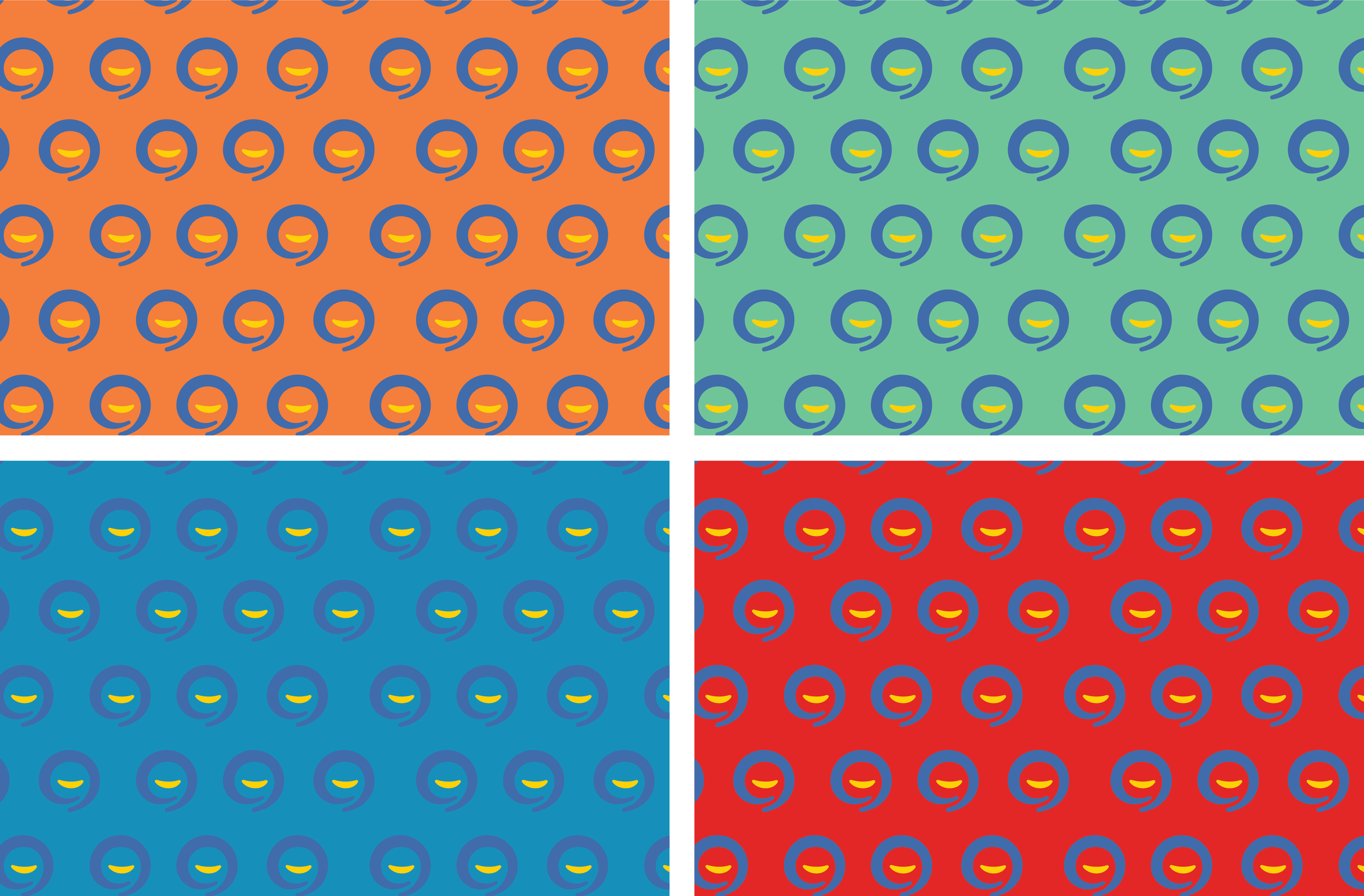
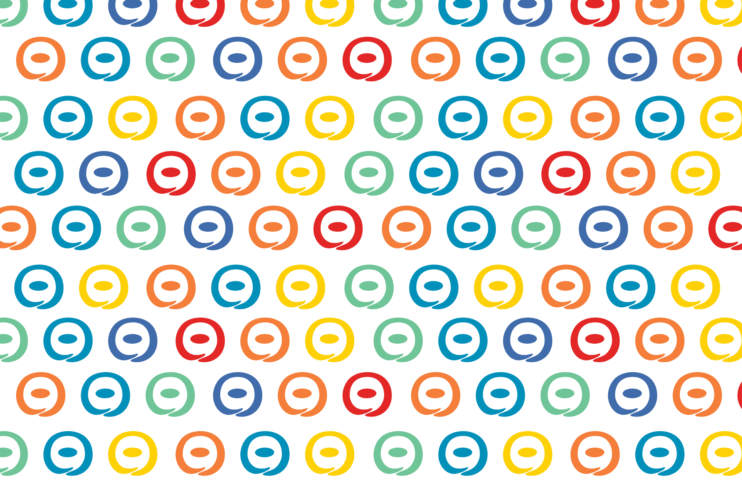
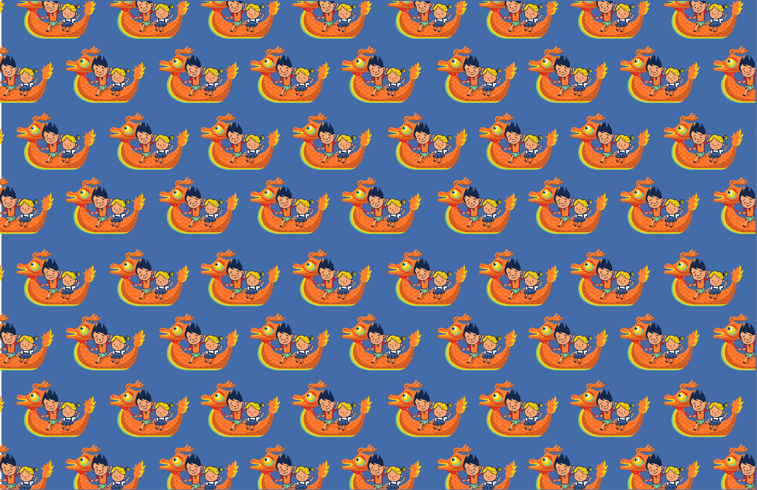
Pattern
Playful repeats extending the visual language.
Patterns in the JoJo Learning identity serve as moments of warmth and discovery. Built from the brand’s core shapes and illustrations, these repeats introduce rhythm, play, and cultural storytelling across applications. Whether used in packaging, digital backgrounds, or special‑edition materials, the patterns reinforce JoJo’s global, child‑centered spirit while remaining flexible enough to scale from subtle textures to expressive hero surfaces.

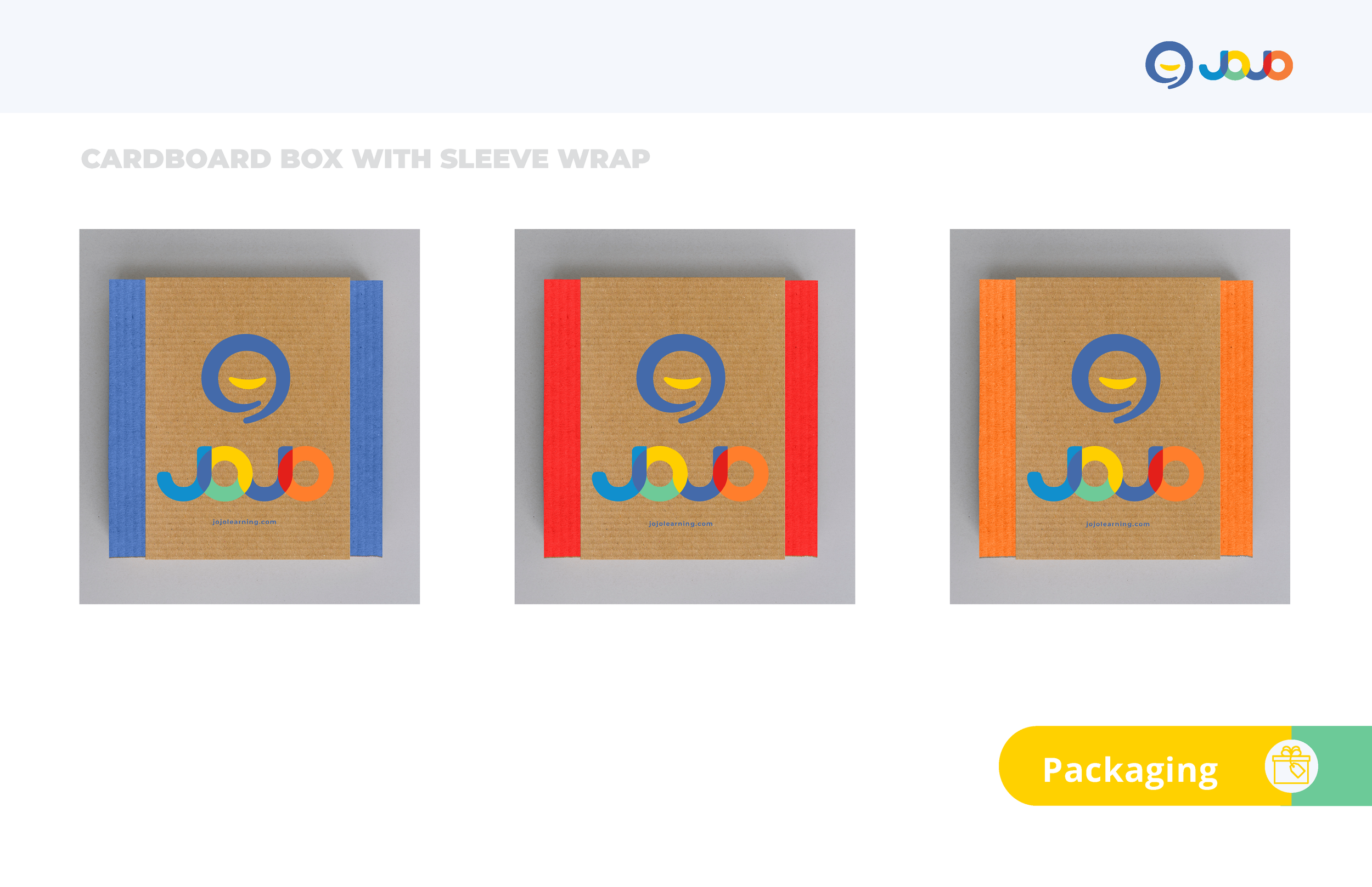
Packaging Concepts
Packaging Concept
A protective, minimal system for shipping books and learning materials.
JoJo Learning’s packaging approach translates the brand’s warmth and clarity into a simple, functional system for shipping books and learning materials. The structure emphasizes protection and ease of use, while the slip‑sleeve design provides a clean canvas for the identity to extend into physical touchpoints. This concept demonstrates how the visual system adapts to real‑world applications with consistency and calm, global expression.
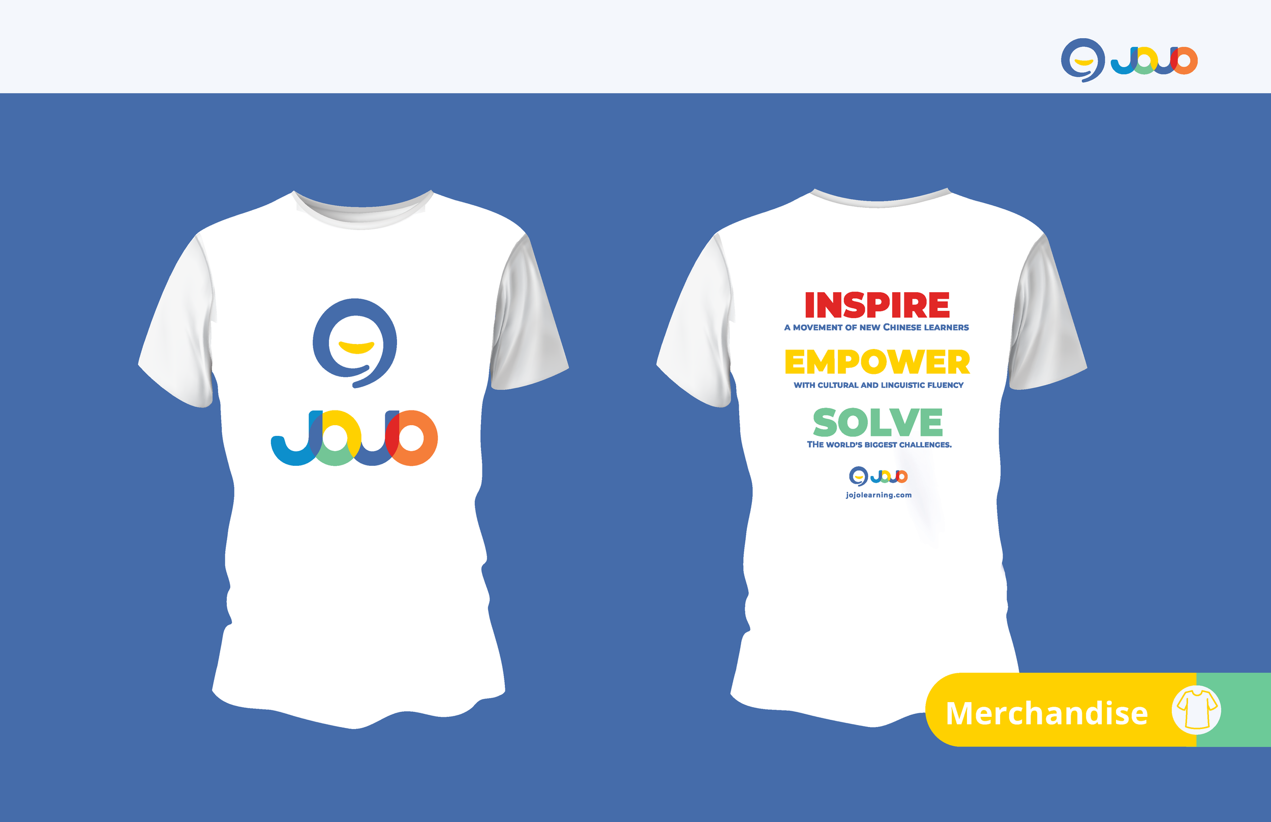
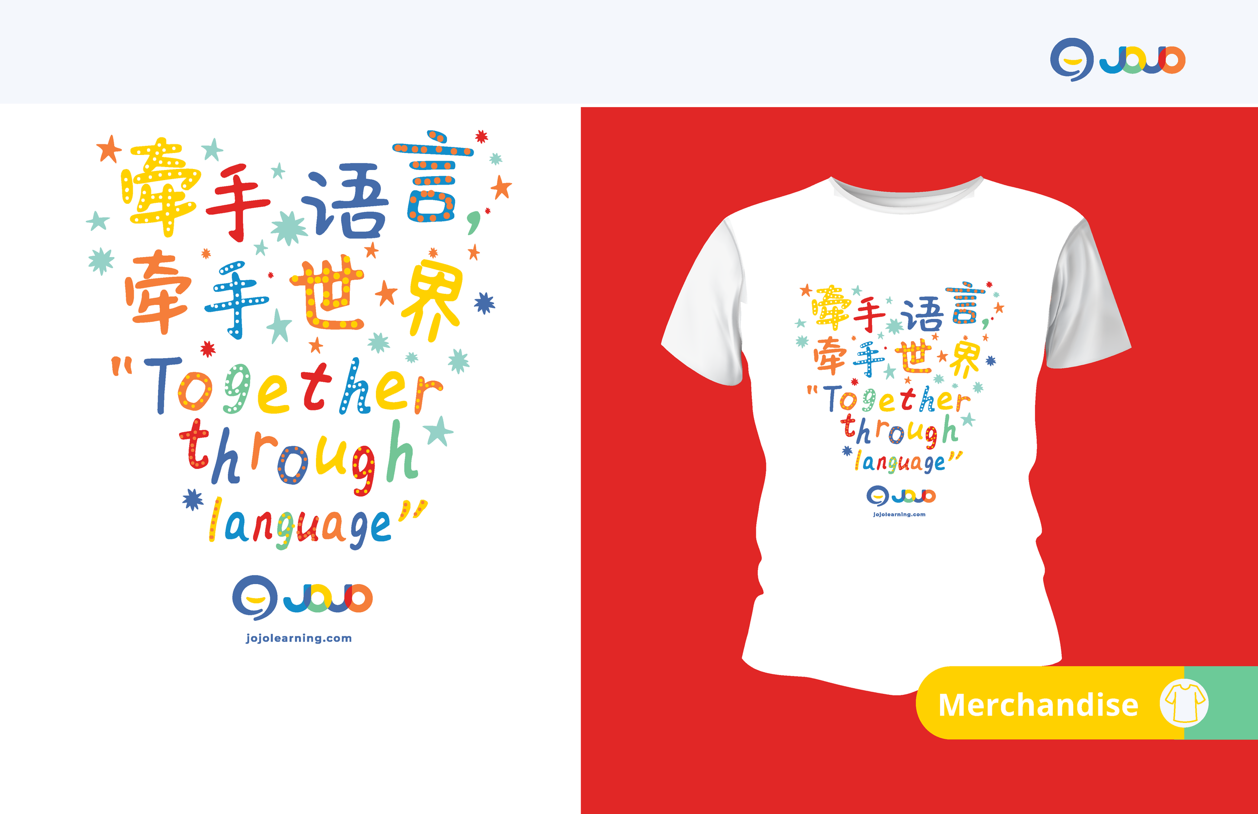
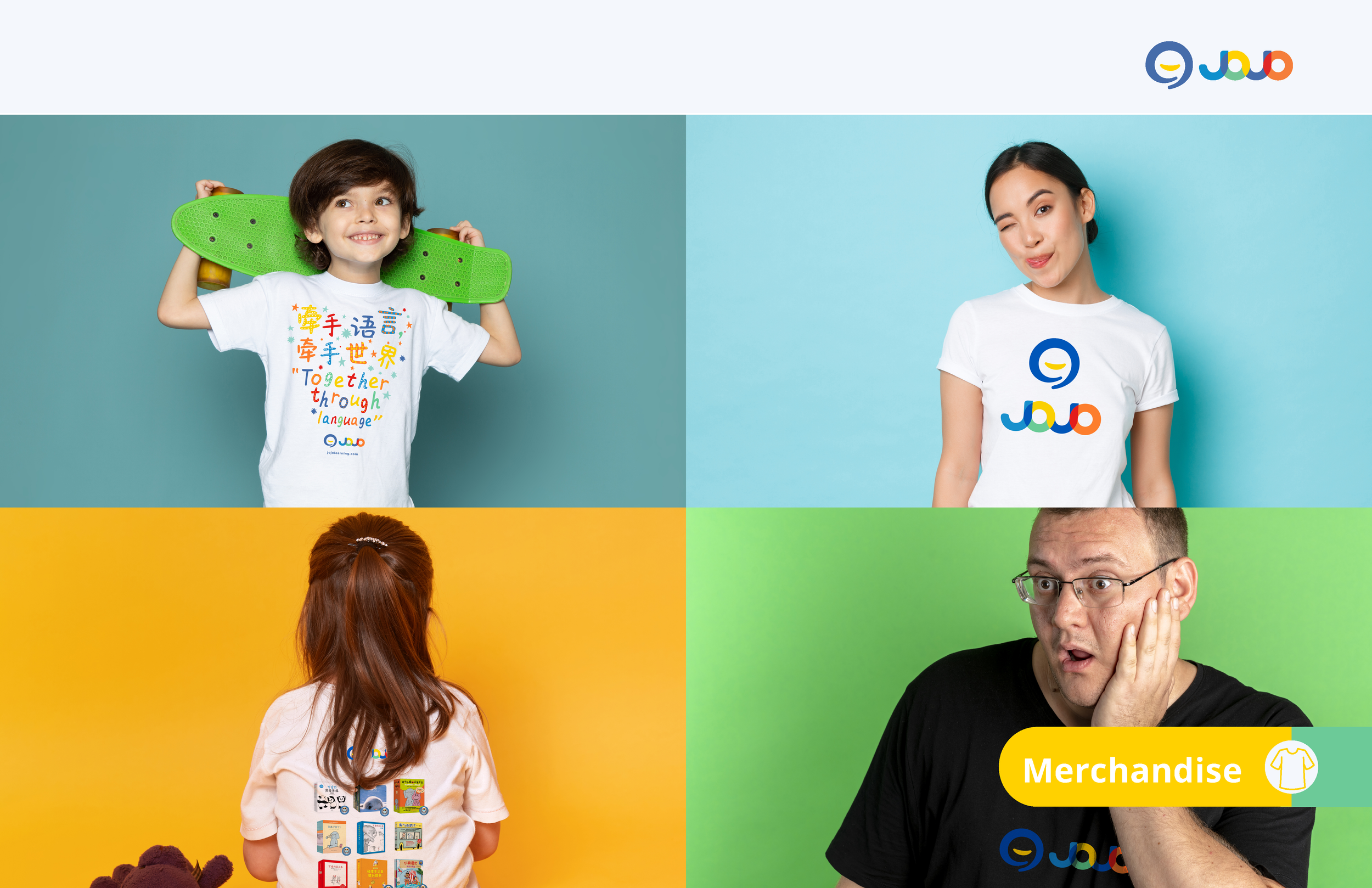
Merchandise
Everyday touchpoints extending the brand’s warmth and clarity.
JoJo Learning’s merchandise extends the brand's identity into tactile, everyday touchpoints that reinforce its warmth and clarity. Each item applies the visual system with restraint and consistency, allowing color, typography, and simple graphic elements to create a cohesive presence across physical products. These concepts demonstrate how the brand translates into real‑world objects with a calm, approachable expression.
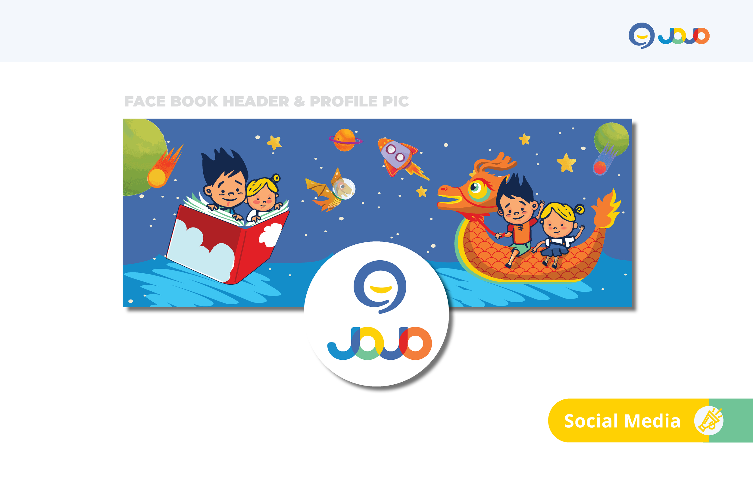
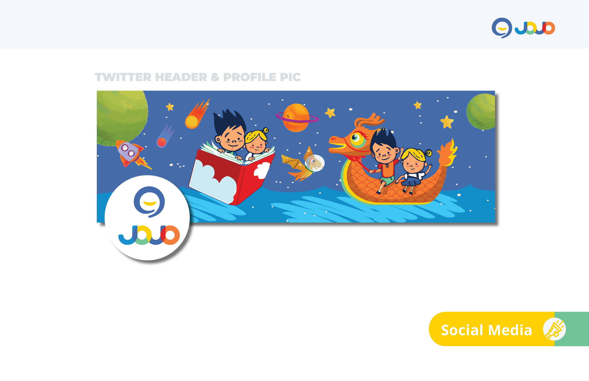
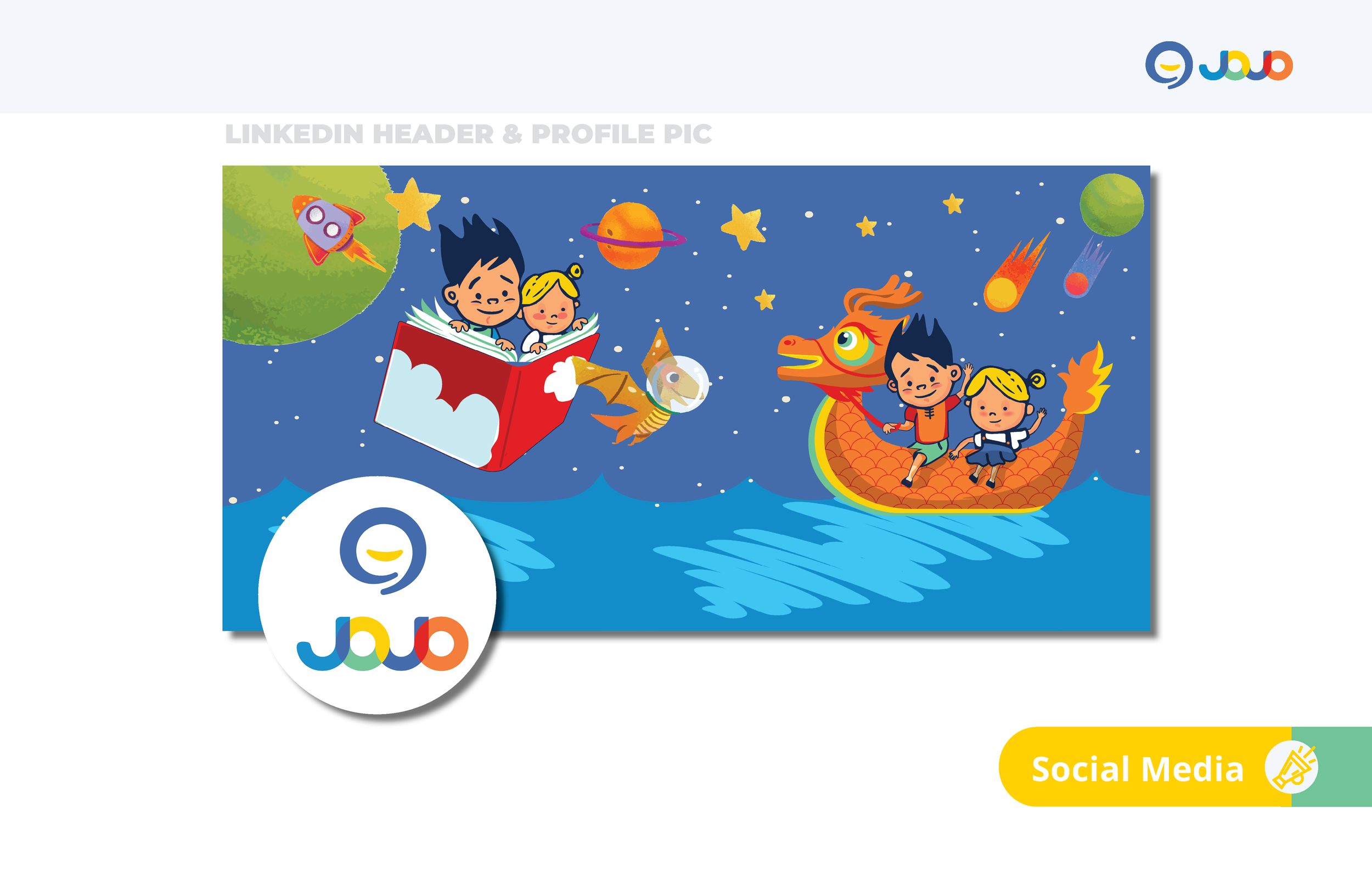
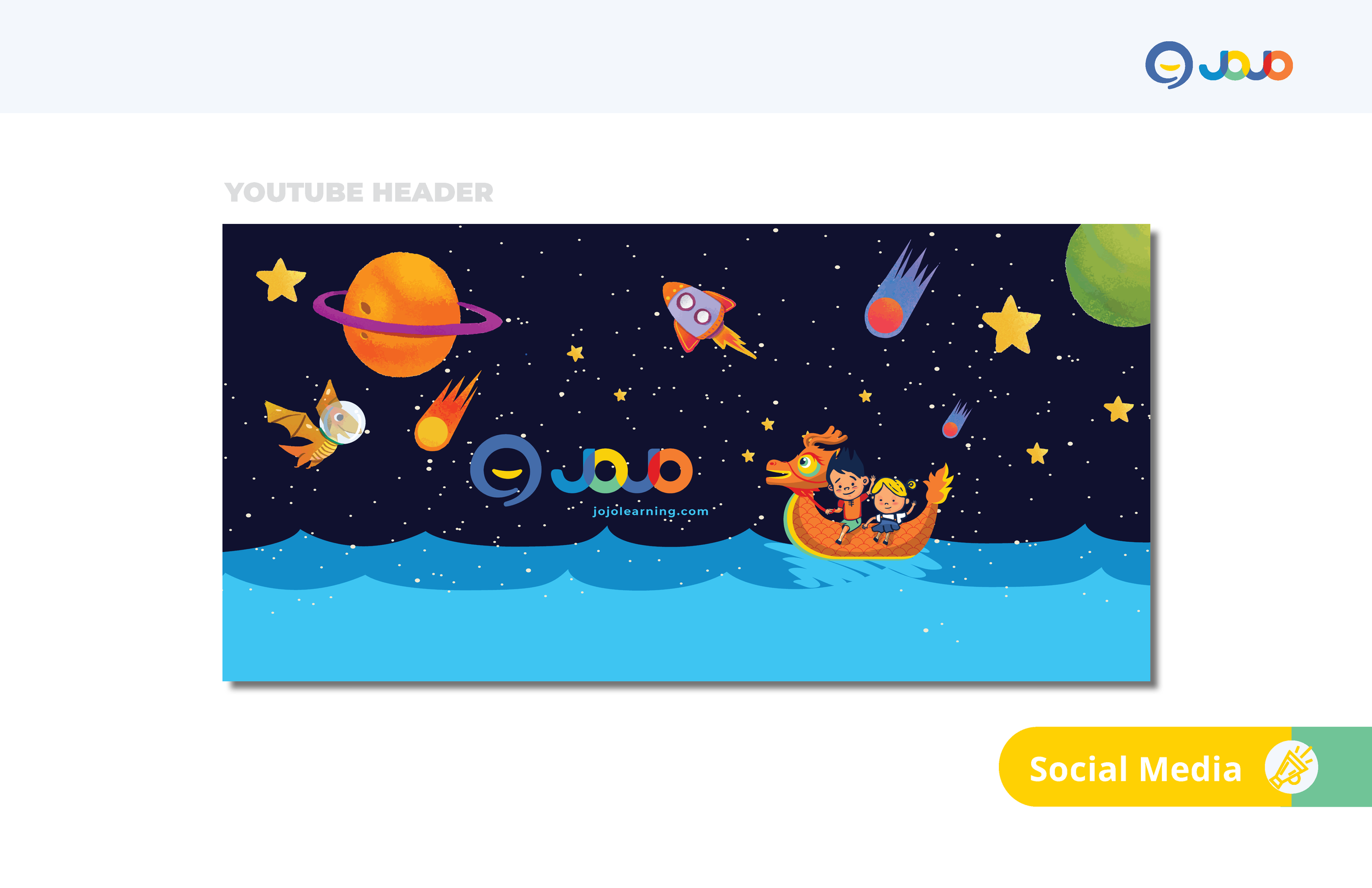
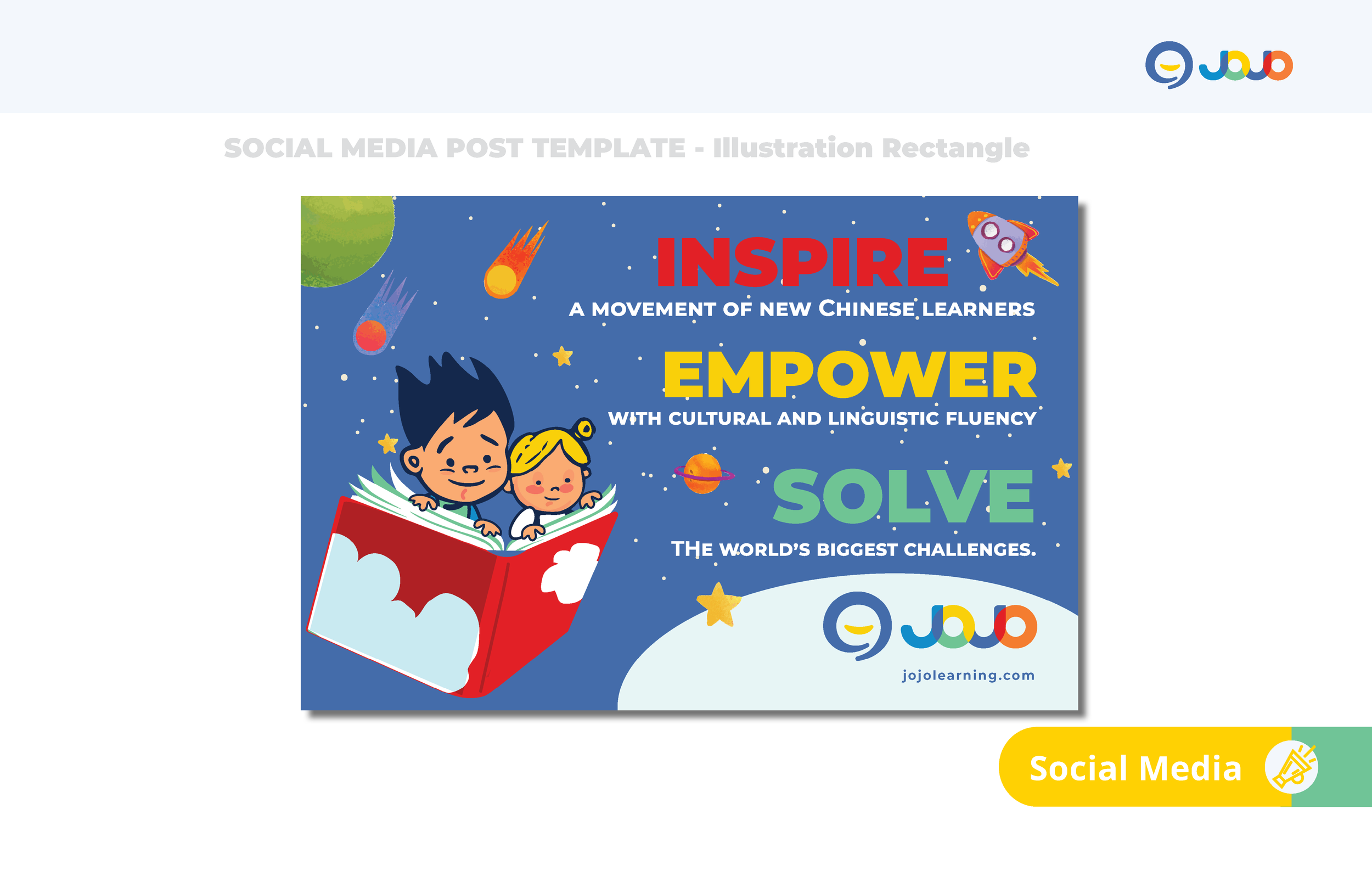
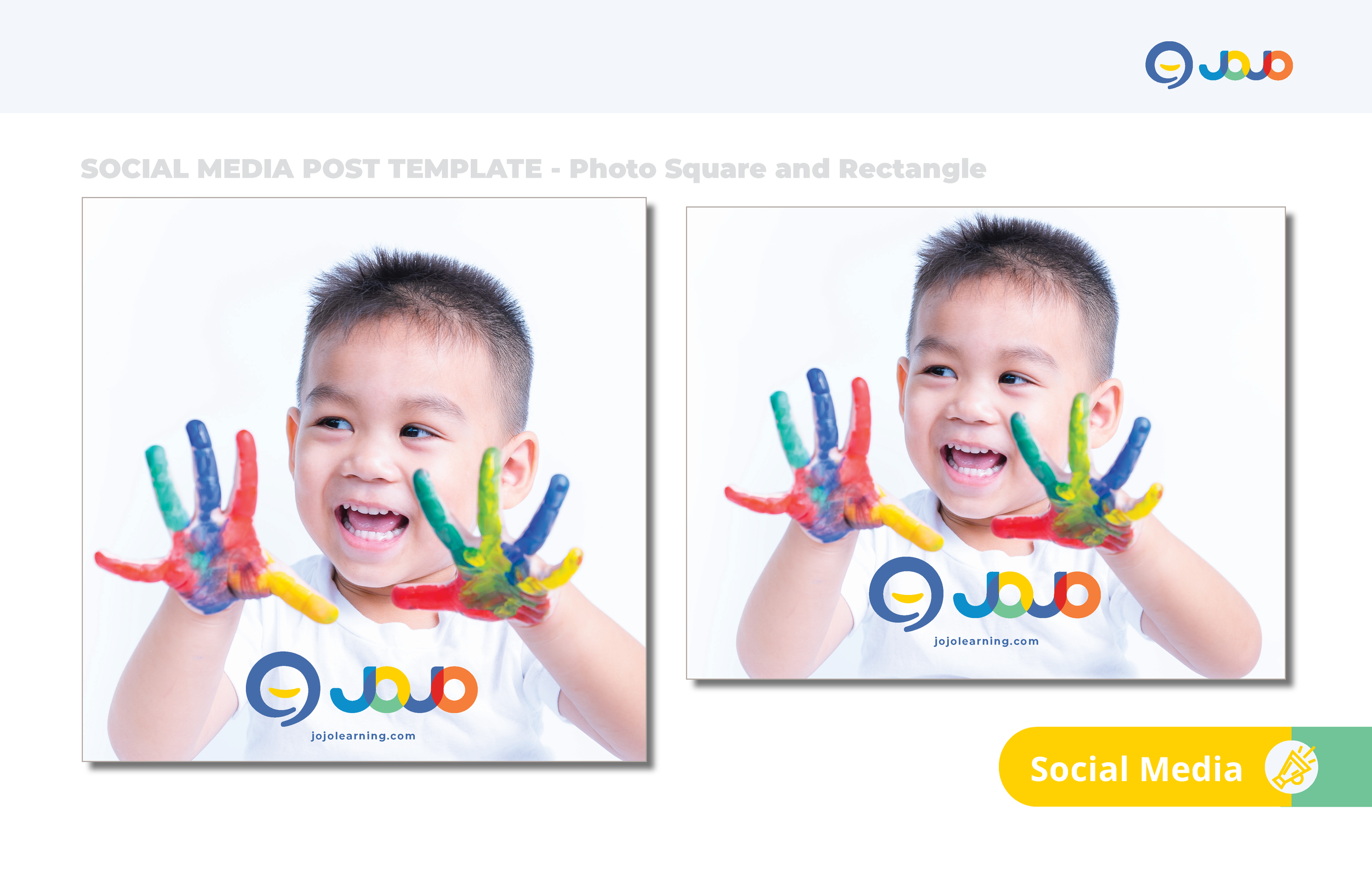
Social Media Templates
Structured layouts for global, multilingual digital communication.
JoJo Learning’s social media system adapts the brand’s visual language for fast‑moving, multilingual communication. The templates balance clarity and warmth through consistent typography, flexible color usage, and structured layouts that support both educational content and community engagement. This framework ensures JoJo’s voice remains recognizable and coherent across global digital platforms.
JoJo Learning’s identity system brings together clarity, warmth, and global adaptability to support early multilingual growth.
This guide outlines the core elements that shape the brand across print, digital, and physical touchpoints, providing a foundation for consistent and expressive communication.

Brand Identity System for JoJo Learning