Serum Libertine
A Botanical Elixir Reimagined Into a Lusciously Sensual Ritual
-
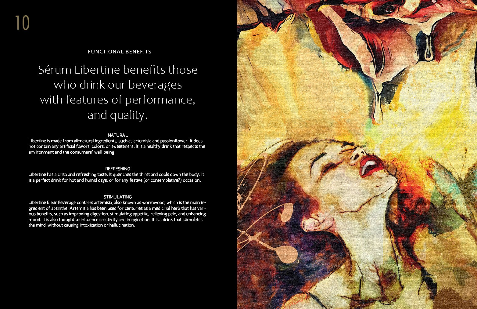
Serum Libertine began as a bold idea: a non‑alcoholic elixir that could deliver the same sense of indulgence and atmosphere as fine spirits. The early brand materials hinted at potential but lacked cohesion, sensuality, and narrative depth. Libertine needed a system that could hold both the scientific and the sensual — a brand that felt luxurious, modern, and alive.
-
The founder envisioned a world where ritual, intimacy, and botanical craft could coexist. To reach that vision, the brand required a complete identity evolution — one that could elevate the product beyond “non‑alcoholic alternative” and into a category of its own: sensual, premium, and emotionally resonant.
-
Big Concepts Studio approached Libertine as a sensory architecture project. The work began with a refined mark and expanded into a full identity language — typography, color, illustration, packaging, and narrative. Every decision was guided by the emotional mechanics of sensuality: warmth, tactility, intimacy, and the slow pleasure of ritual.
System Components
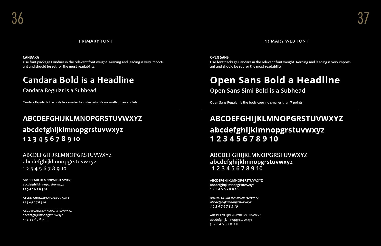
Logo refinement and typographic system
Brand narrative and verbal identity
Color palette and supporting graphics
Custom illustrations and iconography
Packaging and label architecture
Product design and presentation assets
-
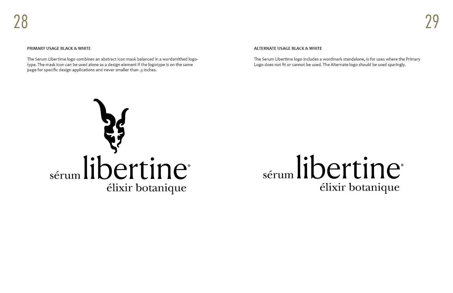
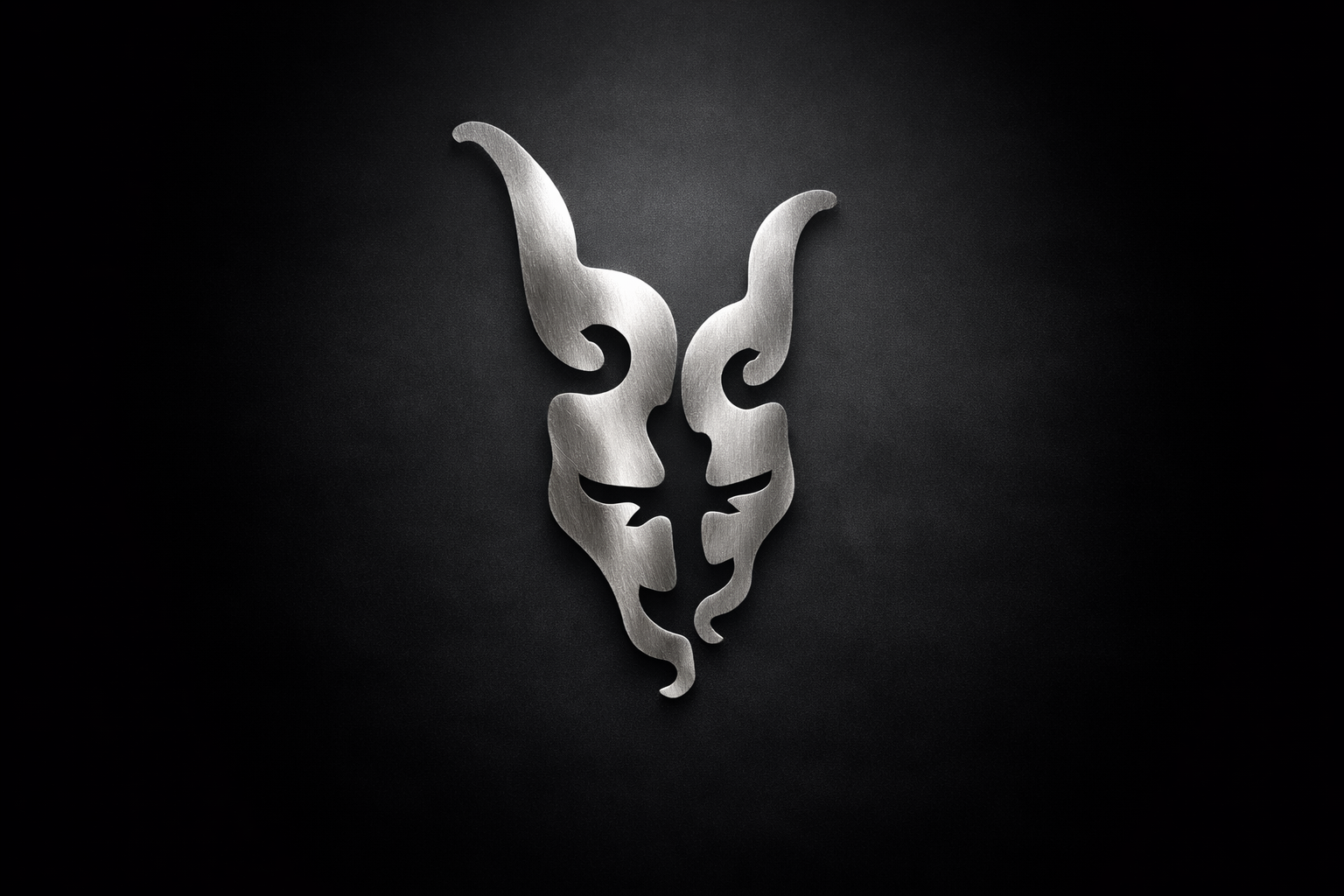
The identity blends botanical richness with modern restraint. The logo — sérum libertine élixir botanique — balances French elegance with contemporary clarity. The packaging merges art and science: abstract floral illustrations, gold accents, and a sculptural box silhouette that reveals the emblem. The palette draws from nature — deep greens, warm reds, and botanical golds — creating a visual language that feels both organic and opulent.
-
The final system elevates Libertine into a premium sensory experience. The bottle and box work together as a unified object — expressive, tactile, and unmistakably authored. The illustrations feel alive. The typography feels intentional. The entire system invites touch, curiosity, and indulgence.
-
The refined identity system transformed Serum Libertine into a brand with unmistakable presence and emotional clarity. What began as a promising concept evolved into a fully realized sensory world — cohesive in structure, elevated in craft, and resonant in feeling. The new system deepened the brand’s narrative, strengthened its visual architecture, and created a premium foundation capable of supporting future flavors, formats, and experiences. Serum Libertine now communicates with intention and allure, inviting consumers into a ritual that feels intimate, modern, and beautifully alive.
-
Creative Direction · Brand System Design · Narrative Development · Packaging Architecture · Illustration · Product Design
Big Concepts Studio authored every component of the Libertine world — from the mark to the moment of unboxing — ensuring that the brand’s sensuality and structure coexist in harmony.
This project reflects the studio’s core strength:
building real brand systems for real companies with real reach.
Serum Libertine: The Triptych
Emotional Worlds
A sensory triptych exploring bloom, fire, and clarity.
A spark that chooses to rise.

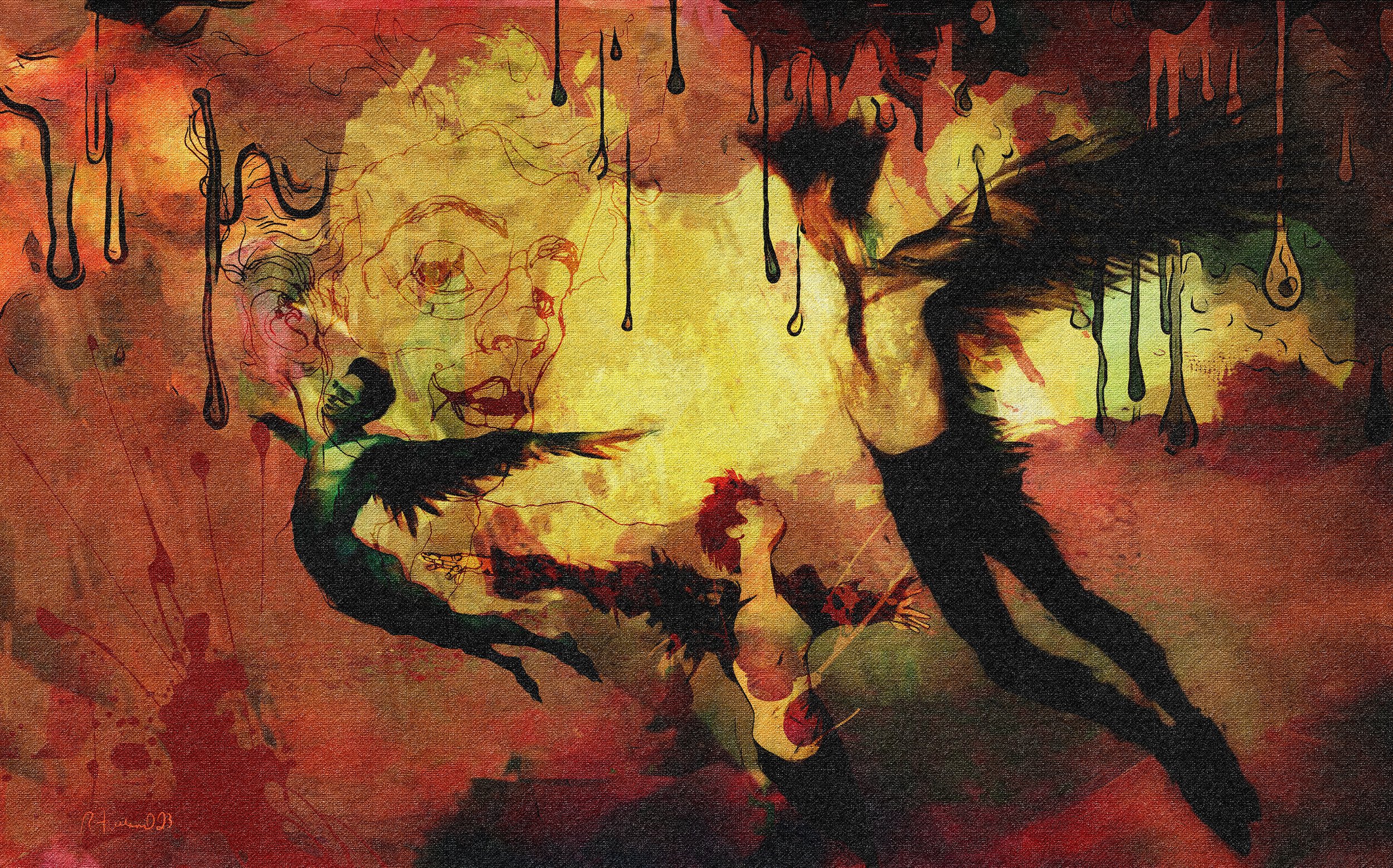
Pimento - Spice
A world of heat and vitality.
Radiant spice, rising wings, and the pulse of something daring.
Pimento moves like embers in motion — bold, warm, and alive with intention.
Where light touches petals, something begins.
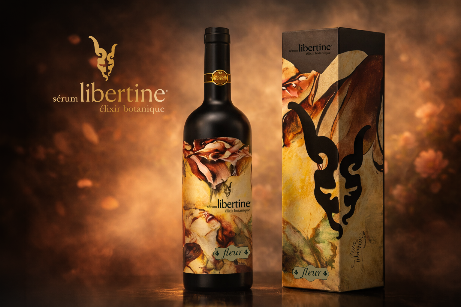
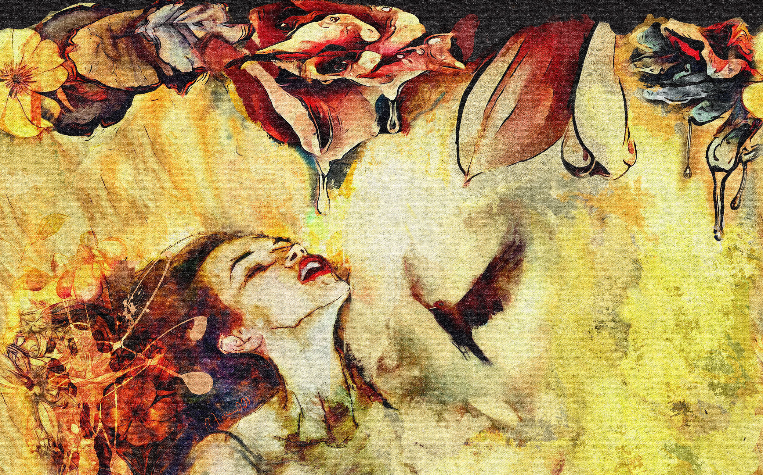
FLEUR — Bloom
A world of petals and breath.
Soft light, tender diffusion, and the quiet awakening of summer.
Fleur opens like a garden in the morning — warm, fragrant, and alive.
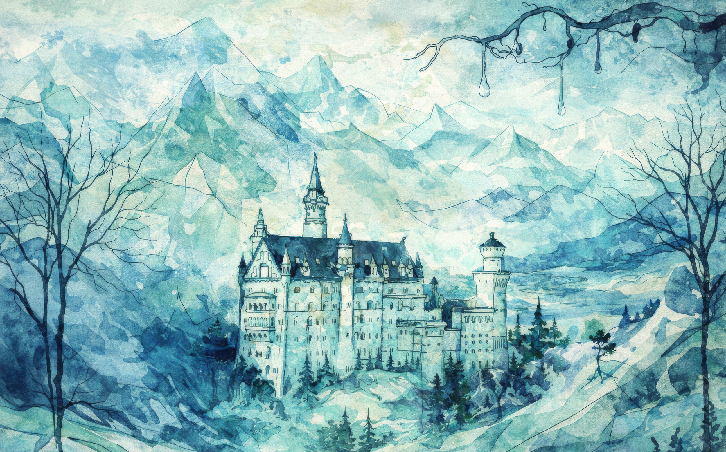
Where silence becomes clarity.
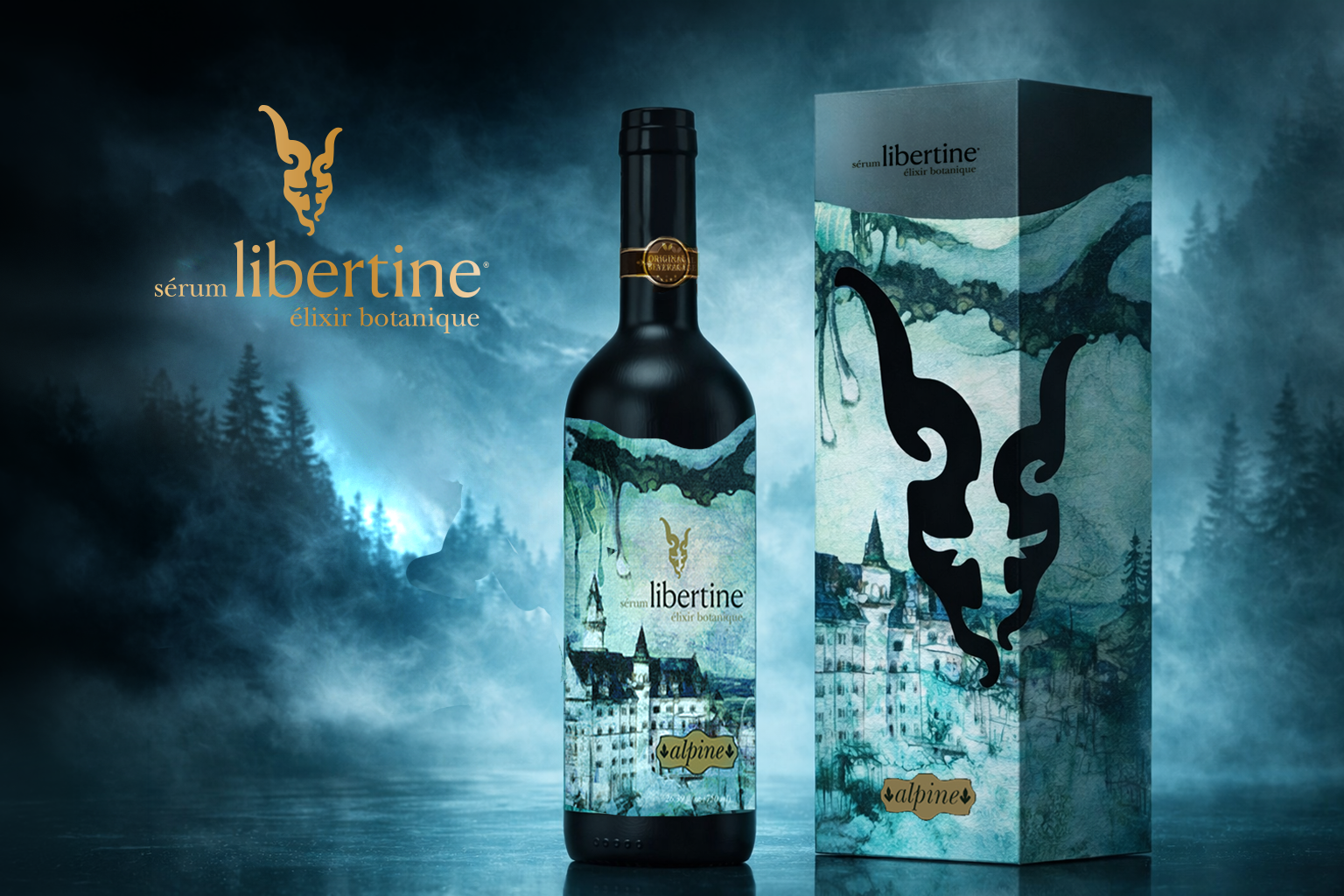
ALPINE — Clarity
A world of air and elevation.
Crystalline peaks, quiet geometry, and the stillness of cold mountain light.
Alpine is the exhale after intensity — clear, contemplative, and enduring.
Serum Libertine: The Brand Guide A botanical elixir reimagined into a lusciously sensual ritual through identity, illustration, and packaging design.