The Blueprint Behind a World of Yes
In the earliest days of Myria, we created the illustration system that expressed how a private office for the ultra‑wealthy thinks, imagines, and engineers the impossible.

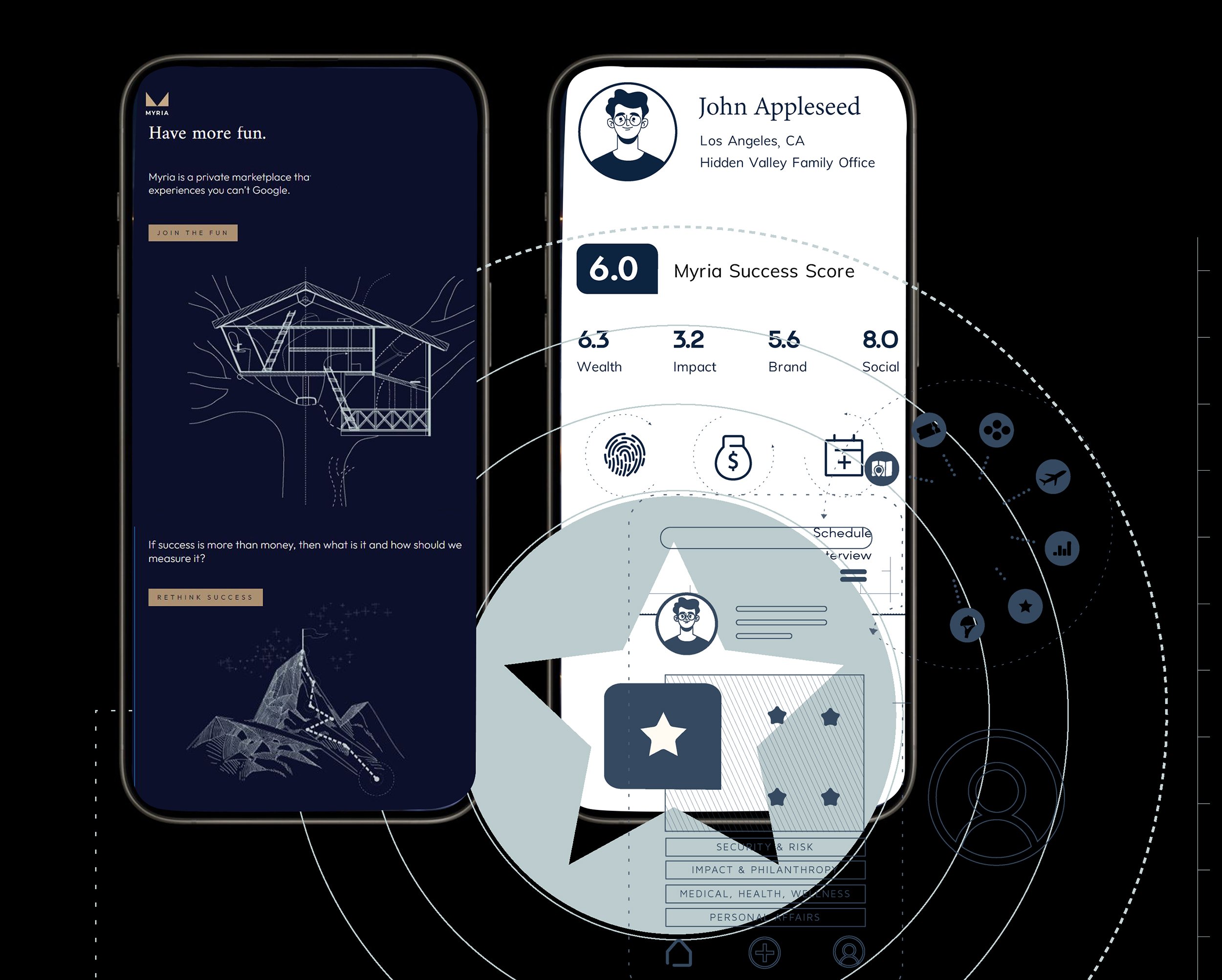
Myria’s online presence began with a visual language that made their invisible world tangible — a blueprint‑driven system that expressed how a private office for the ultra‑wealthy thinks, imagines, and engineers possibility. What you see below is the foundation that later evolved into The Blue.
-
Myria was the precursor to what is now The Blue, a private office serving ultra‑high‑net‑worth individuals — major‑league athletes, entertainers, founders, and global families. In its earliest form, the company needed a visual language that could communicate discretion, intelligence, and limitless possibility without revealing client details.
-
How do you illustrate a company that doesn’t sell a product, a service, or even a category?
Myria operates in a world where requests ranged from:
courtside seats at impossible‑to‑get games
private safaris
custom luxury treehouses
global travel experiences
The work was unpredictable by design. The challenge was to create a coherent, premium visual system for a company whose offering was essentially “whatever you can imagine.”
-
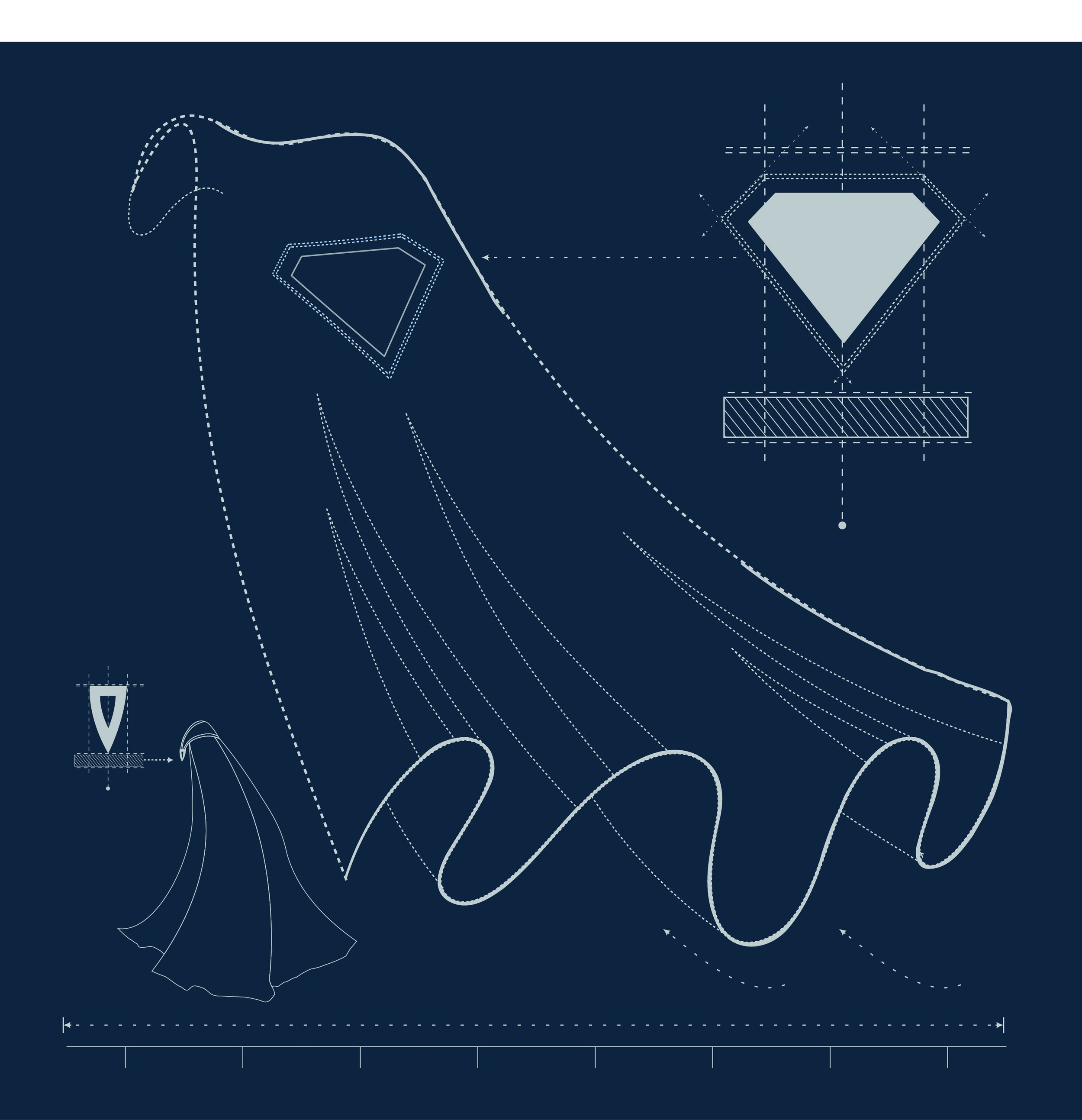
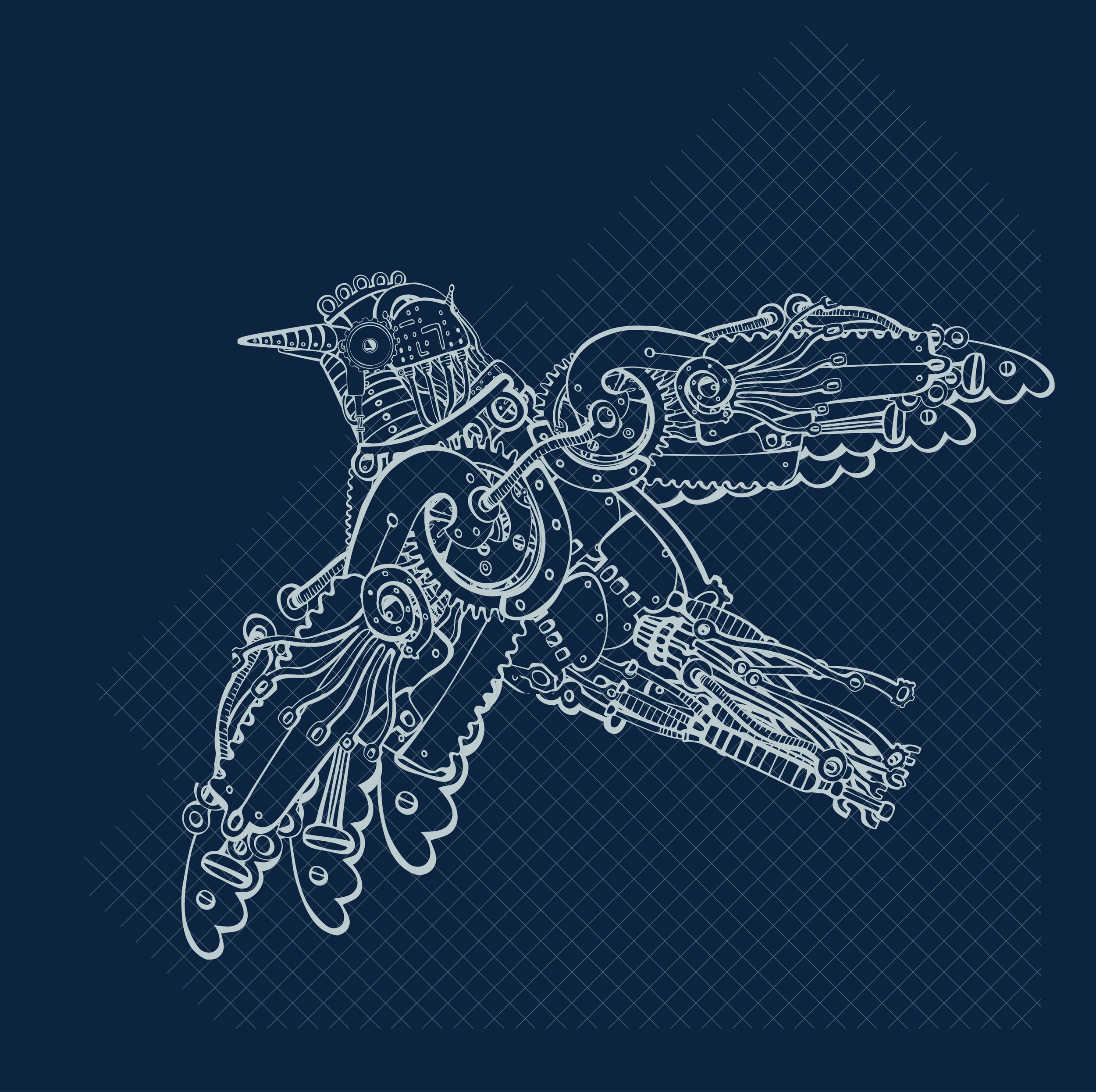
I developed a conceptual illustration language that expressed how Myria thinks — not what they deliver.
The blueprint style became a metaphor for:
intelligence
discretion
imagination
bespoke problem‑solving
Rather than depicting outcomes, the illustrations visualized the architecture of possibility — the internal ideation process that powers Myria’s ability to engineer extraordinary experiences.
This approach allowed the brand to communicate value without compromising privacy.
-
The illustration system included:
conceptual vignettes of luxury experiences
a visual map of the Myria “thought engine”
blueprint‑style renderings of bespoke ideas
and the founder’s signature — hand‑drawn by me — which is still in use today
These assets formed the backbone of Myria’s early identity and carried forward into the company’s evolution as The Blue.
-
Even after a full rebrand, one element remained:
Ray Flemings’ signature — the one I illustrated by hand.
It’s rare for a founder’s signature to survive a brand transformation. Its continuity signals that the work wasn’t decorative — it became part of the company’s identity DNA.
My illustrations were the first visual articulation of a brand that now serves some of the most influential people in the world.