
Fresh Faced
Visual Identity System for a Science‑Driven Skincare Brand
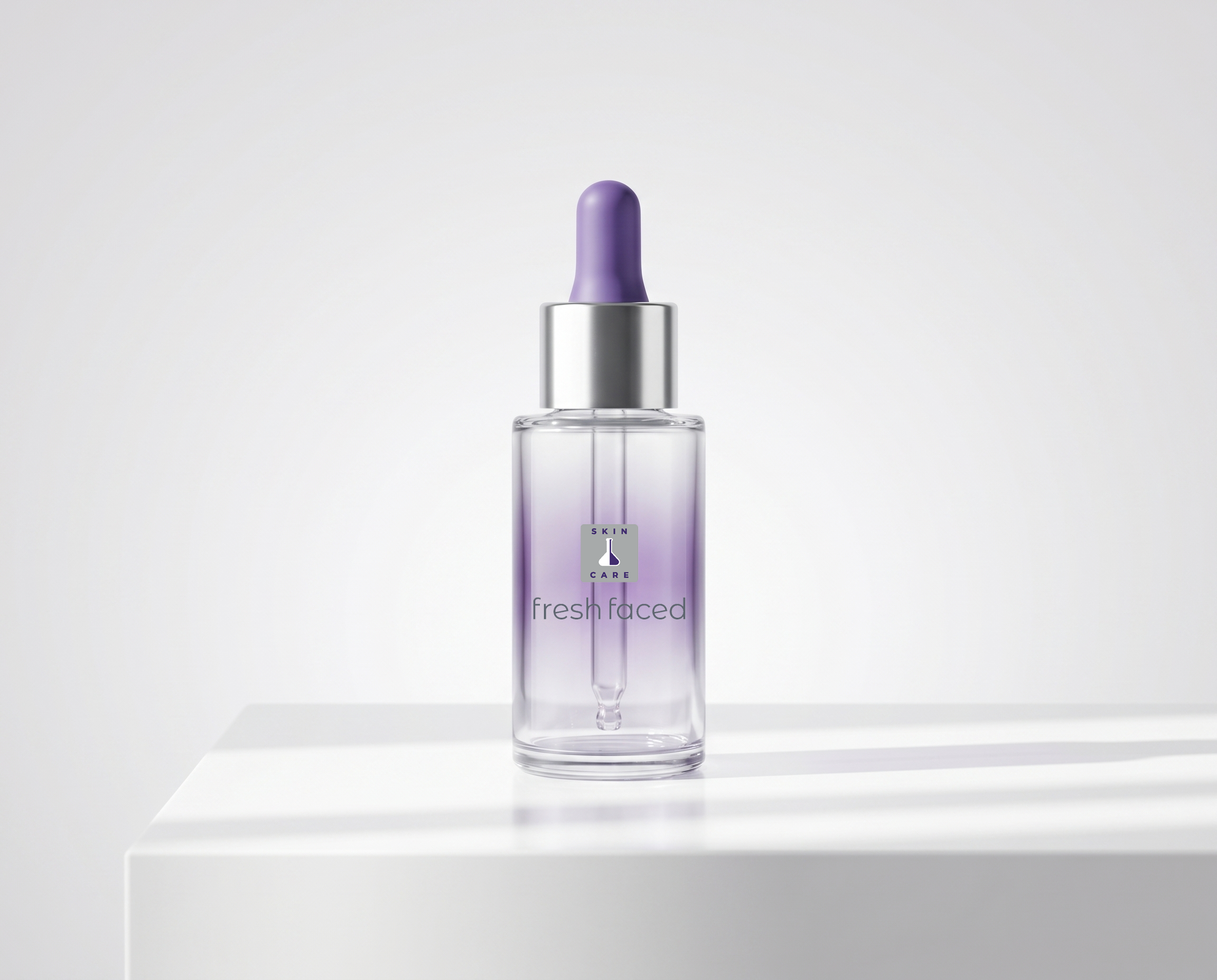
Fresh Faced is a modern‑clinical skincare brand built around clarity, simplicity, and trust. The founder’s vision was to create a line that feels clean and approachable, yet grounded in real dermatological care. A brand that removes the noise and focuses on what skin actually needs. Our role was to translate that philosophy into a visual identity and packaging system that feels modern, calm, and quietly confident.
The Fresh Faced Product System
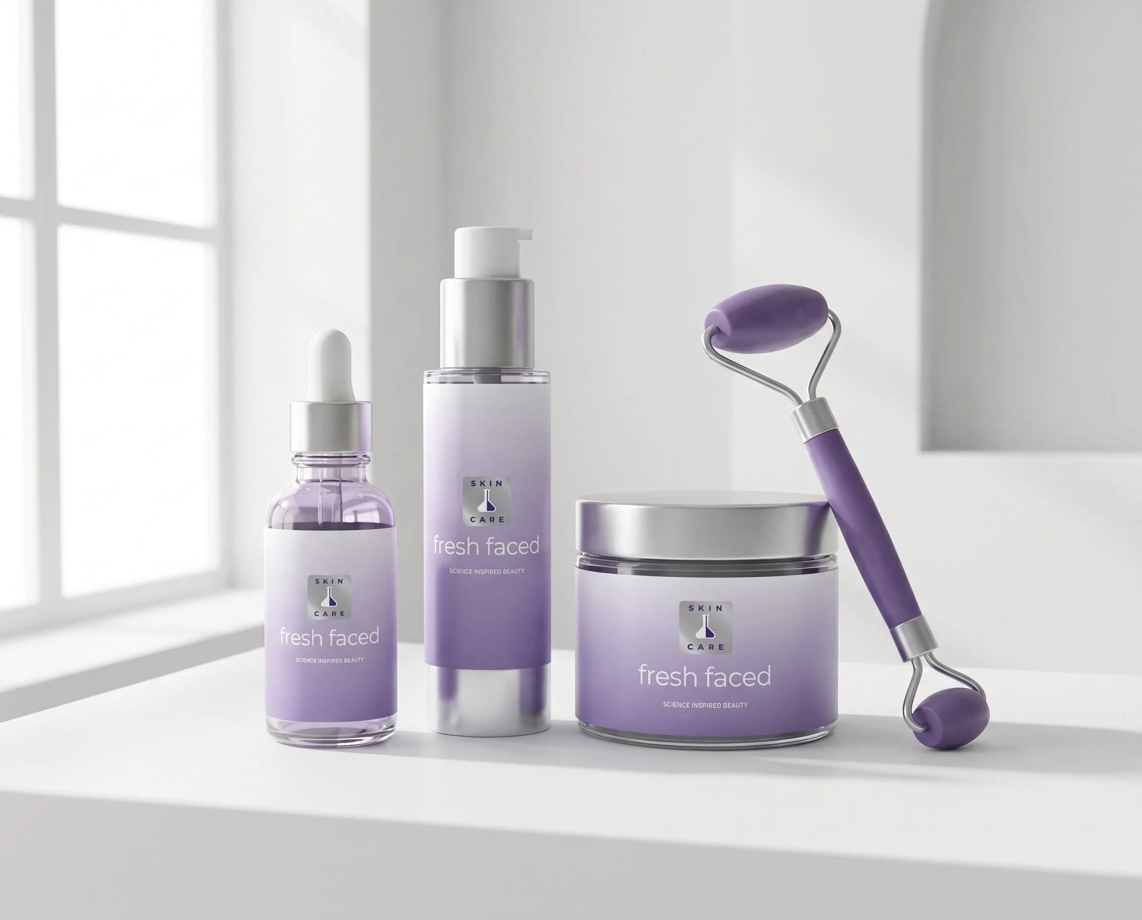
A clinical‑calm identity built on clarity, science, and modern beauty.
Brand Identity
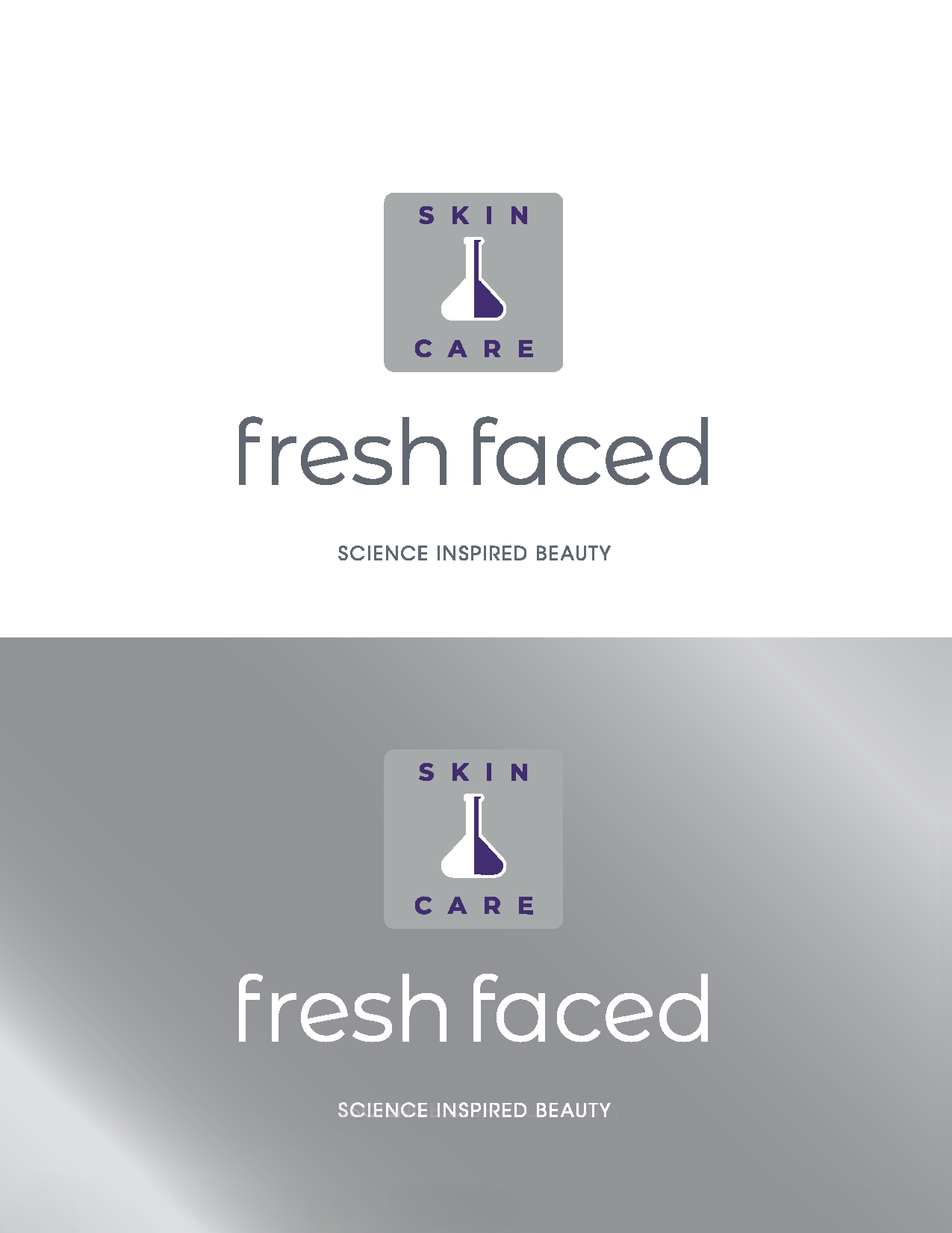
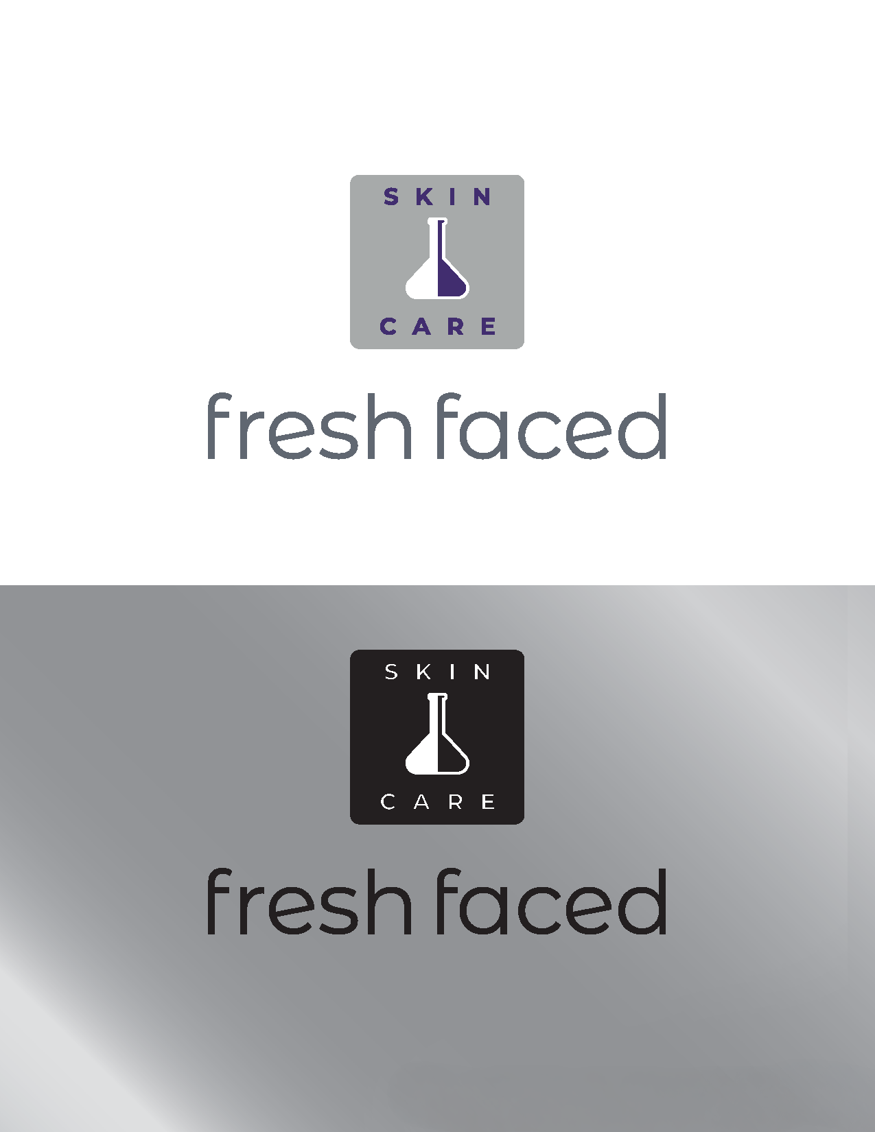
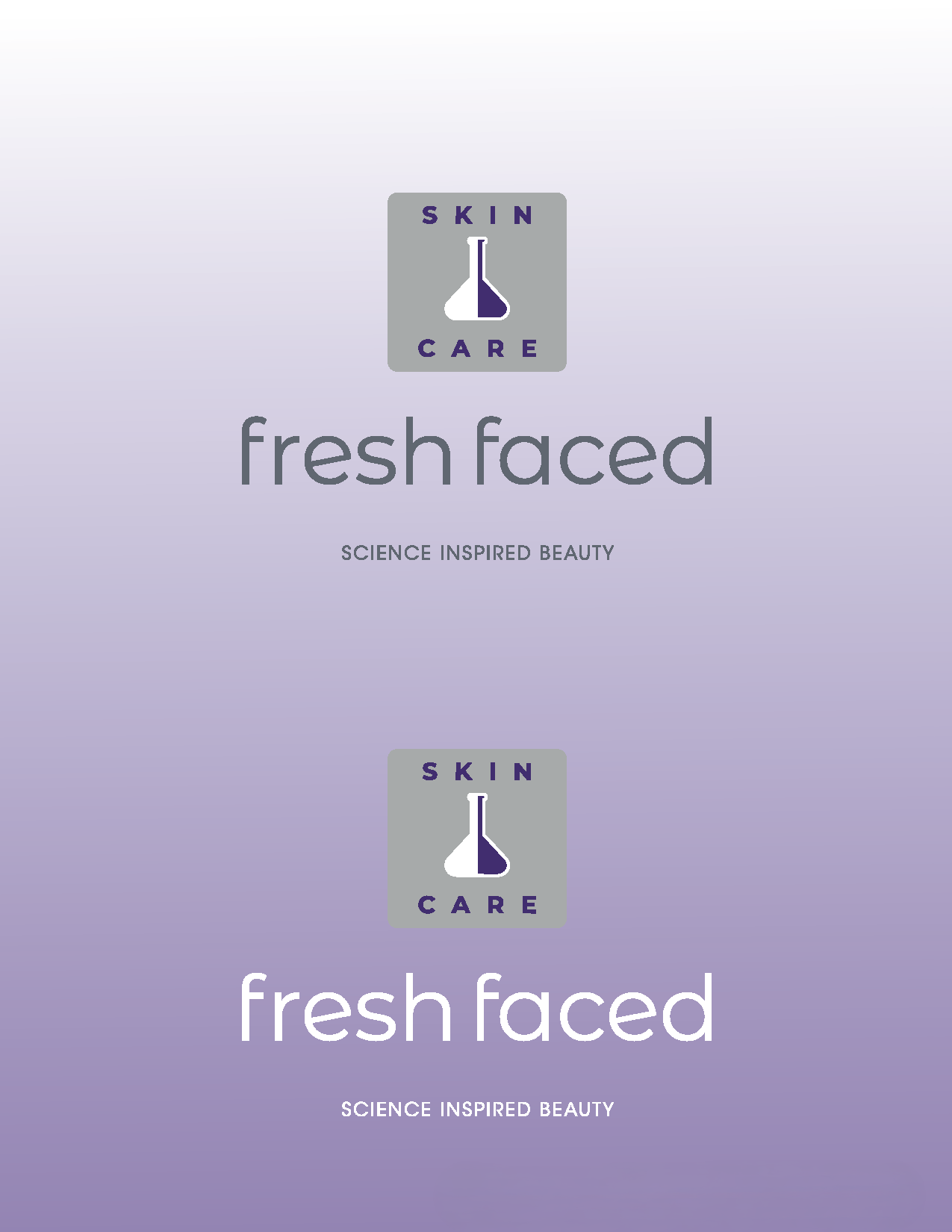
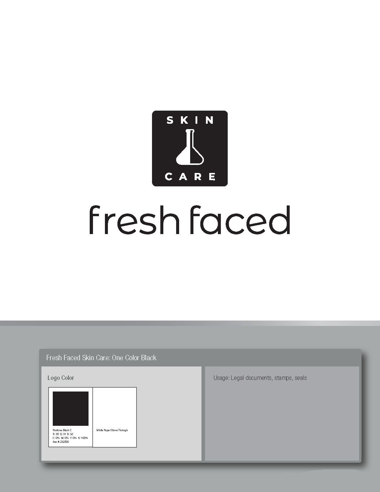
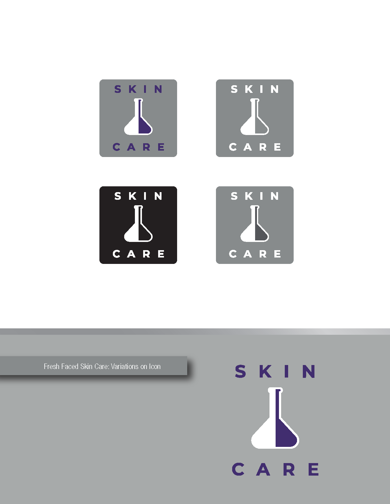
The Fresh Faced identity is intentionally minimal. Soft lavender tones paired with cool neutrals create a sense of purity without drifting into sterility. Clean, unobtrusive typography lets the formulations and the brand’s ethos take center stage. Every element is designed to feel gentle, honest, and clinically trustworthy.

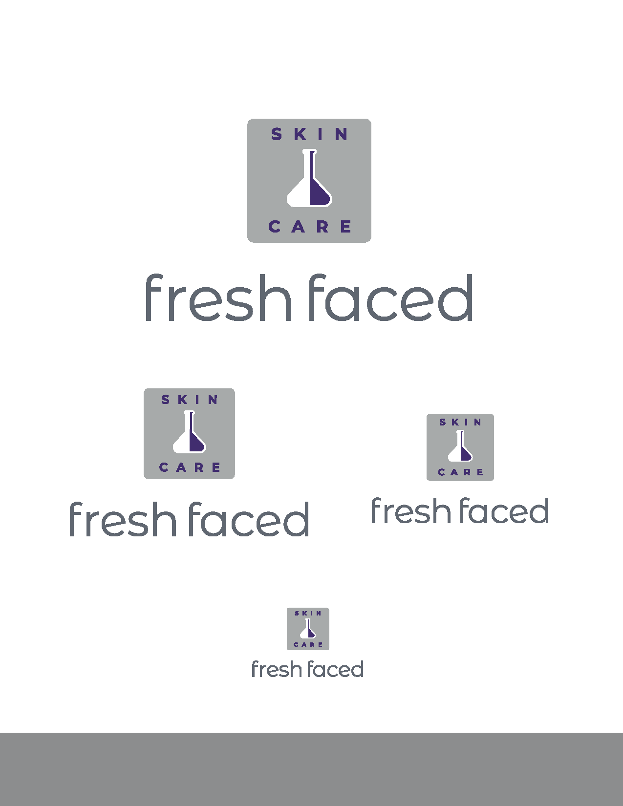


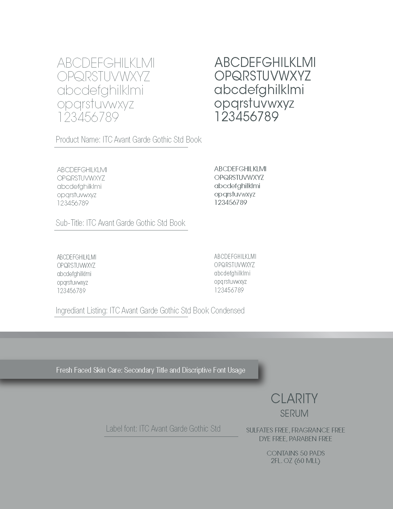
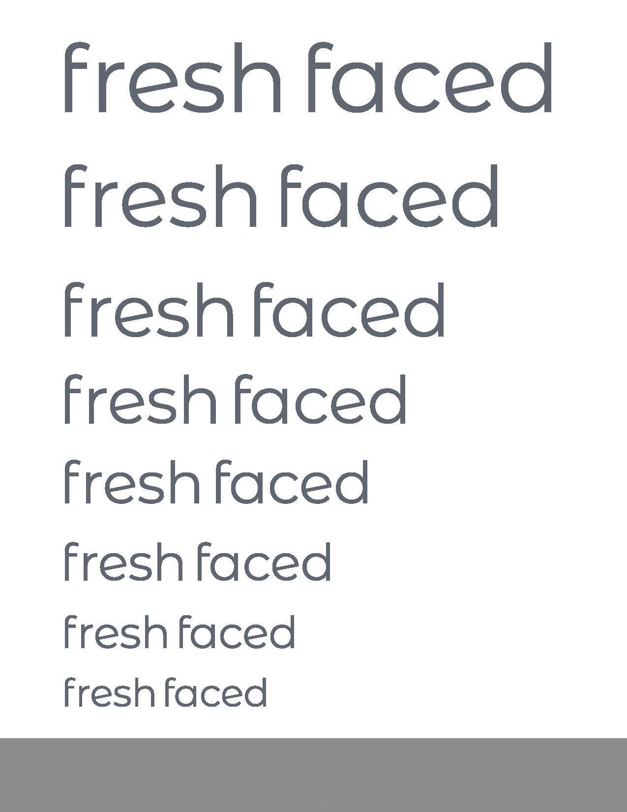
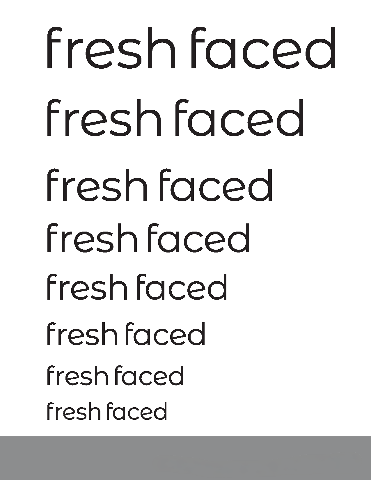
Typography System
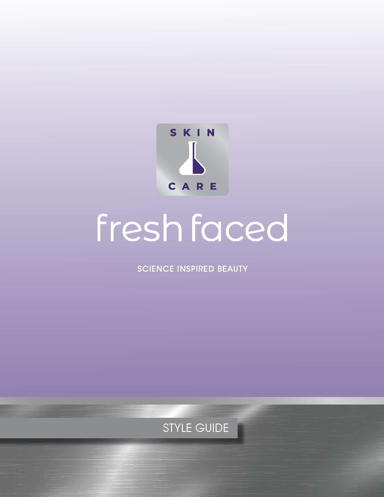
The Fresh Faced typographic system balances scientific clarity with a soft, human tone. The primary typeface is chosen for its clean structure and quiet confidence, supporting the brand’s chemist‑led credibility without feeling clinical. A complementary secondary typeface provides warmth and readability across packaging, digital touchpoints, and long‑form content. Together, the system creates a voice that feels modern, trustworthy, and gently feminine. A perfect reflection of the founder’s approach.
Color Logic
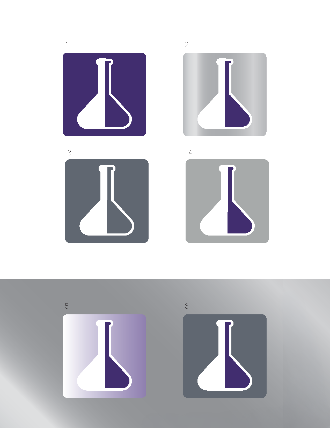
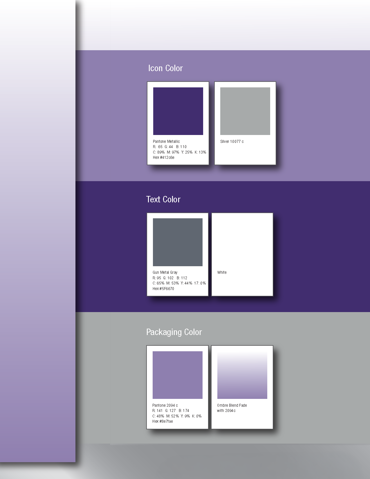
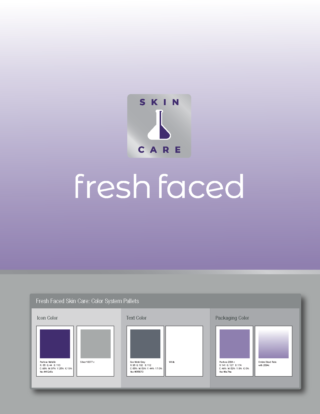
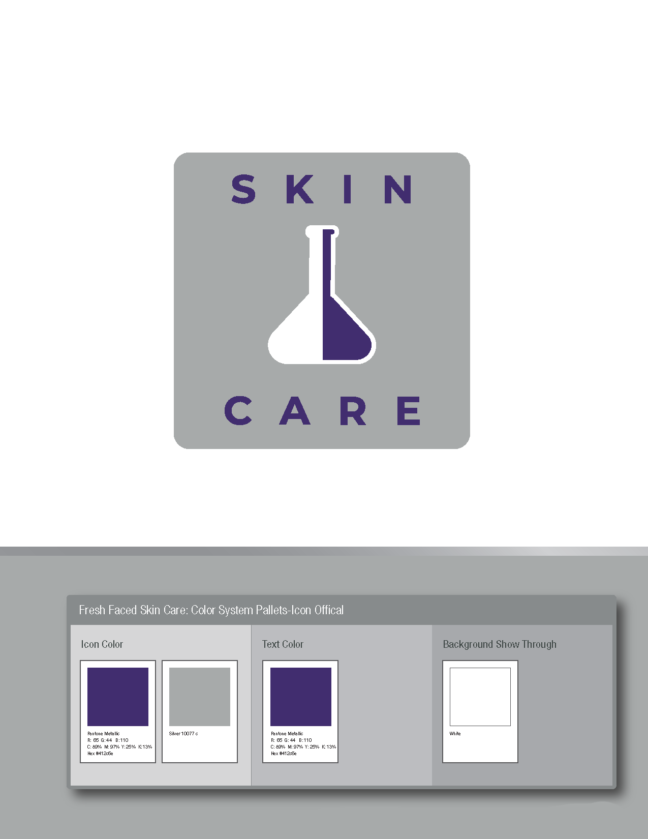
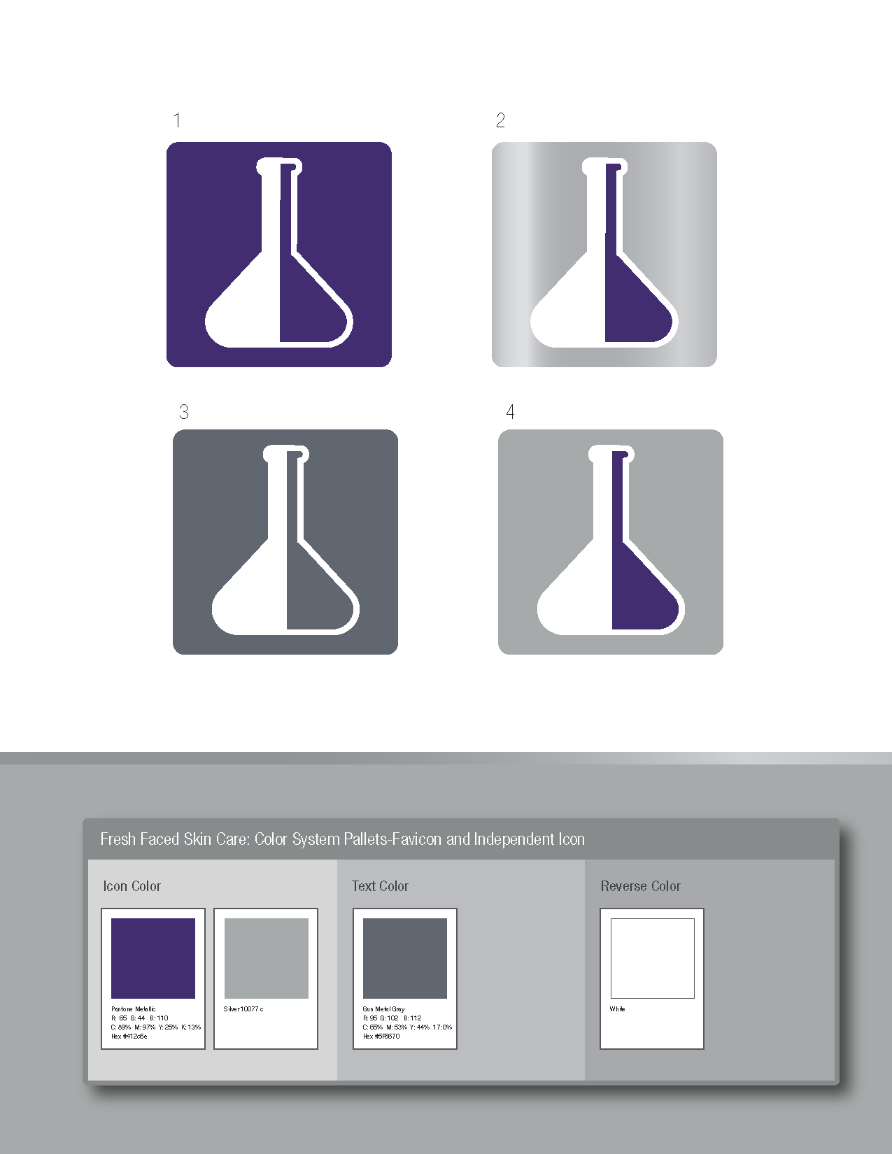
The Fresh Faced palette is built around a single anchor hue — a soft, cosmetic‑grade purple chosen by the founder — and refined into a system that feels modern, calm, and editorial. Rather than fighting the purple, the identity disciplines it: the saturation is softened, the undertones are cooled, and the supporting neutrals are carefully tuned to create balance and clarity. Warm creams and muted grays provide grounding, while the purple becomes a quiet signature rather than an overpowering brand color. The result is a palette that feels scientific yet approachable, feminine without cliché, and cohesive across packaging, digital, and in‑store applications.

Pantone System & Production Color
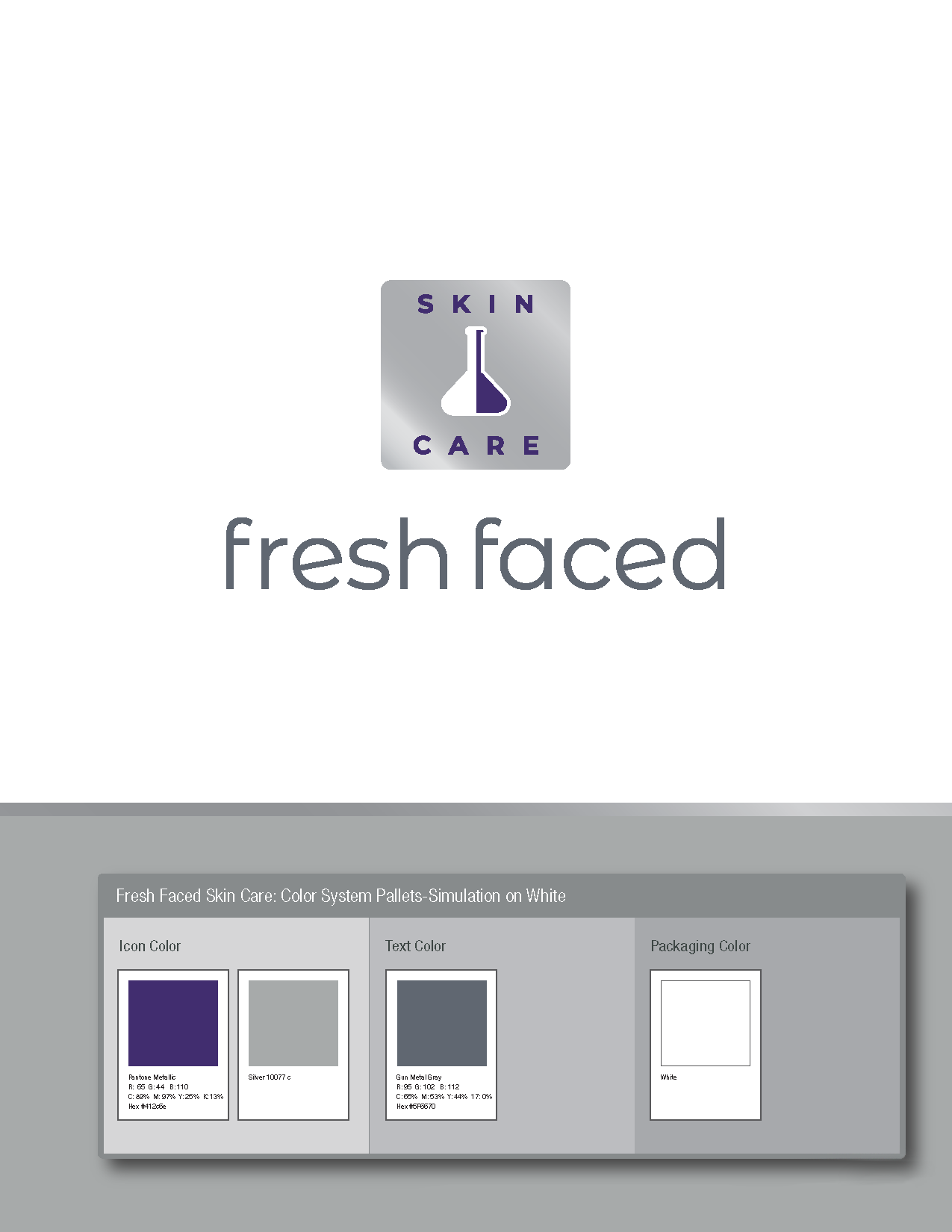
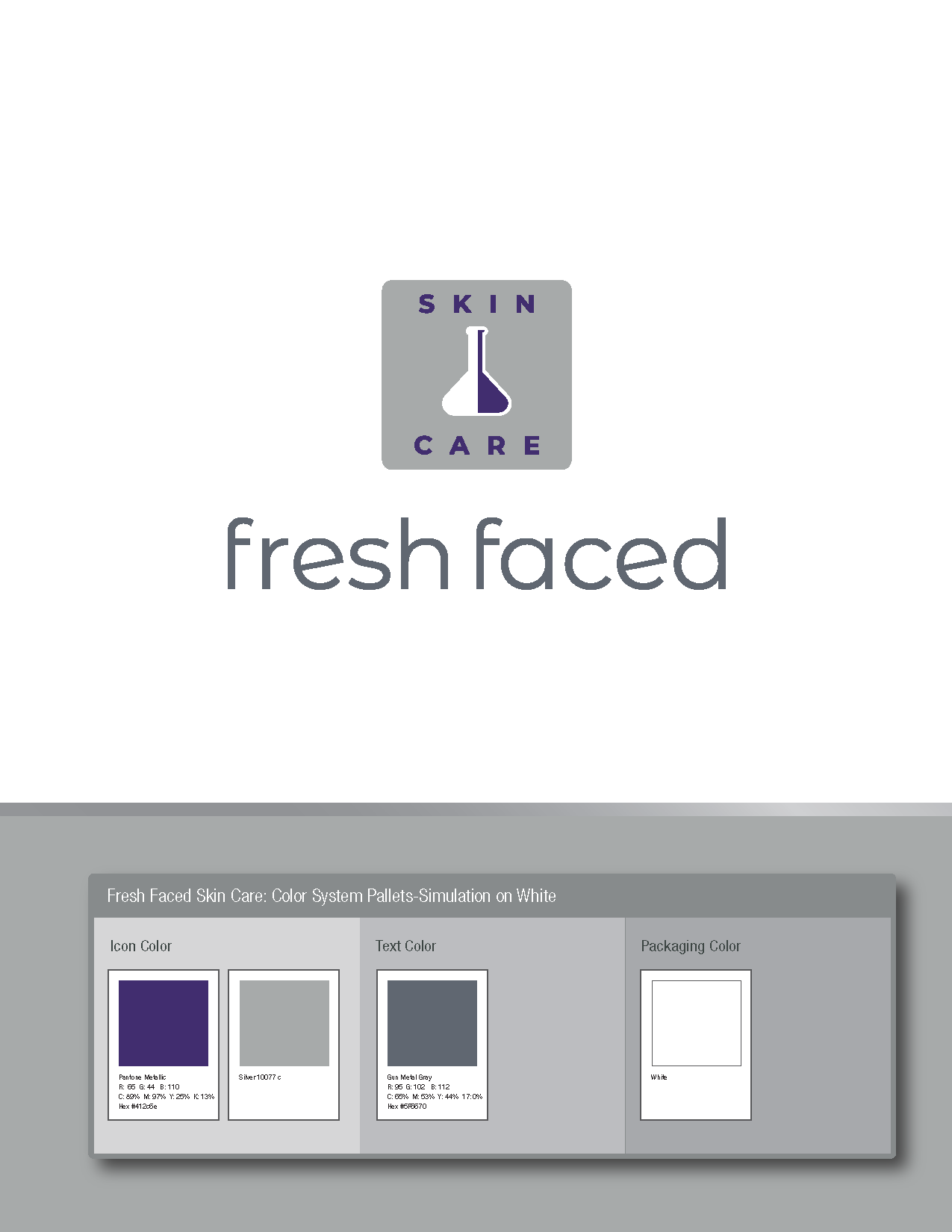
Fresh Faced’s palette is grounded in a refined Pantone system that translates seamlessly from digital design to physical packaging. The signature lavender (Pantone 2094 C) is supported by a metallic accent and a soft gunmetal gray, creating a balanced, modern range. Each color is specified with full Pantone, CMYK, RGB, and HEX values, ensuring that every bottle, label, and printed element maintains the same calm, cohesive tone. The result is a palette that feels both scientific and softly feminine. A perfect reflection of the brand’s identity
Product & Packaging System
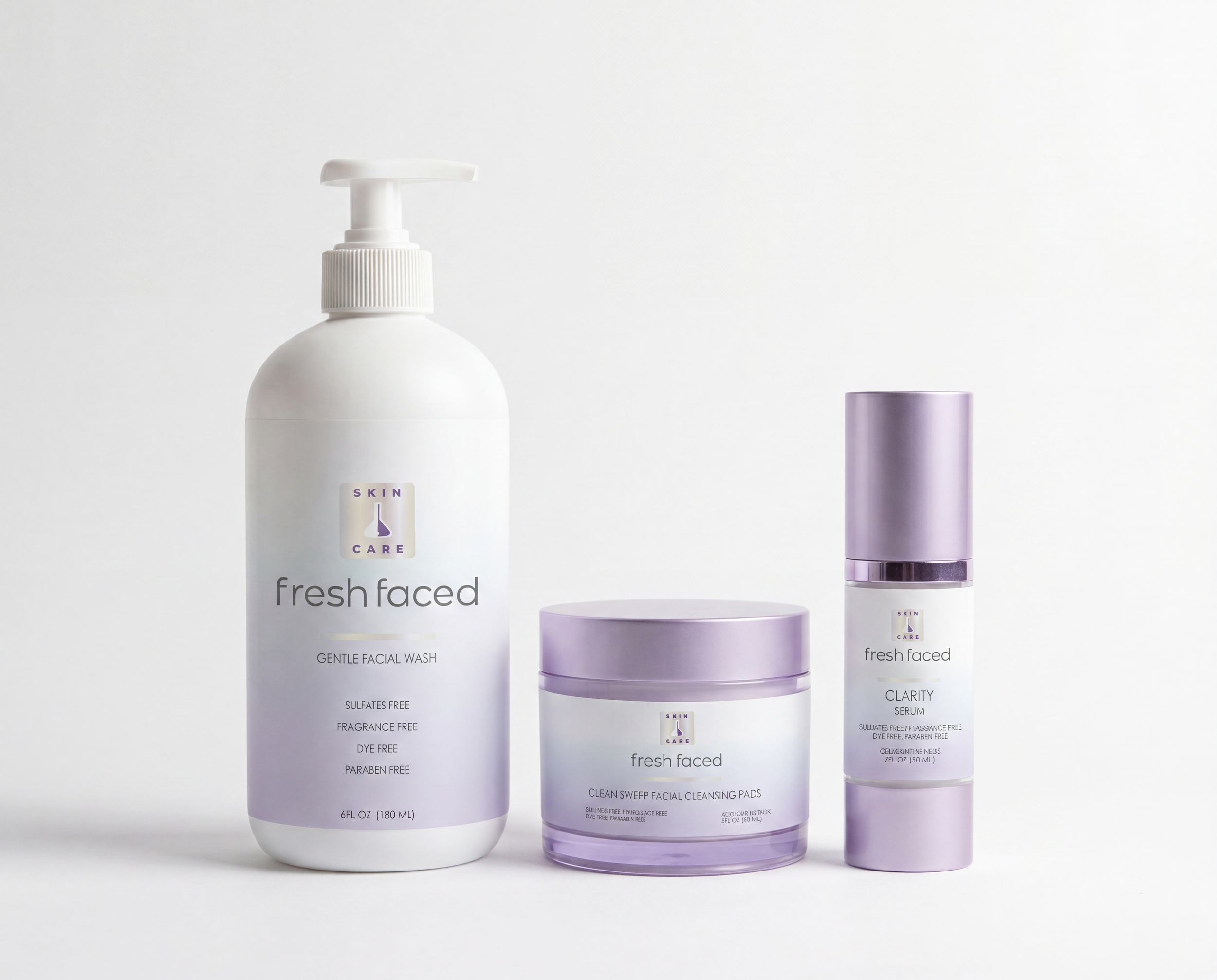
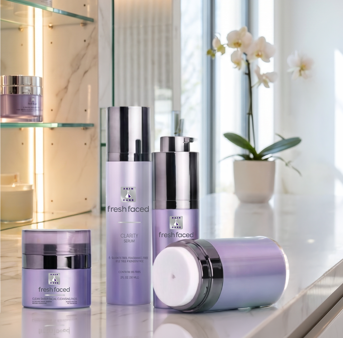
Fresh Faced is built as a simple, effective routine, a small collection of essentials designed to work together. The product lineup includes a gentle facial wash, cleansing pads, and a clarity serum, each formulated without sulfates, dyes, parabens, or fragrance. The packaging reflects this purity: clean lines, clear labeling, and a calm visual rhythm that reinforces the brand’s promise of uncomplicated care.
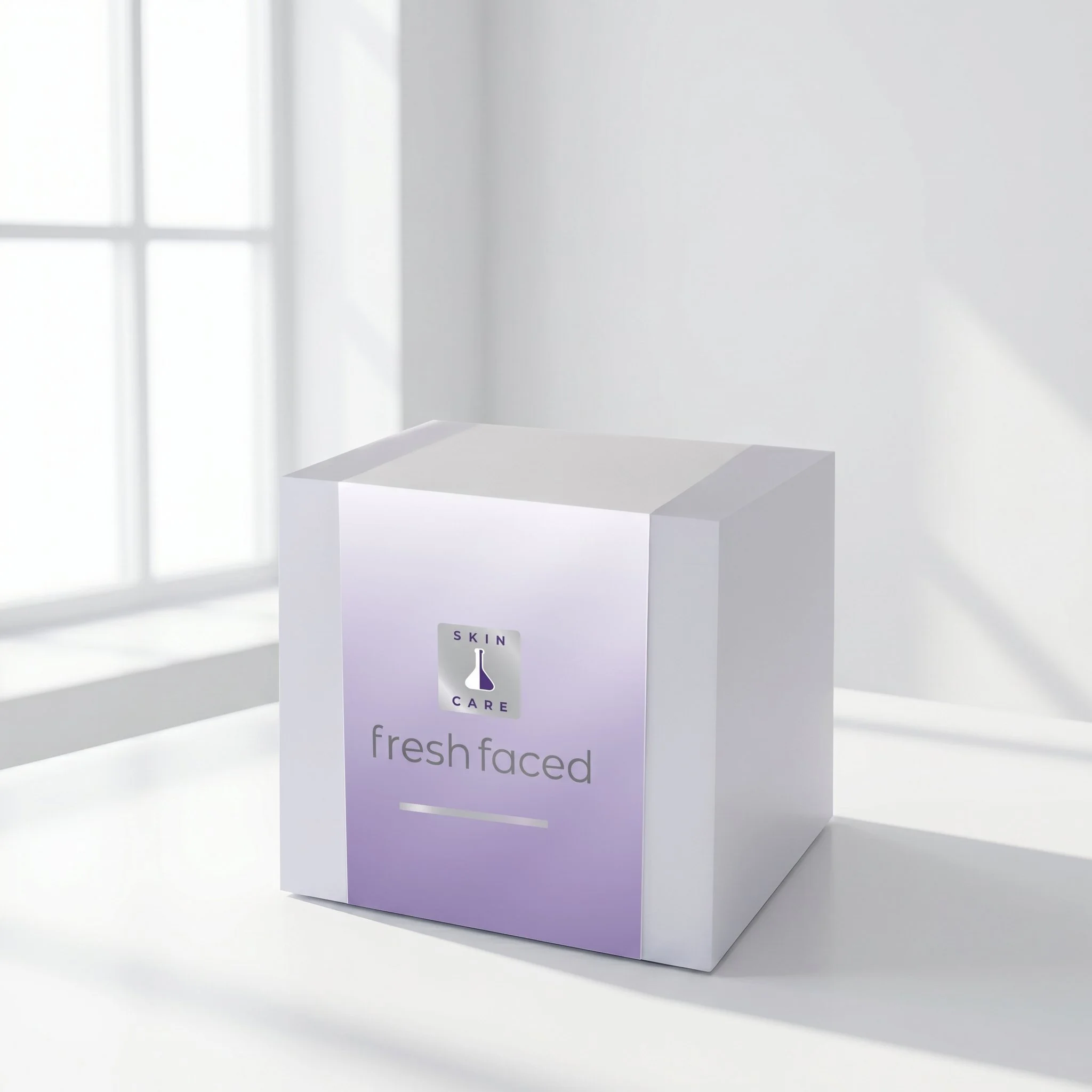
The packaging system balances clinical clarity with a soft, human touch. Each product uses a consistent hierarchy: brand mark, product name, formulation notes, and size. The metallic caps introduce a subtle premium cue, while the matte lavender surfaces keep the line approachable. The result is a system that feels cohesive, modern, and aligned with the brand’s gentle‑clinical positioning.
Founder’ Story
Fresh Faced was created by a chemist who formulates every product by hand in her small storefront lab. Her approach is deeply personal, founded in science, craft, and genuine care for her clients. The visual identity honors this intimacy by pairing editorial calm with grounded expertise. The brand feels human, thoughtful, and quietly confident, reflecting the founder’s commitment to creating products that are both effective and deeply considered.
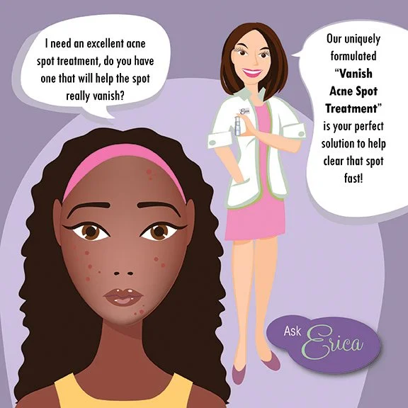
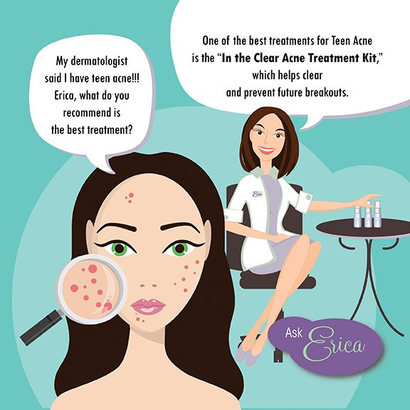
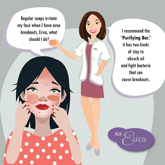
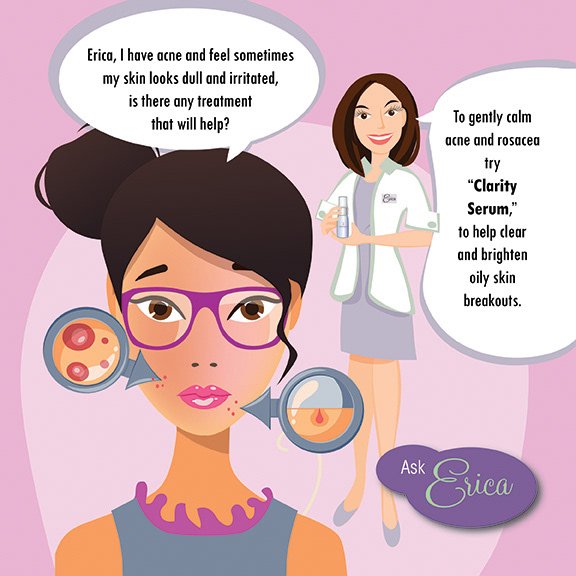
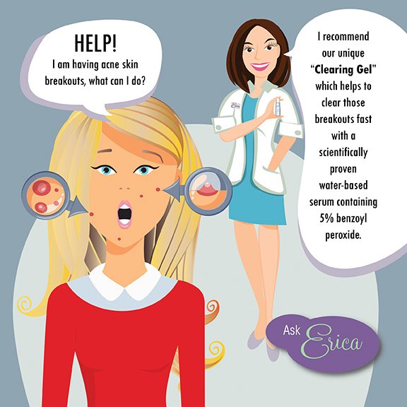
Ask Erica: The Fresh Faced Social Media Campaign
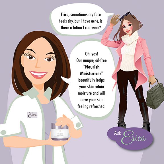
To support the brand’s launch, we created Ask Erica, a social media series that answers common skincare questions in a clear, approachable voice. The campaign helped position Fresh Faced as both knowledgeable and human. A modern‑clinical brand that educates without overwhelming. Each post paired simple explanations with clean visuals, reinforcing the brand’s commitment to clarity and care.



Closing Note
Fresh Faced is a brand built on clarity, in formulation, in design, and in experience. The identity and packaging system reflect a commitment to simplicity and care, creating a foundation for the brand to grow with confidence.