Pax Domus Press
A Contemporary Identity for a Modern Independent Publisher
-
Pax Domus Press began with a clear vision: to publish thoughtful, contemporary work with a calm, confident voice. The early identity hinted at minimalism but lacked the structural clarity and editorial refinement needed to support a growing catalog. The press needed a system that felt modern, literary, and quietly authoritative.
-
As Pax Domus expanded its publishing ambitions, the brand required a visual language capable of scaling across book covers, digital platforms, and author‑facing materials. The goal was to create an identity that elevated the written word while remaining understated, timeless, and unmistakably contemporary.
-
Big Concepts approached Pax Domus as an editorial architecture project. The work began with a reductive mark and extended into a full identity system — typography, palette, spacing, and digital templates. Every decision was guided by the emotional mechanics of clarity, openness, and modern literary presence.
System Components
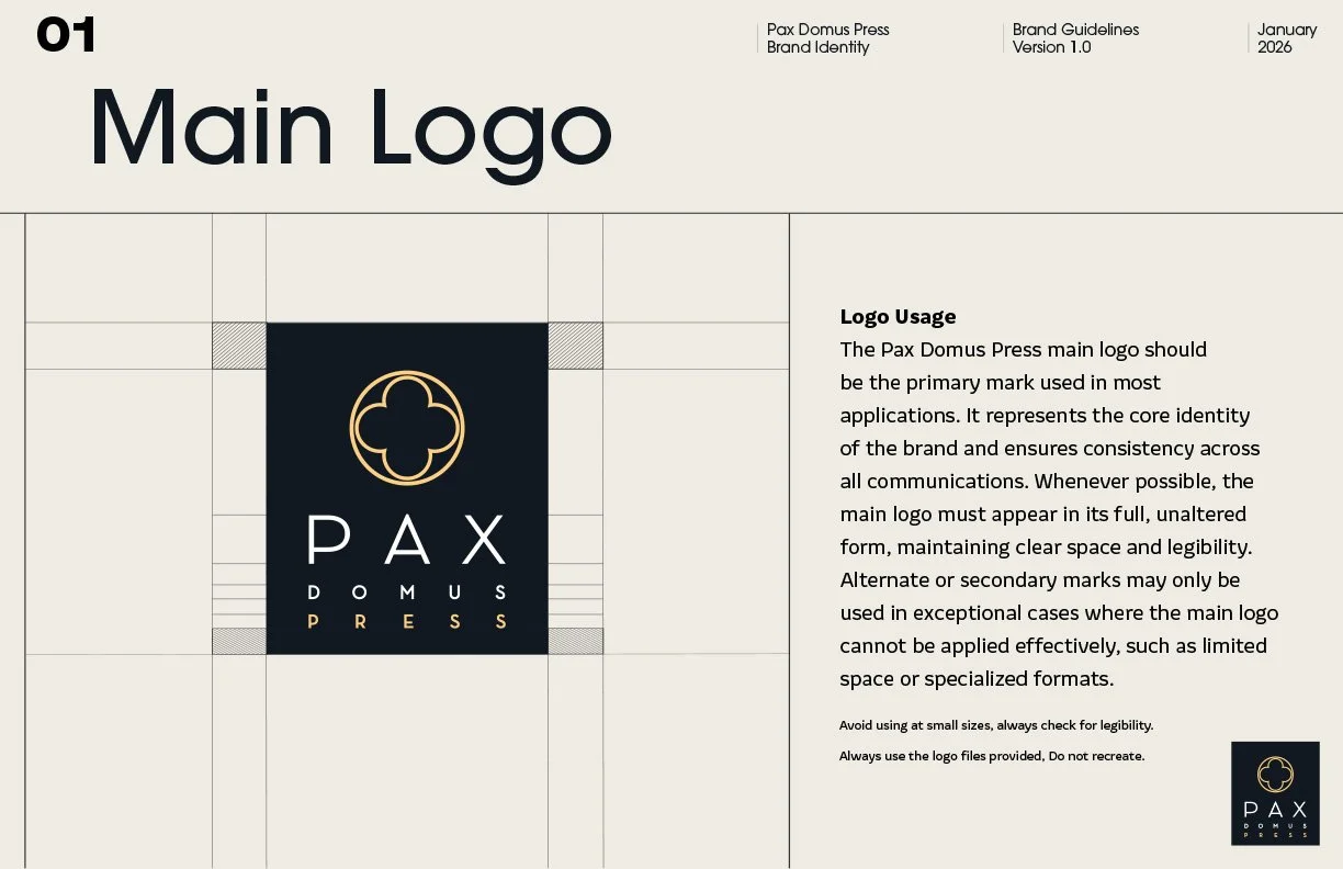
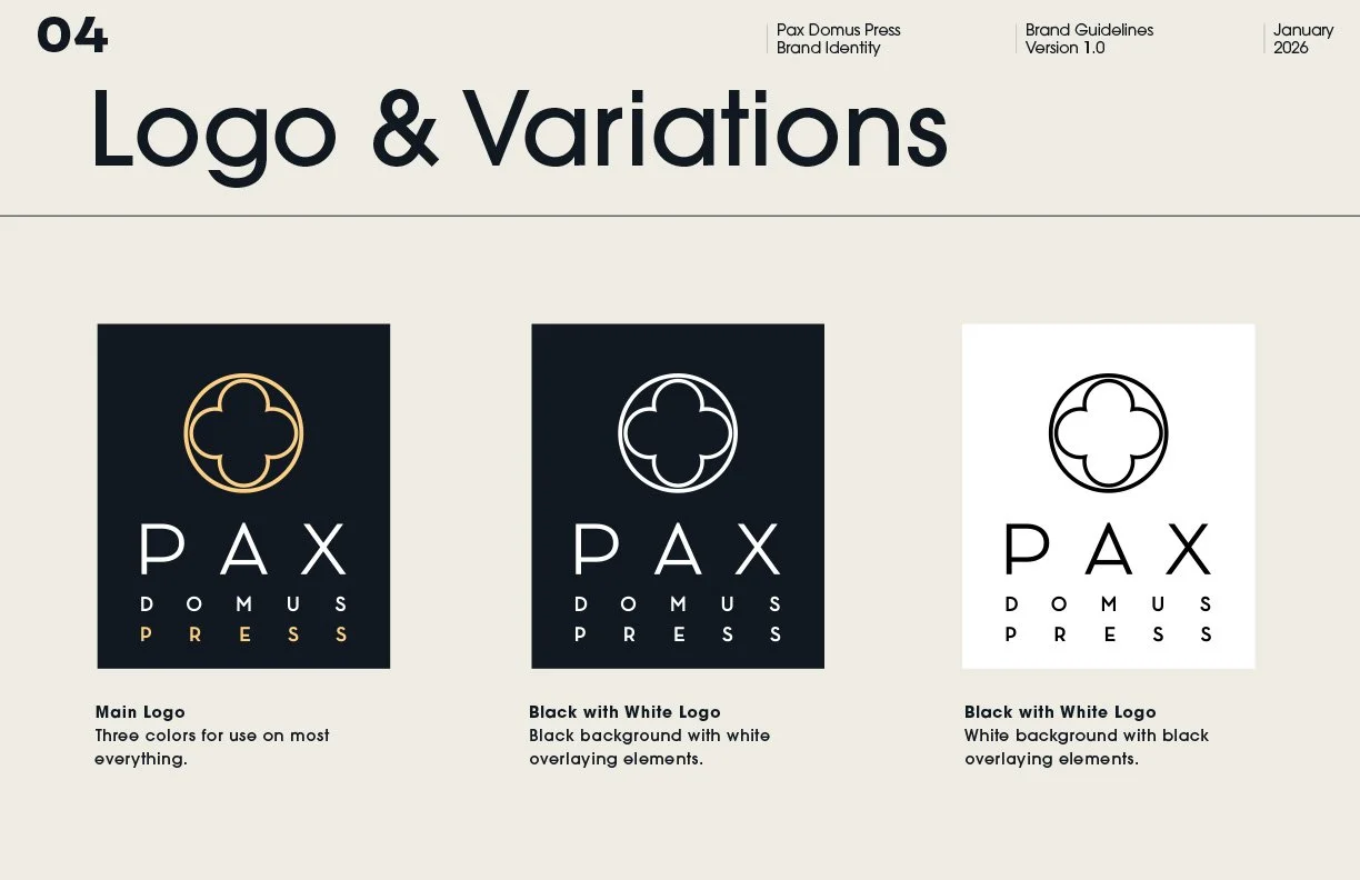
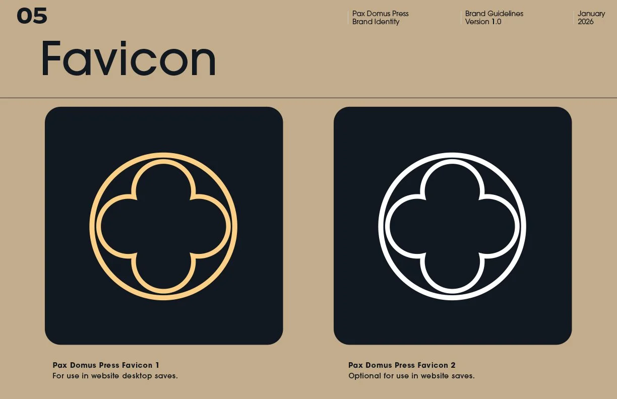
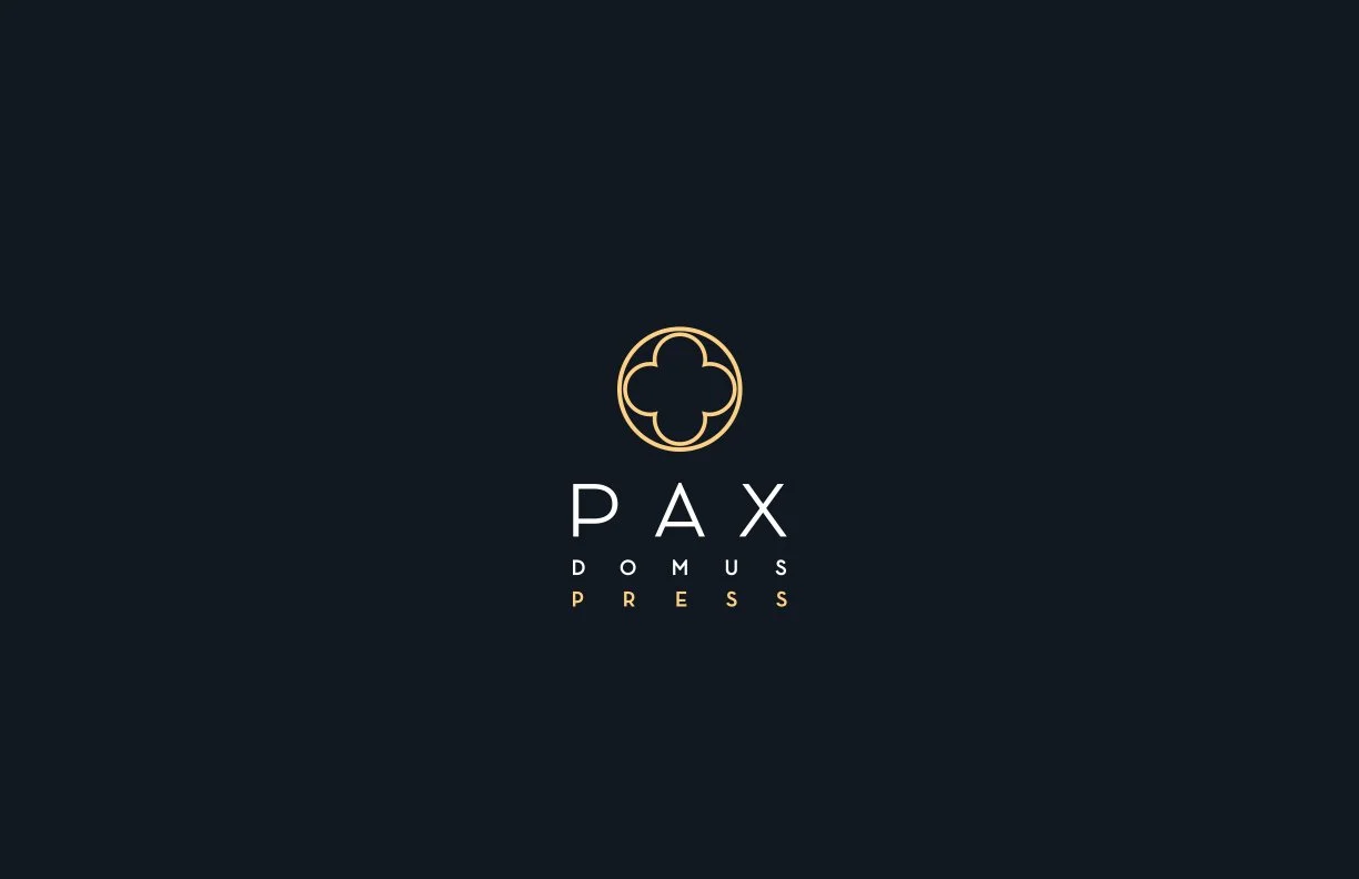
Geometric, reductive logo mark
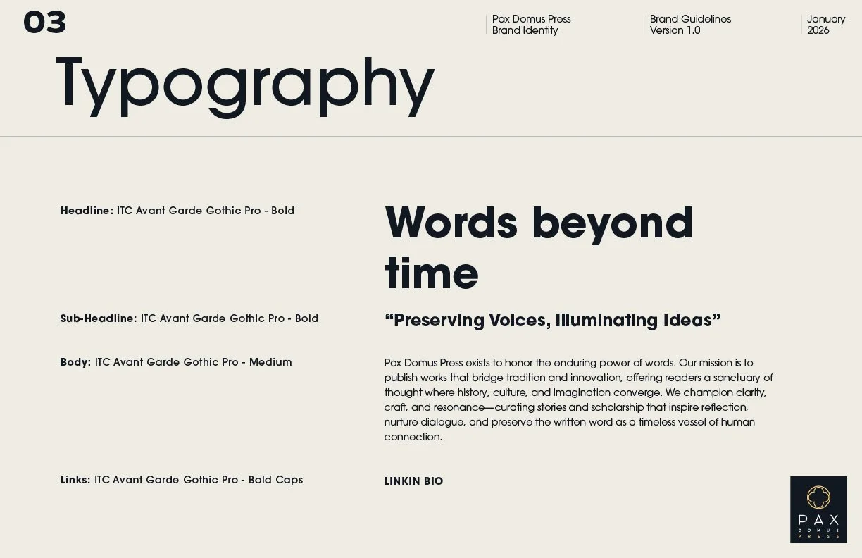
Editorial typographic system
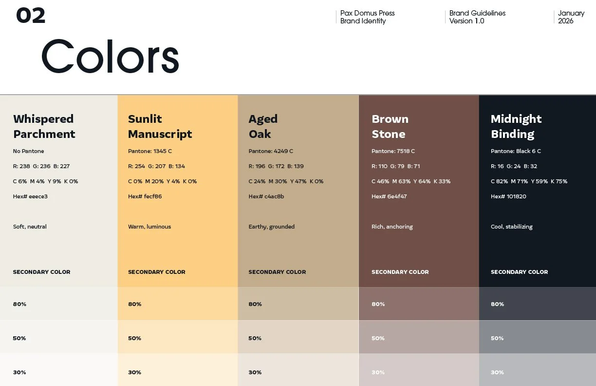
Minimal color palette and spacing rules
Modular grid and layout standards
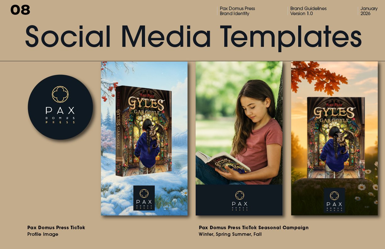
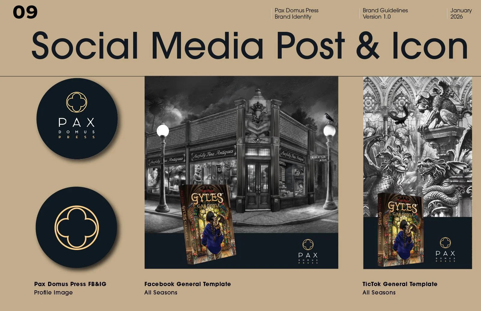
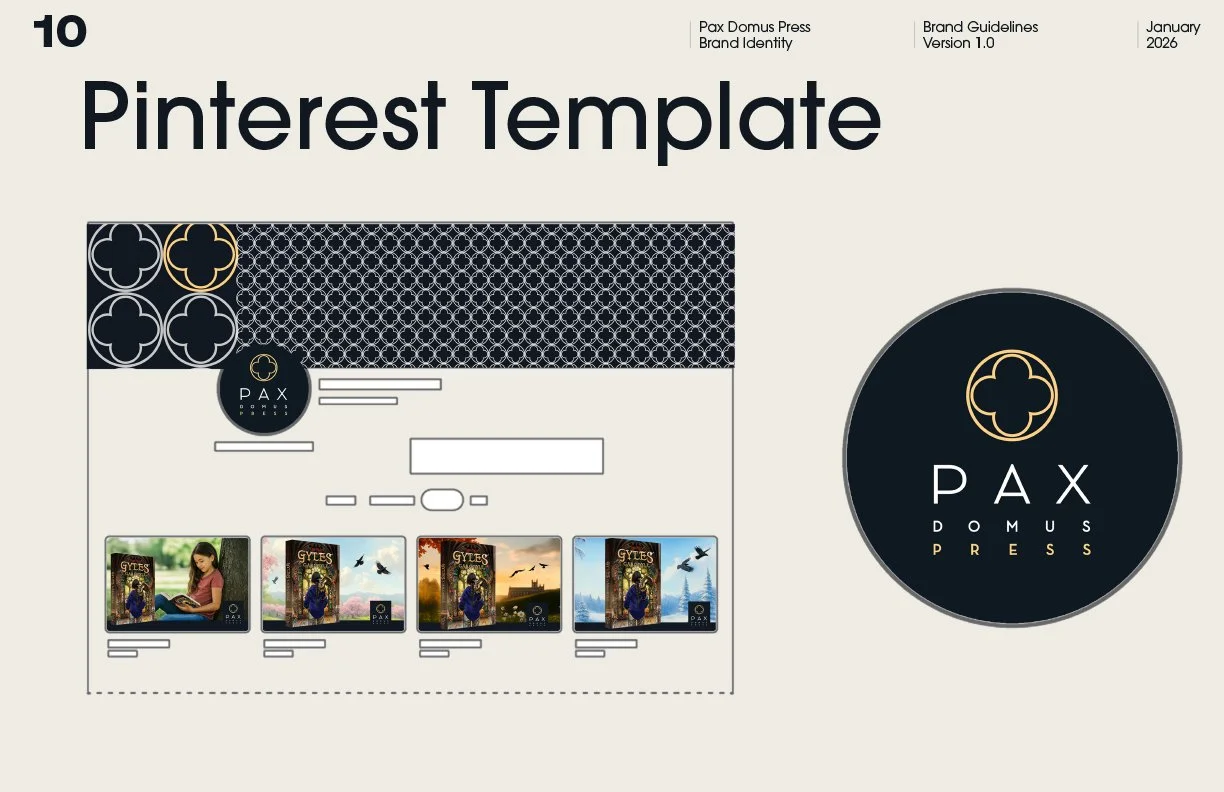
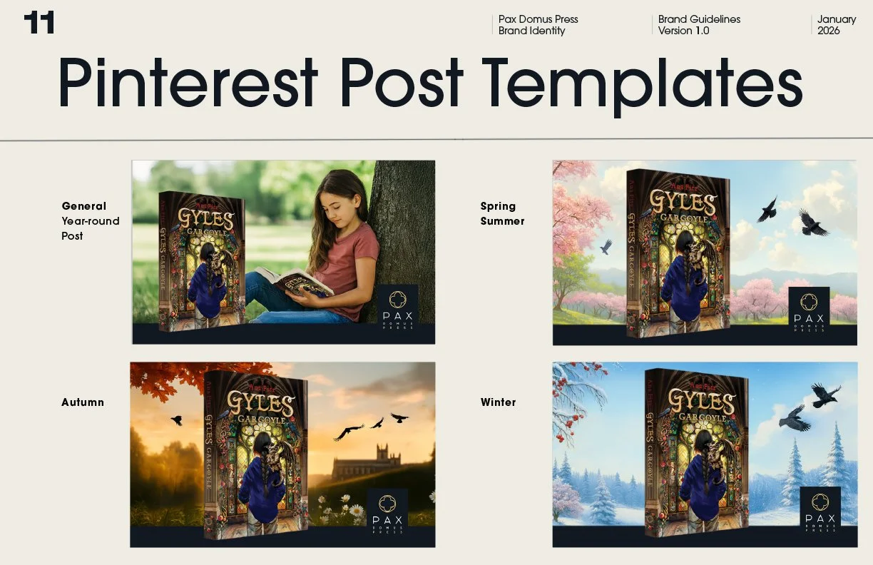
Social media templates and digital assets
-
The identity is built on restraint and precision. The logo — a clean geometric construction — conveys stability and openness. The typographic system balances contemporary sans‑serif clarity with subtle warmth. The palette is intentionally quiet, allowing content to lead. Generous whitespace and a disciplined grid create a calm, editorial rhythm across print and digital applications.
-
The final system positions Pax Domus Press with a refined, modern presence. The logo, style guide, and digital templates work together as a unified language — elegant, approachable, and built for longevity. The identity supports authors, elevates content, and gives the press a confident visual foundation for future growth.
-
The refreshed identity strengthened Pax Domus’s digital presence, improved consistency across platforms, and created a visual world that feels intentional, contemporary, and distinctly literary. The system is flexible enough for daily use yet refined enough for long‑term brand evolution.
-
Creative Direction · Brand System Design · Logo Design · Editorial Typography · Social Media Digital Templates · Style Guide Development