
Read & Co. Brand Identity System
A heritage‑driven identity engineered for modern production environments

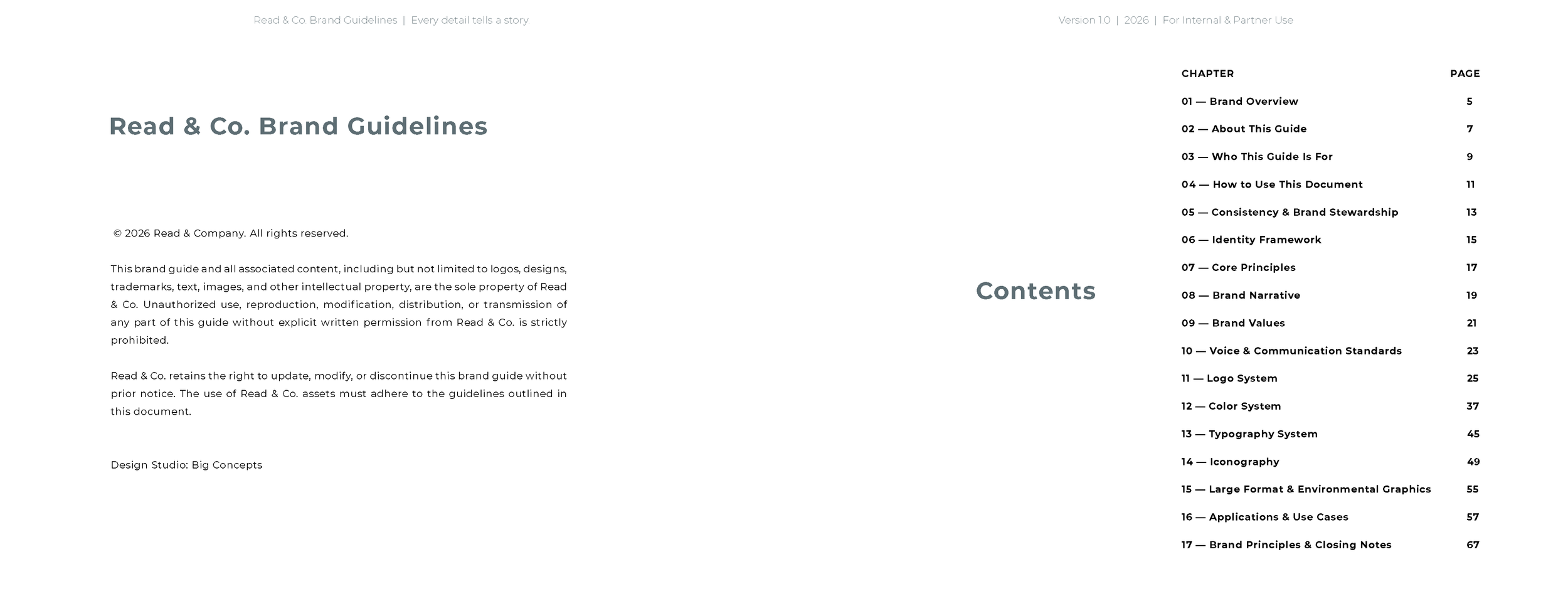
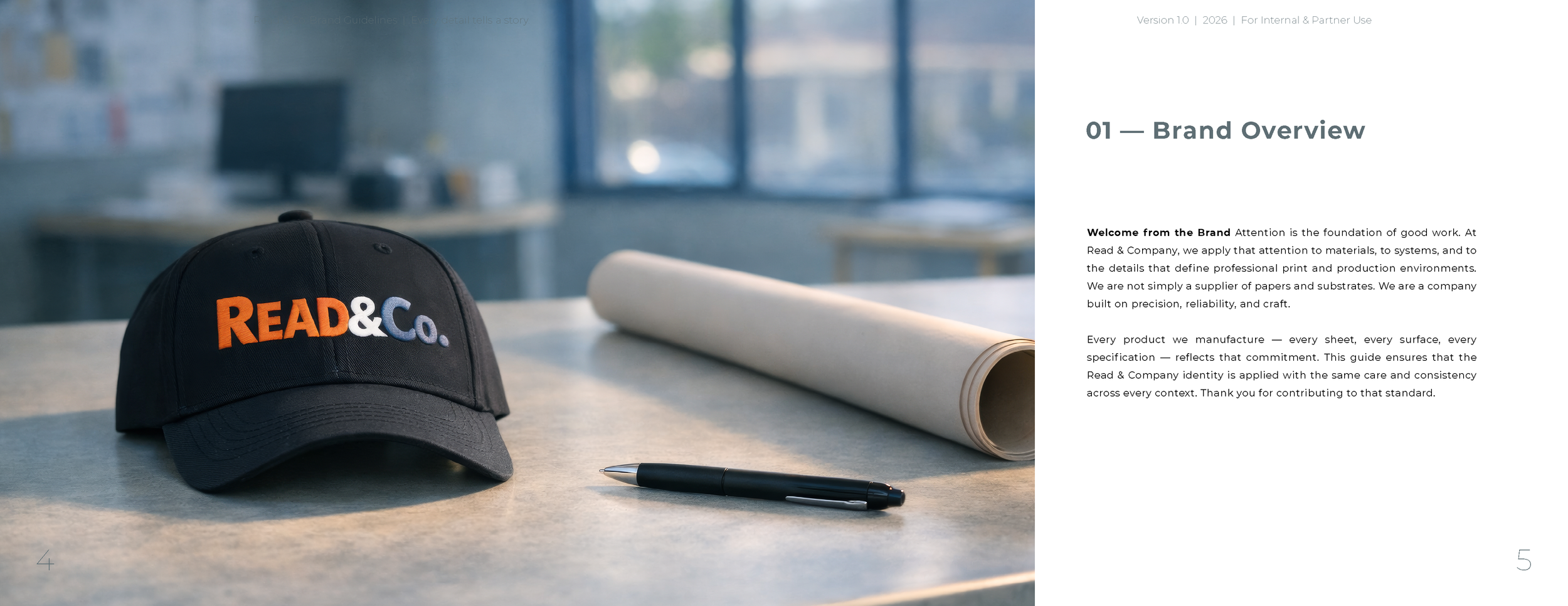
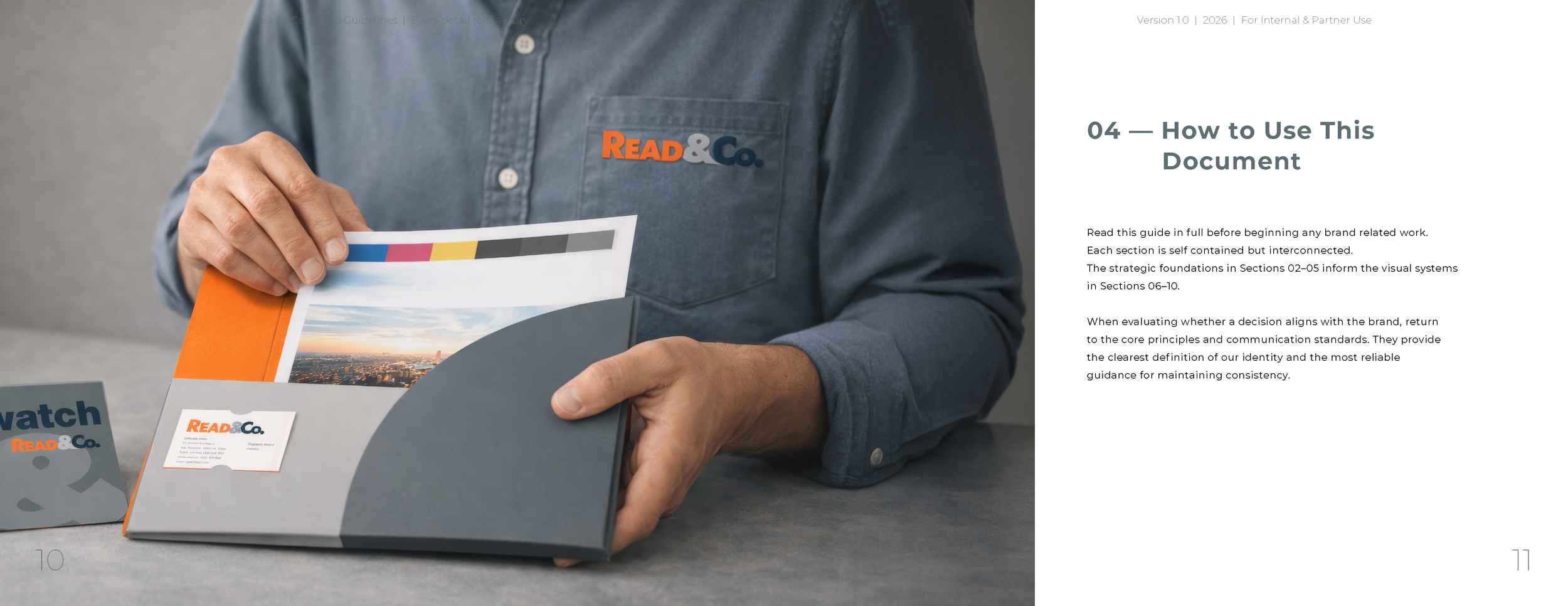
Read & Co. is a materials company built on precision, reliability, and craft. Their papers, substrates, and inkjet solutions support professionals who depend on accuracy in every workflow. Our task was to create a brand identity system that reflects that commitment — an identity rooted in heritage craftsmanship, elevated by modern engineering, and expressed with editorial clarity.
The resulting system is deliberate, tactile, and quietly confident. Every element, from color to typography to environmental graphics, is designed to perform with consistency across print and digital environments. This case study outlines the strategic foundations, visual systems, and applications that define the Read & Co. brand.
-
Read & Co. needed a brand identity that honored its legacy while supporting modern production environments. The new system balances heritage and innovation, combining engineered typography, calibrated color, and material‑driven design principles.
-
The previous identity lacked cohesion across print, digital, and large‑format applications. Our challenge was to build a system that could scale — from business cards to environmental graphics — without losing clarity or consistency.
-
We grounded the identity in four principles: Analytical Clarity, Editorial Precision, Craft Integrity, and Long‑Term Reliability. These principles shaped every decision, from logo construction to color hierarchy to communication standards.
-
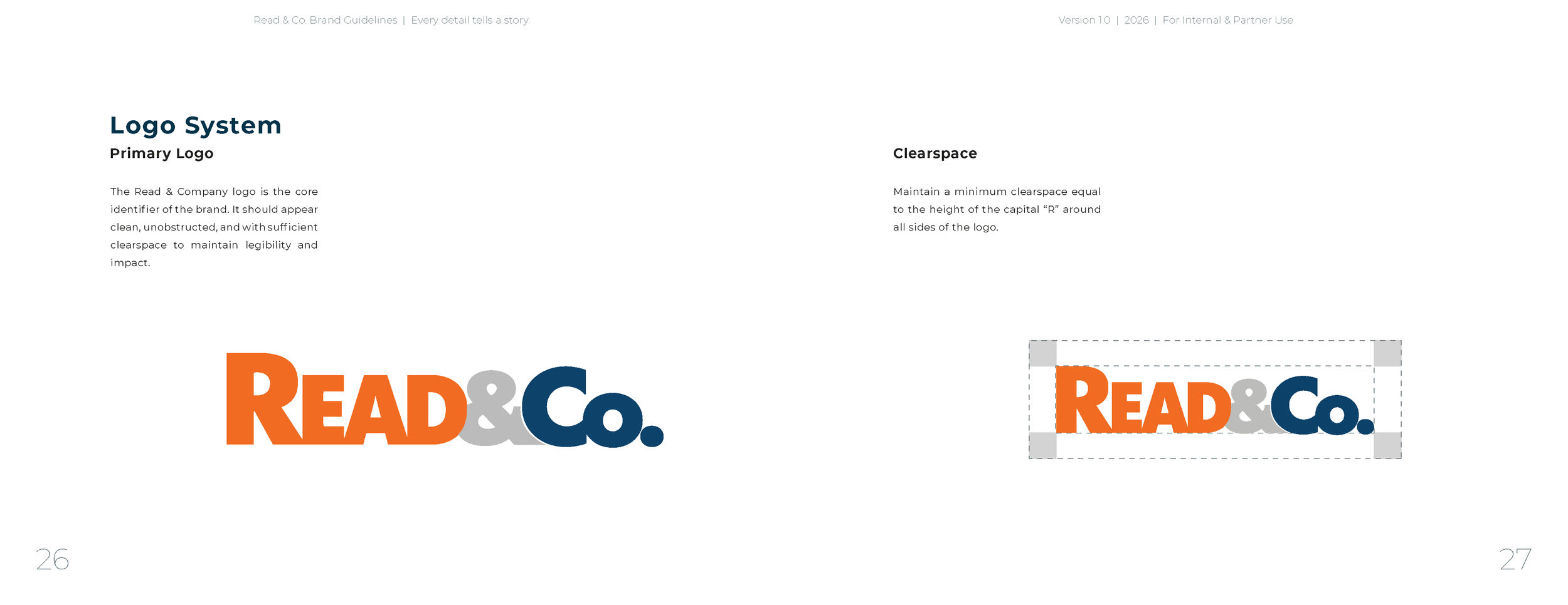
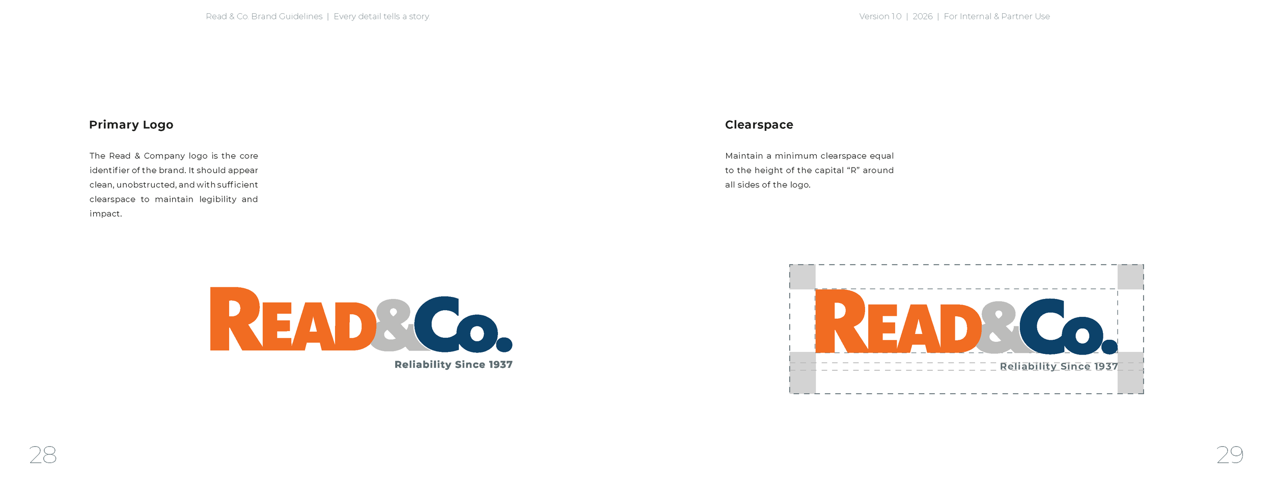
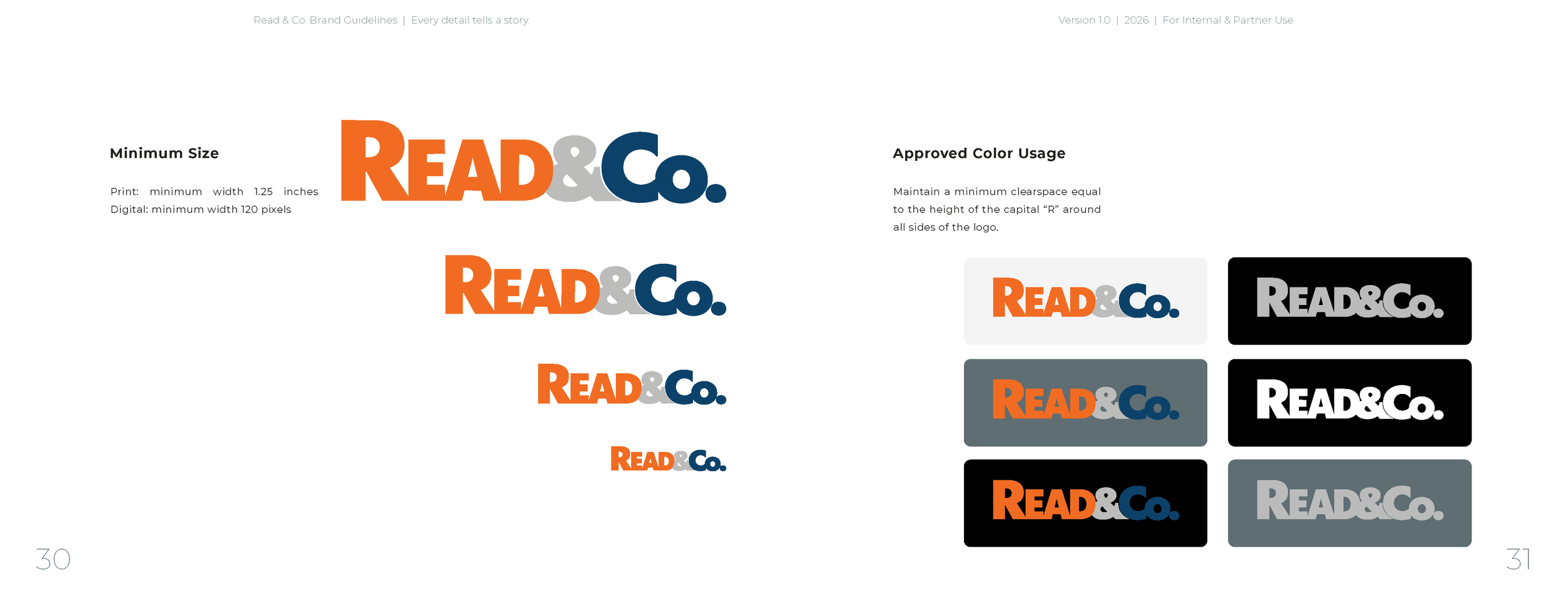
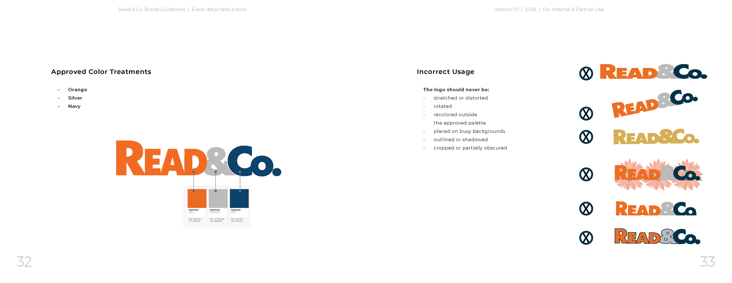
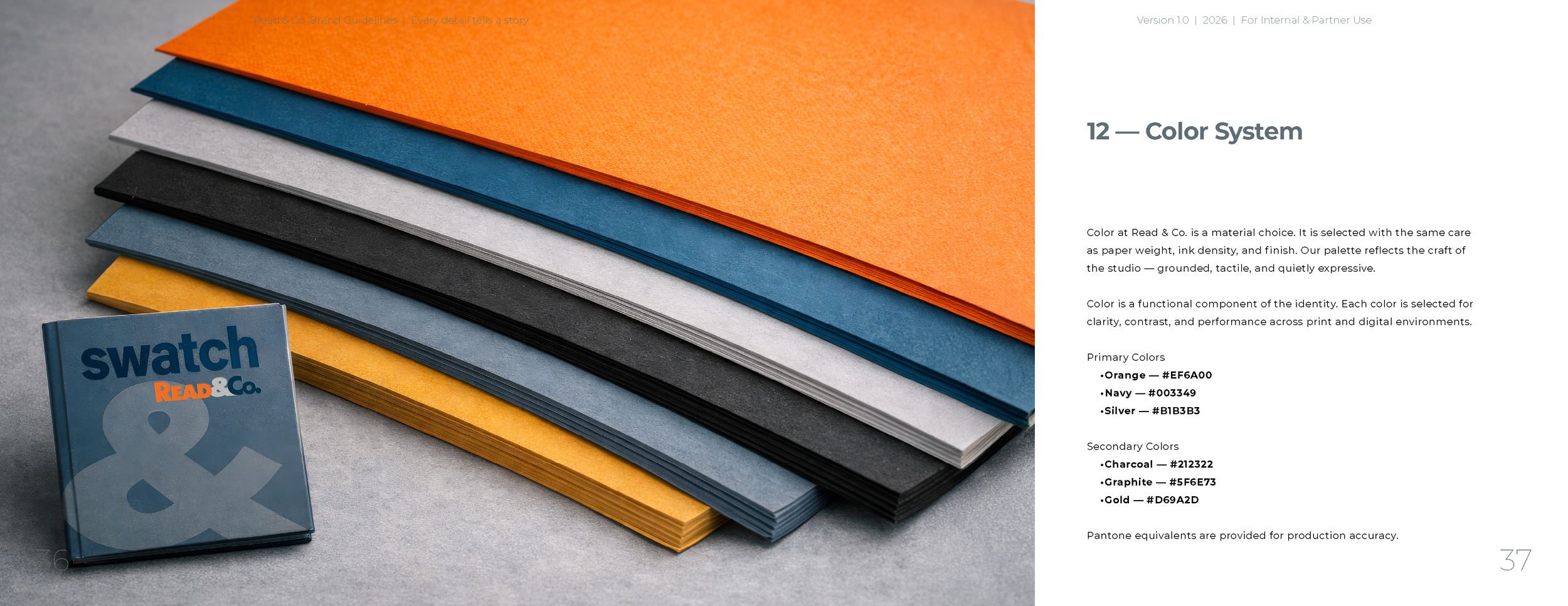
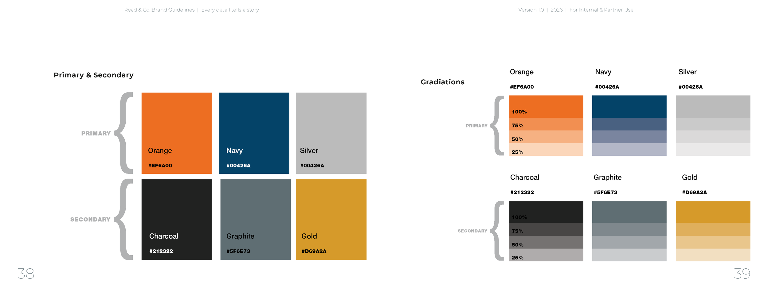
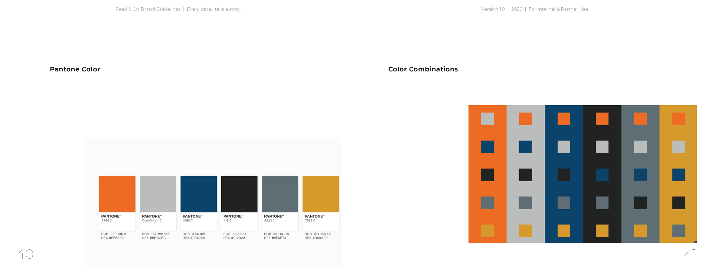
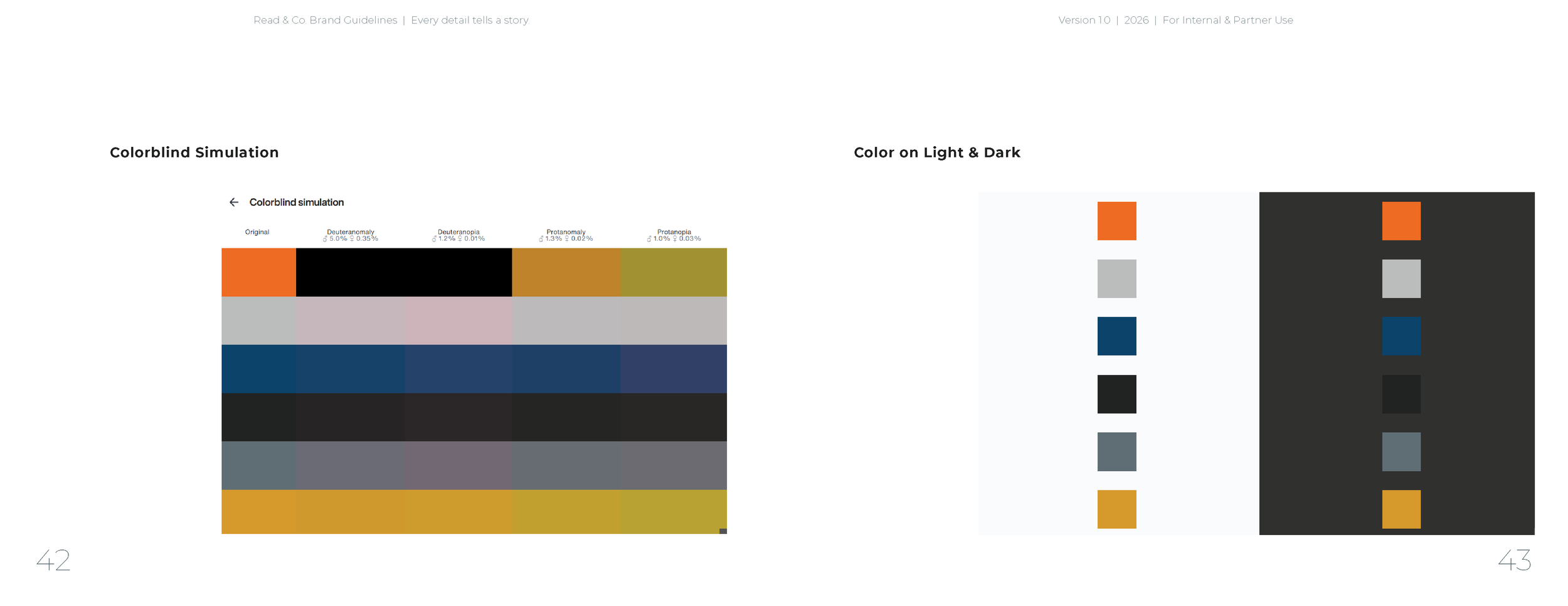
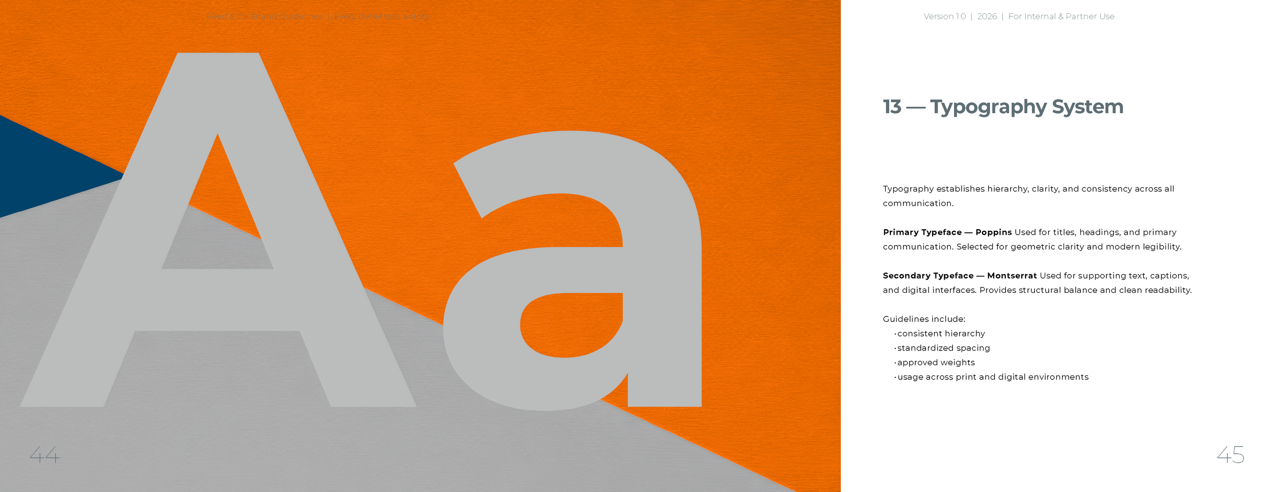
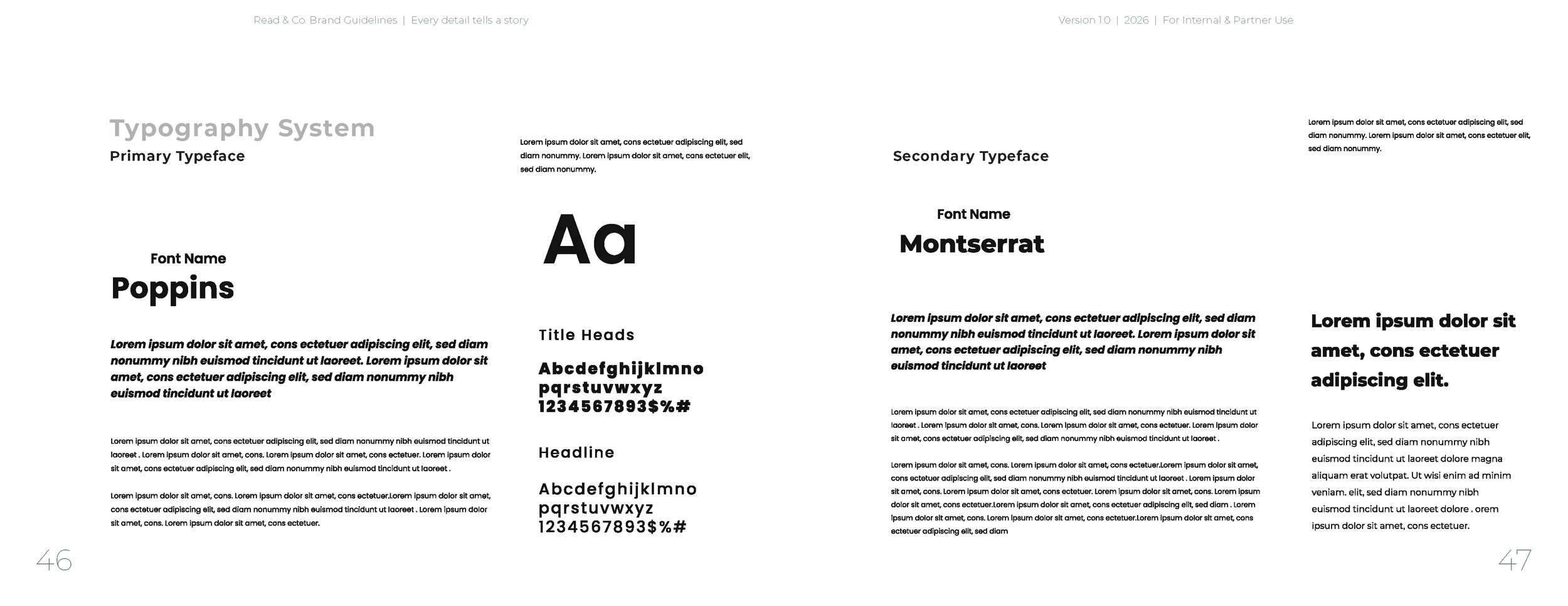
The system includes a mixed‑case engineered wordmark, a calibrated color palette inspired by production materials, and a dual‑typeface hierarchy designed for clarity and performance. Each component is built for reliability across professional workflows.
-
The visual language uses minimal geometry, matte lighting, and material‑driven compositions. Abstract paper panels introduce editorial calm and reinforce the brand’s connection to substrates and craft.
-
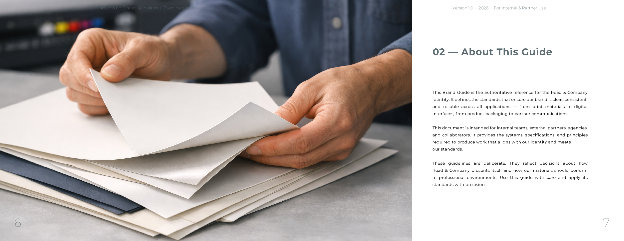
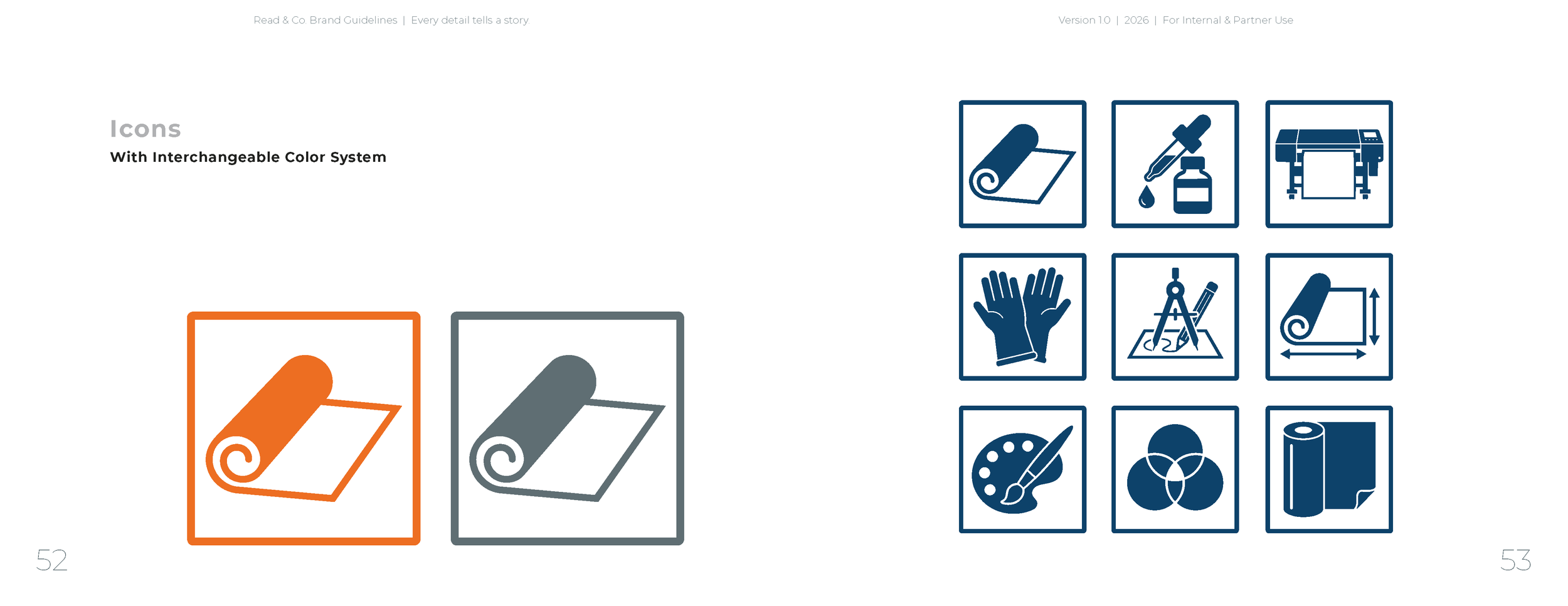
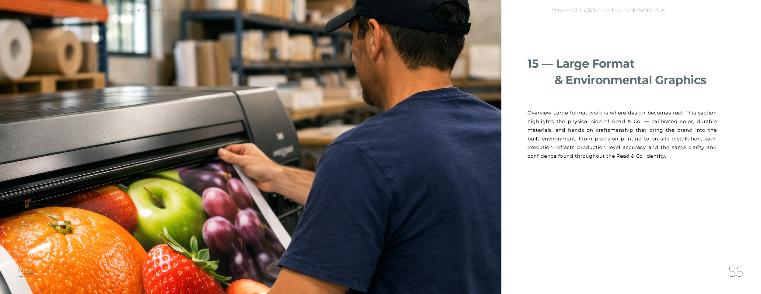
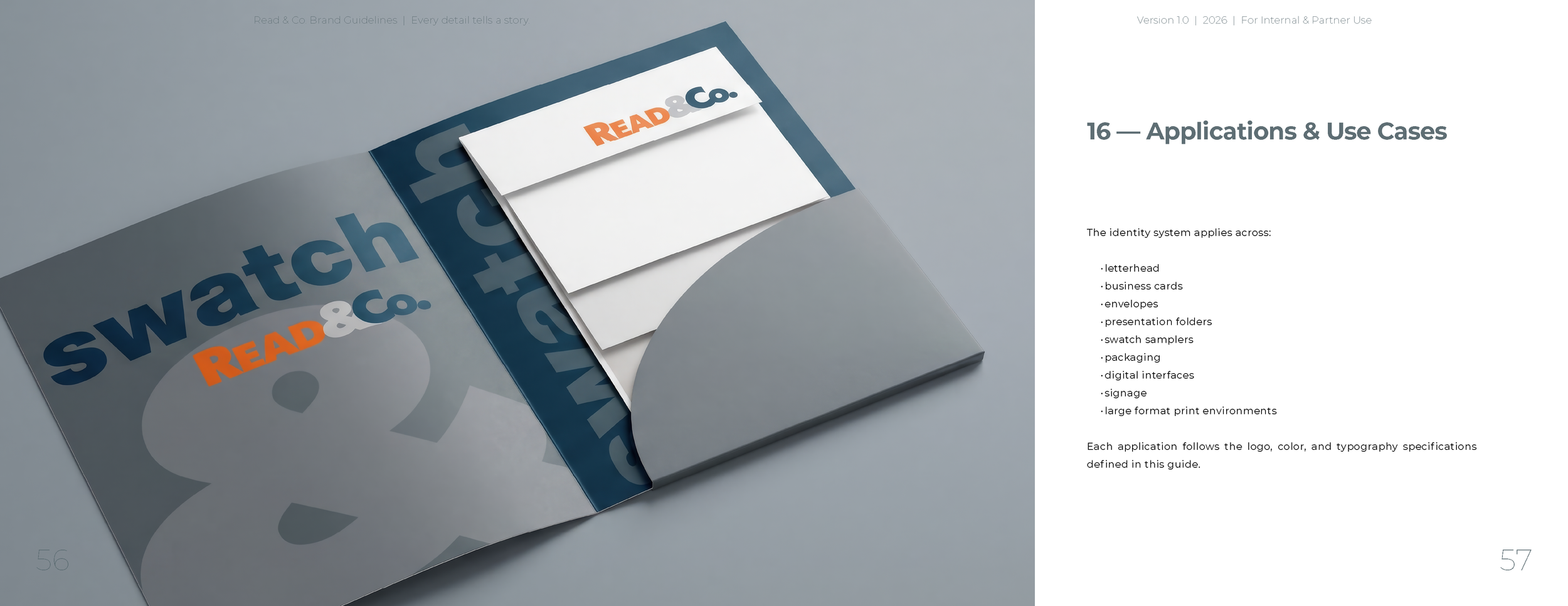
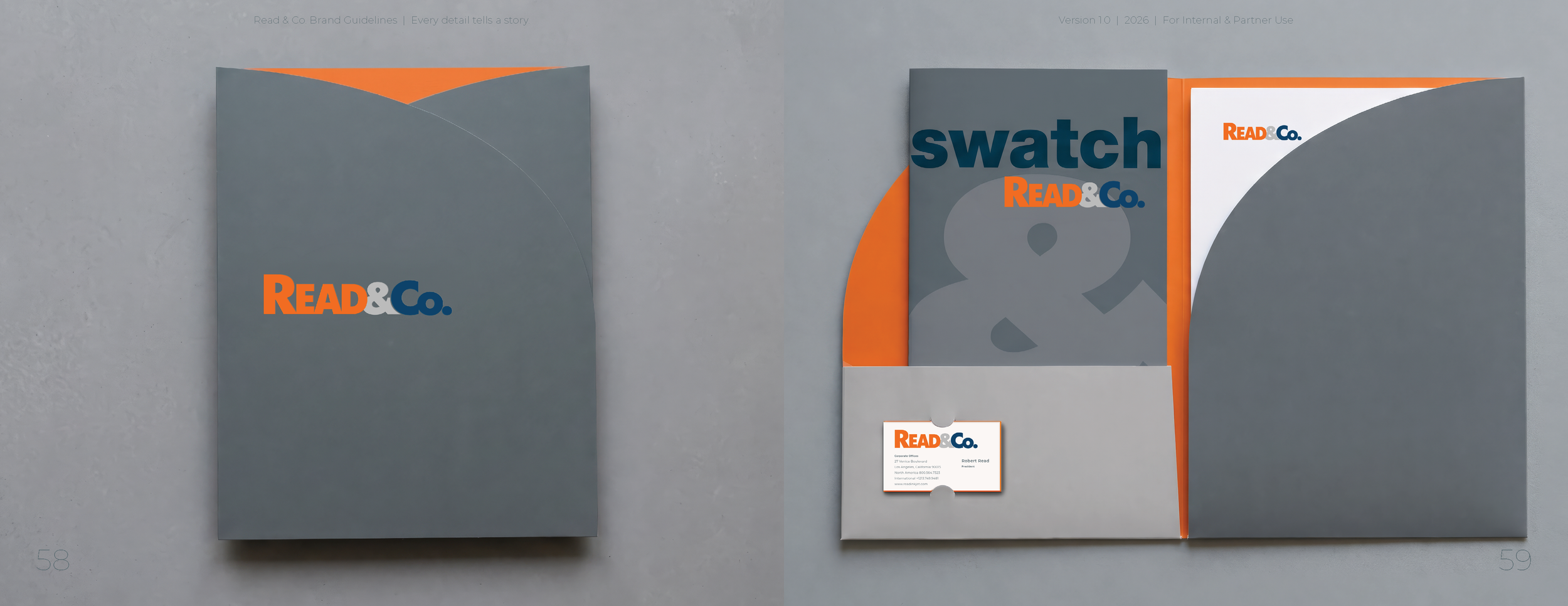
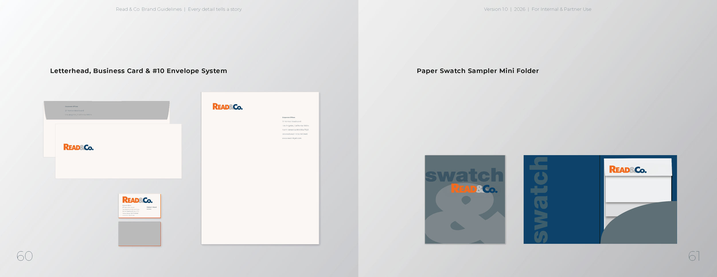
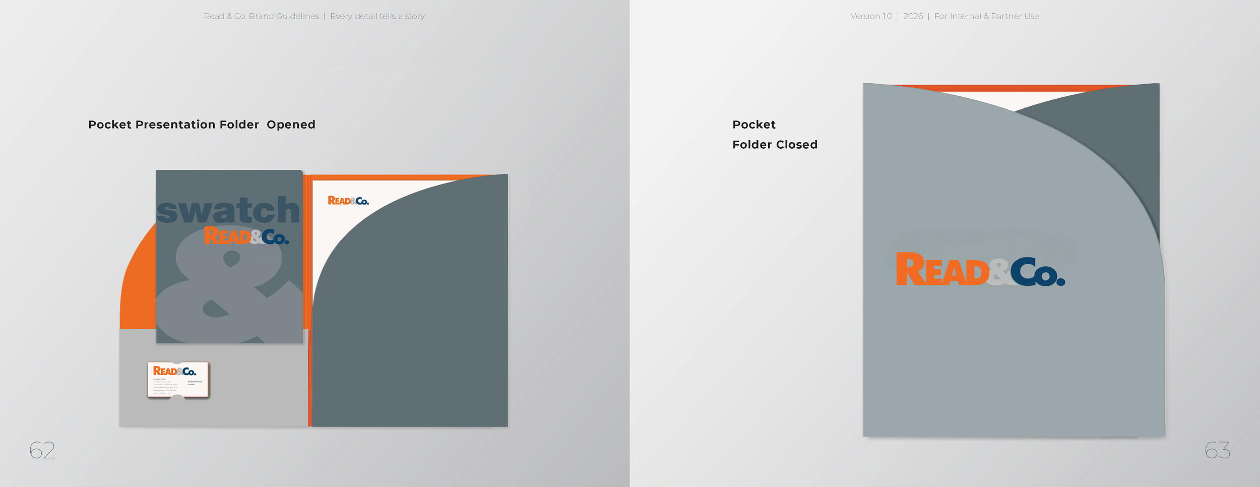
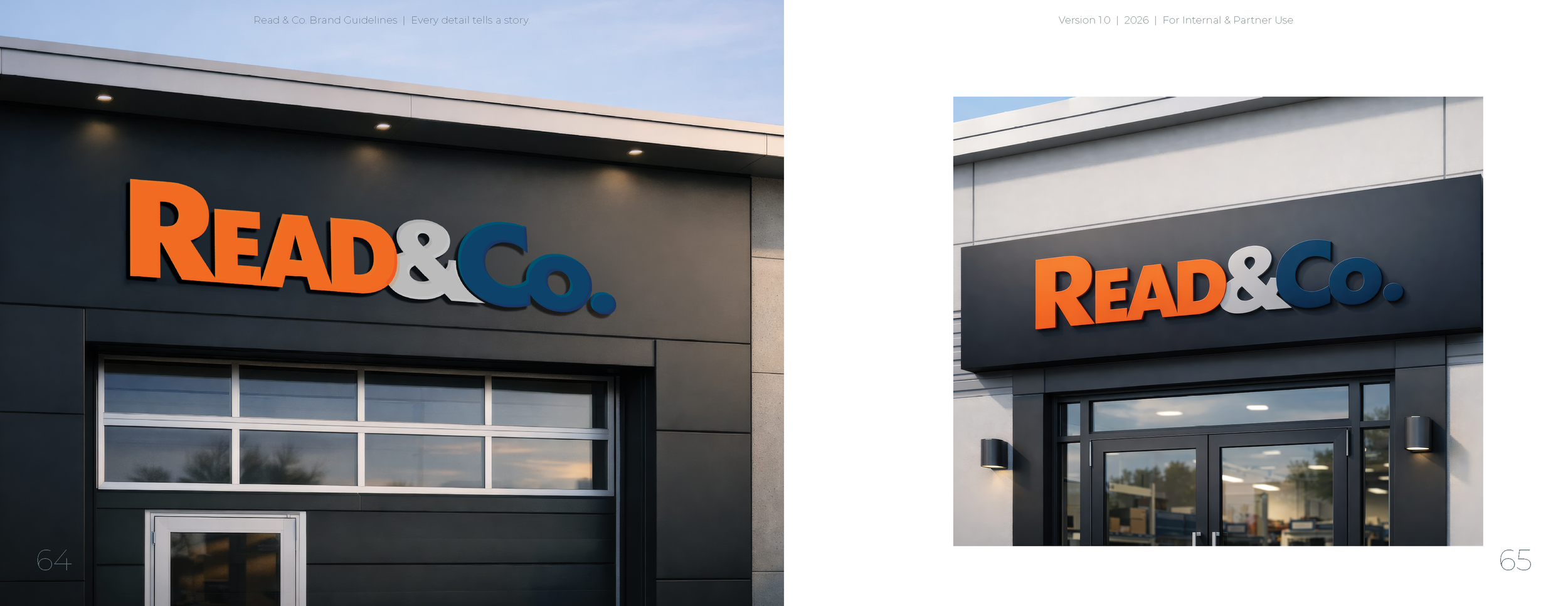
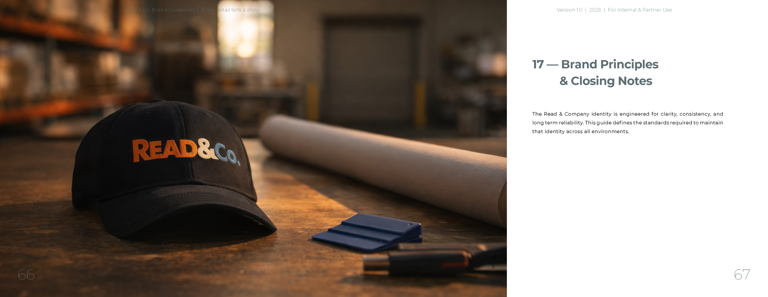
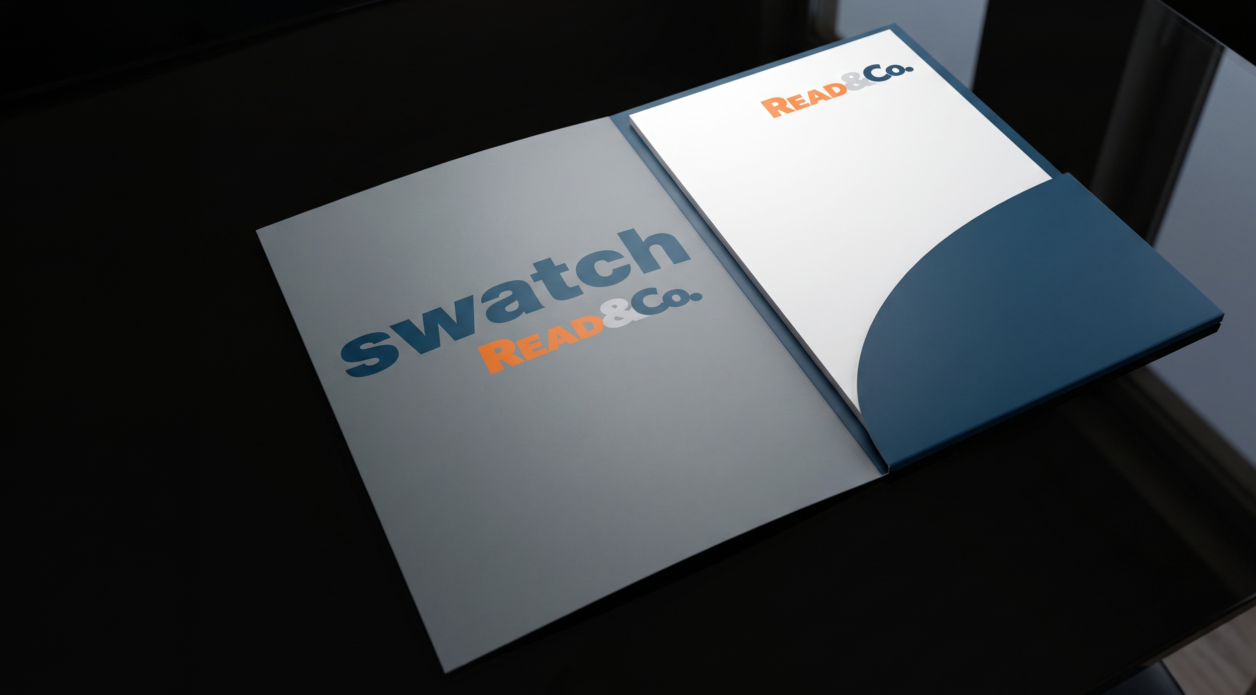
The identity extends across stationery, packaging, swatch systems, digital interfaces, signage, and large‑format environments. Each application follows strict spacing, color, and hierarchy standards to maintain consistency.
-
The final brand system is clear, confident, and engineered for long‑term use. It positions Read & Co. as a modern materials leader while honoring the craft that shaped its history.








Read & Co. is a materials company built on precision, reliability, and craft.
Every execution — from the smallest swatch to the largest installation — reinforces the same truth:
The day begins with craft.